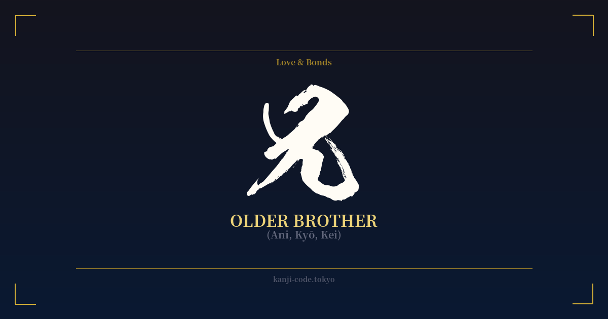
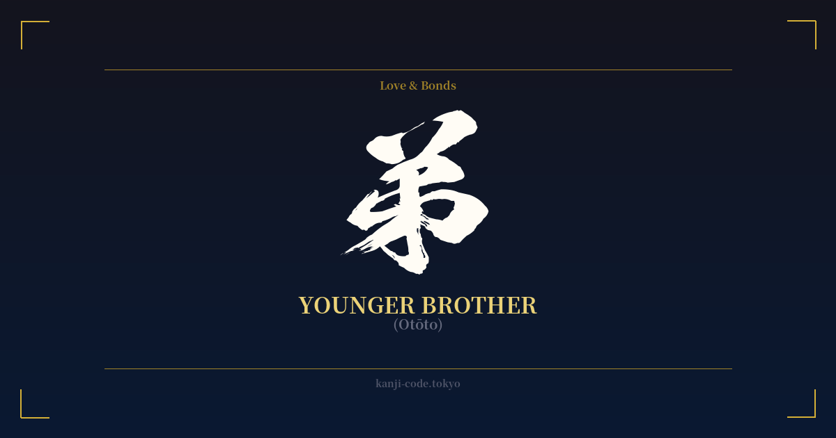
✍️ 兄 (Ani, Kyō, Kei) — Cultural Context
The kanji 兄 (Ani) is more than just a word for an older brother; it's a symbol deeply embedded in the hierarchical structure of Japanese family and society. Its form offers a clue to its origin: the character is a combination of 口 (kuchi), meaning 'mouth,' and 儿 (hito), representing 'person' or 'legs.' The image is that of a person with a prominent mouth, interpreted as the one who gives instructions or speaks with authority within the family—the elder sibling.
Historically, under the influence of Confucian values, the role of the eldest son (chōnan) was paramount. He was the heir, the one responsible for carrying on the family name, caring for aging parents, and managing ancestral rites. The 兄 was expected to be a pillar of strength, a role model, and a protector for his younger siblings. This cultural weight gives the kanji a sense of duty, reliability, and leadership.
In modern Japanese, how you refer to an older brother is nuanced and context-dependent. When speaking about your own older brother to others, you use the humble term 兄 (Ani). When addressing him directly or speaking about someone else's older brother, you use the more respectful お兄さん (Onii-san). The term 兄貴 (Aniki) has a more masculine, rough-and-tumble feel, often used among men to show respect to a senior or mentor in a gang, club, or workplace, carrying a 'big bro' energy.
This distinction is crucial. While 兄 is the dictionary form, it's rarely used in direct address. This is why a tattoo of the single character can feel stark or impersonal—it lacks the social warmth embedded in the terms used in daily conversation. Despite this, its simple, powerful form makes it a popular choice for those wishing to honor their own older brother, symbolizing a personal bond of protection, guidance, and unwavering support. It captures the essence of the role rather than the casual, everyday term.
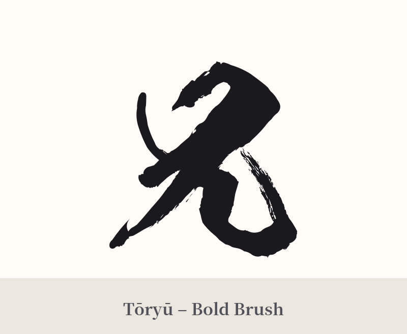
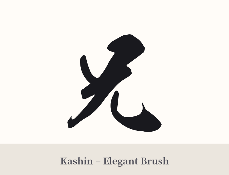
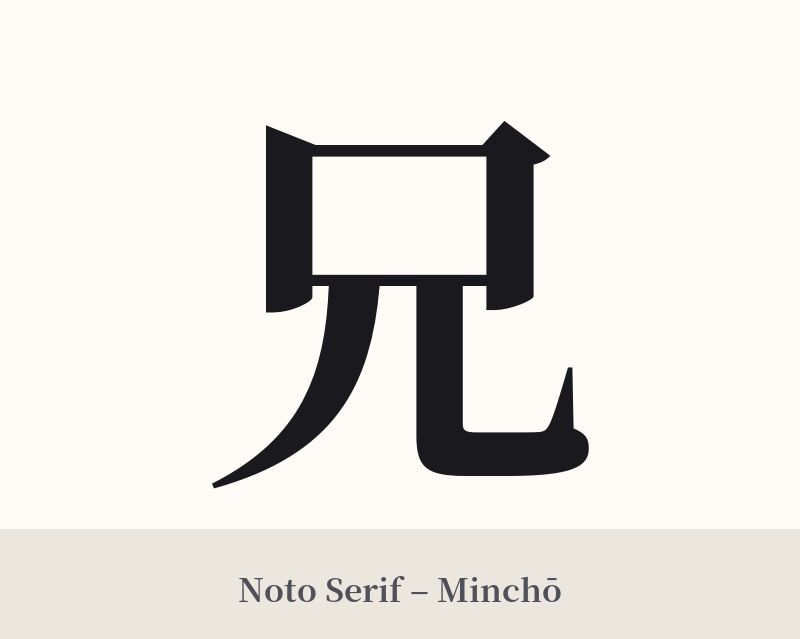
🖌️ Font Styles for 兄
The same kanji can look dramatically different depending on the calligraphy style. Choose a font that matches the mood you want for your tattoo or design.
🎨 Tattoo Suitability
📐 Tattoo Design Guide
A tattoo of 兄 works best when its simplicity is embraced. It's a character that conveys its meaning through clean, direct form rather than ornamentation.
– Placement: This is a personal symbol, making it well-suited for places you see often. The inner forearm, the chest over the heart, or the back of the shoulder are all excellent choices. A smaller version on the wrist can serve as a constant, subtle reminder.
– Font Style: A strong, clear script is usually most effective. Standard block script (Kaisho) emphasizes its stability and reliability. A slightly more fluid semi-cursive style (Gyosho) can add a touch of personal warmth and movement without sacrificing legibility.
– Visual Tips: Consider incorporating it into a larger design. It could be paired with your brother's birthdate, a symbol representing a shared memory, or the kanji for 'bond' (絆). However, it stands strong on its own. Its minimalist design means it should not be crowded by overly complex elements that could overshadow its quiet strength.
Comments