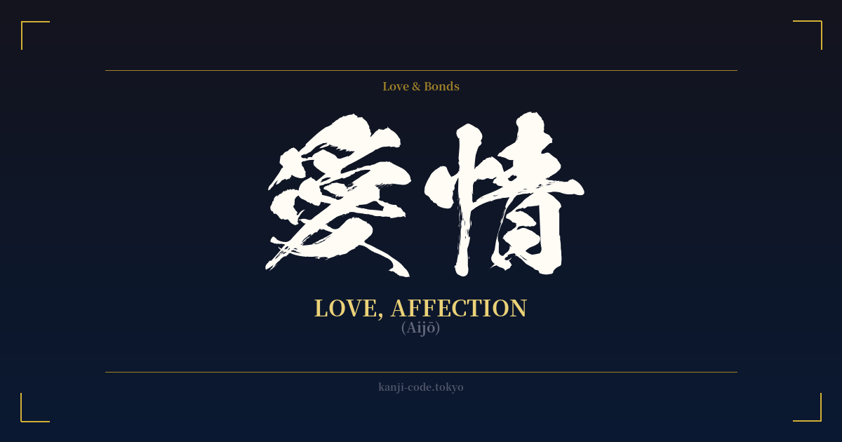
✍️ 愛情 (Aijō) — Cultural Context
In the vast lexicon of human emotion, few concepts are as central as love. The Japanese language, with its characteristic precision and nuance, offers several words to capture its different facets. Among them, 愛情 (Aijō) stands out as a term for a deep, nurturing, and enduring form of love and affection.
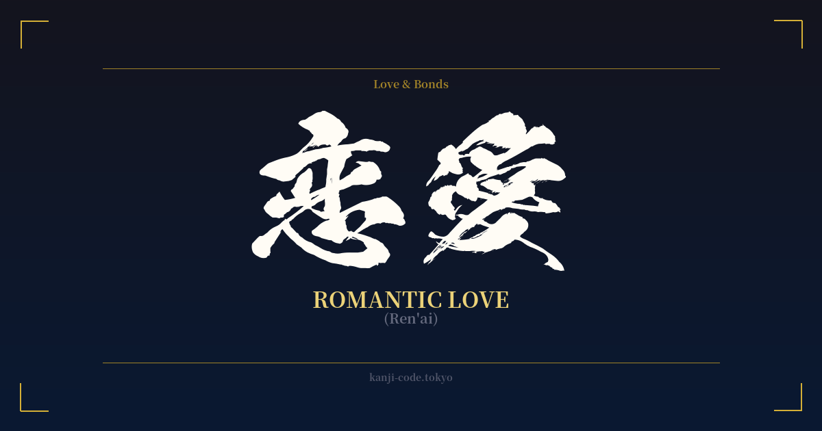
Unlike the fiery, often all-consuming passion of 恋 (koi), which can be translated as romantic love or infatuation, 愛情 speaks to a quieter, more stable, and selfless emotion. It is the love that grows and deepens over time, built on a foundation of mutual care, understanding, and empathy. While koi describes the feeling of wanting to be with someone, Aijō describes the feeling of wanting to care for them.
This distinction is crucial in Japanese culture. Aijō is the word used to describe a parent's love for a child (親の愛情 – oya no aijō), a profound and unconditional bond. It’s the affection shared between long-term partners who have weathered life's storms together, and the deep-seated care one feels for a lifelong friend or even a beloved pet. It is a love that gives without expecting anything in return.
The characters themselves reveal this depth. 愛 (ai) is the general character for love, containing the 'heart' radical (心) at its center. It signifies a broad, almost spiritual concept of love. When combined with 情 (jō), which means 'feelings,' 'emotion,' and 'sympathy,' the concept becomes grounded and personalized. 愛情 is literally 'love-feelings'—an affection that is not just an abstract ideal but is actively felt and expressed through compassionate action.
In Japanese media and daily life, Aijō is often portrayed as the bedrock of family and stable relationships. It's the quiet strength that holds society together. A character in a novel might lament a lack of Aijō in their childhood, or a film might celebrate the enduring Aijō of an elderly couple. It represents security, warmth, and an unwavering emotional connection that is both powerful and gentle.
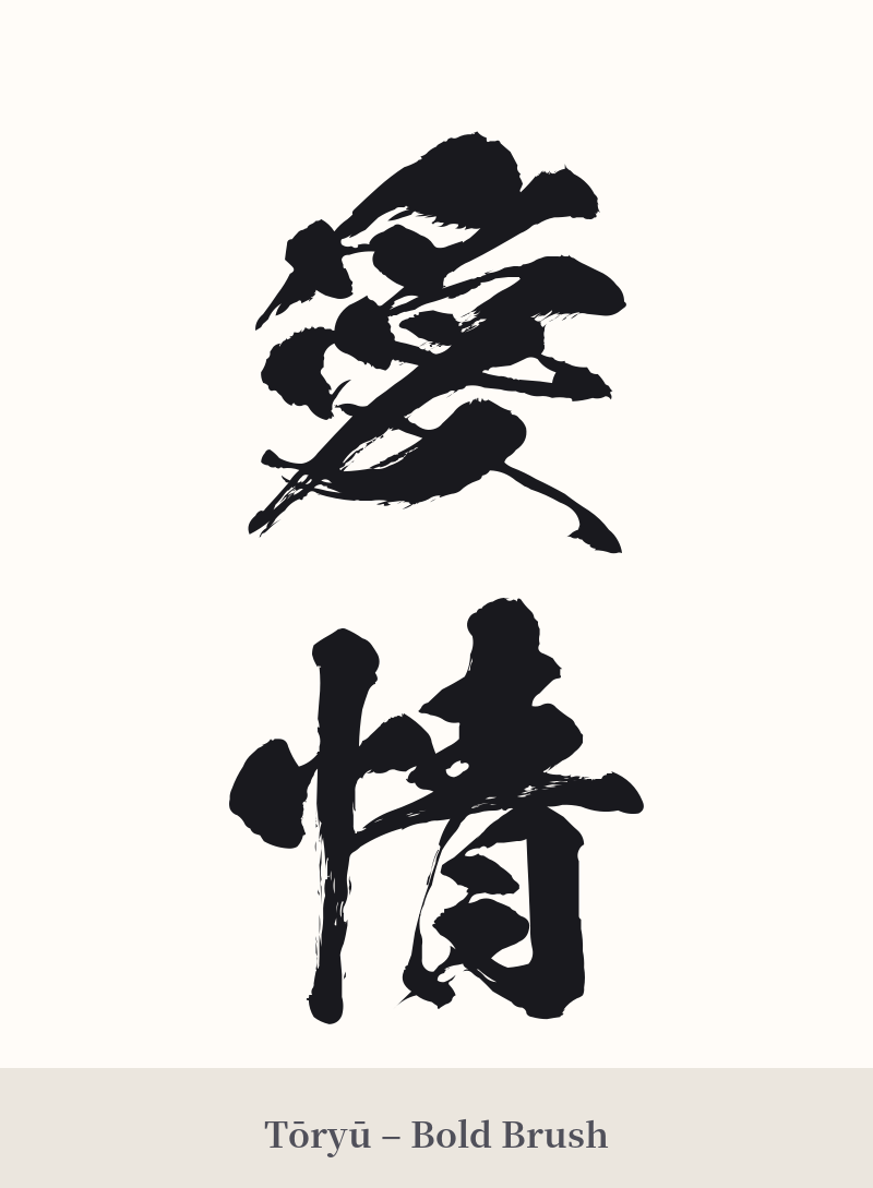
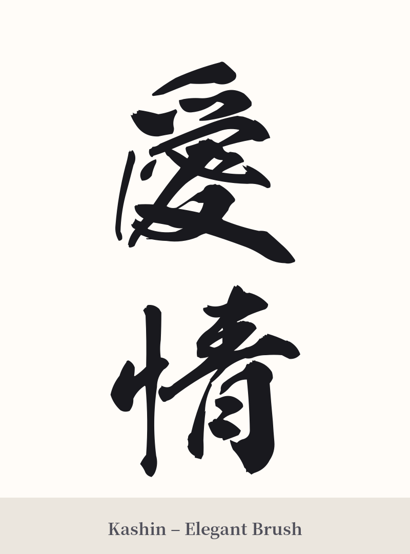
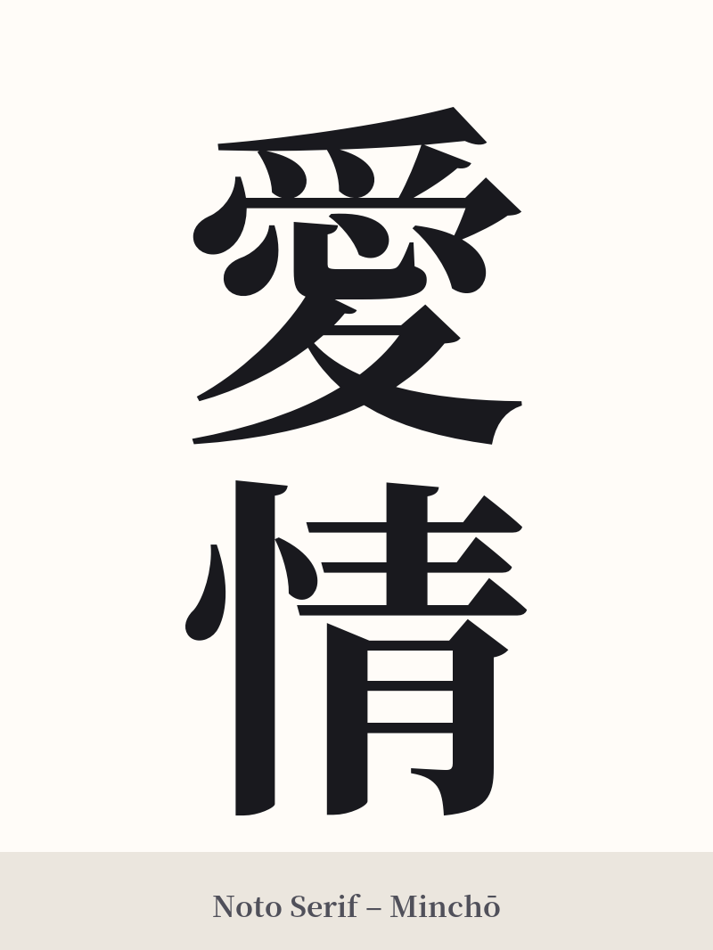
🖌️ Font Styles for 愛情
The same kanji can look dramatically different depending on the calligraphy style. Choose a font that matches the mood you want for your tattoo or design.
🎨 Tattoo Suitability
📐 Tattoo Design Guide
For a tattoo of 愛情, the design should reflect its meaning of deep, heartfelt connection. Both vertical and horizontal arrangements work well, offering flexibility in placement.
– Vertical Placement: A classic choice that follows traditional Japanese writing. This looks excellent along the spine, the forearm, or running down the calf. It creates an elegant, flowing line.
– Horizontal Placement: Well-suited for areas like the chest, upper back (below the neck), or the inner bicep. This provides a strong, grounded appearance.
– Font Styles: For a personal and emotional feel, consider a semi-cursive (Gyōsho) or full cursive (Sōsho) script. These styles have fluid, connected strokes that mirror the flow of emotion. For a clearer, more timeless statement, the standard block script (Kaisho) is a powerful choice, emphasizing the strength and stability of the love it represents.
– Visual Tips: The characters are detailed enough to be the main focus. Adding a subtle background, like a soft watercolor wash in pink or red, can enhance the design without distraction. Ensure your artist is skilled in kanji and leaves enough negative space within the characters, especially in smaller tattoos, to prevent the ink from bleeding together over the years.
Comments