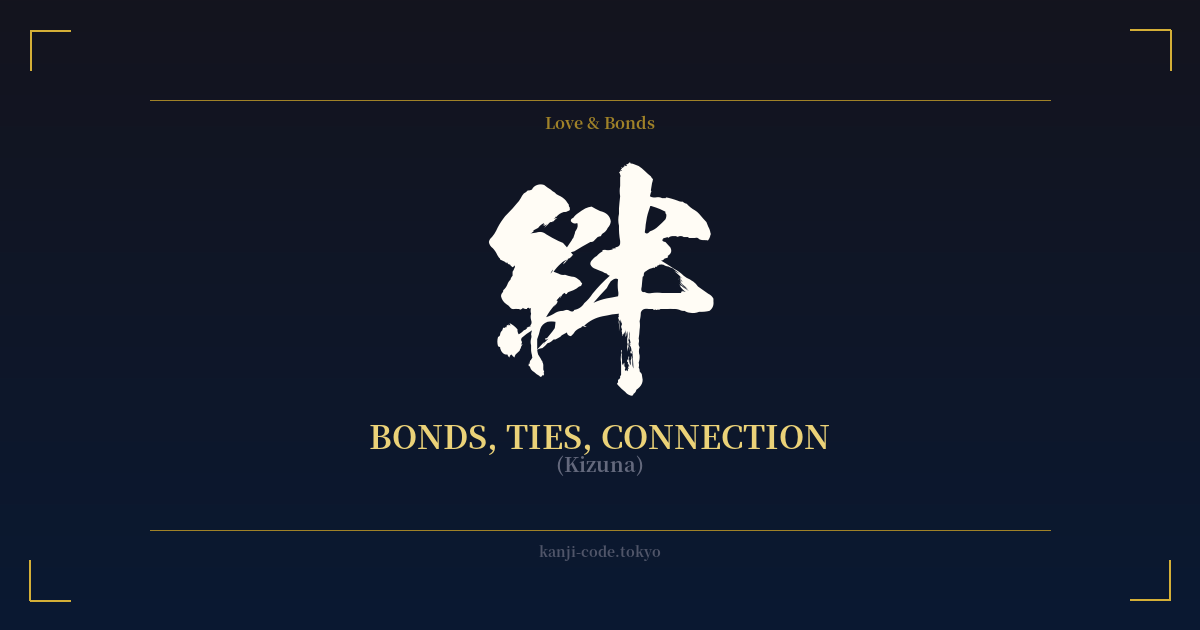
✍️ 絆 (Kizuna) — Cultural Context
The Japanese word 絆 (kizuna) is one of the most poignant and powerful terms in the language, carrying a weight that the English word 'bond' can only partially capture. It signifies not just a connection, but a deep, emotional, and often unbreakable link between people. This can be the bond of family, the profound tie between true friends, the shared experience of a team, or even the spiritual connection one feels with their community.
At its core, Kizuna is about shared humanity. It’s the invisible thread that links us, built through shared experiences, mutual support, and empathy. Unlike a contract or a simple relationship, Kizuna implies a sense of belonging and mutual responsibility that is cherished and nurtured over time.
The character itself paints a beautiful picture of its meaning. It is composed of two radicals: 糸 (ito) on the left, which means 'thread' or 'string,' and 半 (han) on the right, which means 'half.' Together, they evoke the image of two halves being bound together by a thread, forming a whole that is stronger than its individual parts. This etymology perfectly encapsulates the idea of connection and interdependence.
A pivotal moment for Kizuna in modern Japan came in the aftermath of the devastating 2011 Tōhoku earthquake and tsunami. In a time of immense national tragedy, the country rallied together. Stories of sacrifice, support, and strangers helping strangers became commonplace. In recognition of this nationwide spirit of solidarity, 絆 (Kizuna) was overwhelmingly voted as the Kanji of the Year for 2011. It became a symbol of Japan's resilience and the powerful human connections that helped the nation endure and begin to heal.
This event cemented Kizuna's place in the global consciousness, elevating it from a simple word to a profound cultural concept. It is frequently seen in Japanese anime, manga, and music, often as a central theme driving the characters' motivations. For many, it represents an ideal—a form of connection that transcends distance, time, and hardship, reminding us of the fundamental importance of our relationships with others.
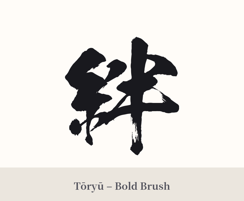
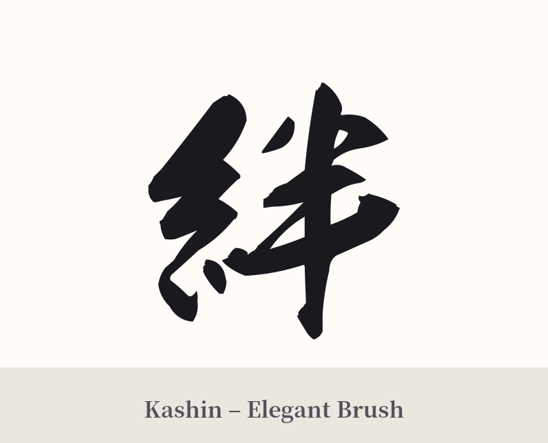
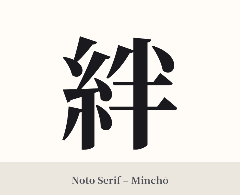
🖌️ Font Styles for 絆
The same kanji can look dramatically different depending on the calligraphy style. Choose a font that matches the mood you want for your tattoo or design.
🎨 Tattoo Suitability
📐 Tattoo Design Guide
The kanji 絆 (Kizuna) is both meaningful and visually appealing, offering great flexibility for a tattoo design.
– Placement: Due to its personal nature, many people choose placements that are close to the heart, literally or figuratively. The chest, over the heart, is a powerful choice. The inner forearm or wrist allows for a constant visual reminder of one's important bonds. The back of the neck or between the shoulder blades are also popular spots for a clean, elegant look.
– Style: A semi-cursive (Gyosho) or fully cursive (Sosho) calligraphic style can beautifully capture the emotional and flowing nature of 'bonds'. The brush strokes feel dynamic and full of life. For a more modern and stark aesthetic, a crisp, architectural font like a bold Mincho or Kaisho style works very well.
– Visuals: While 絆 stands strong on its own, it can be beautifully complemented with other imagery. A common pairing is with a red thread, alluding to the 'red thread of fate' (運命の赤い糸). It can also be integrated with cherry blossoms to symbolize the beauty of these connections, or placed within an Enso circle to represent the completeness and unity that these bonds bring.
Comments