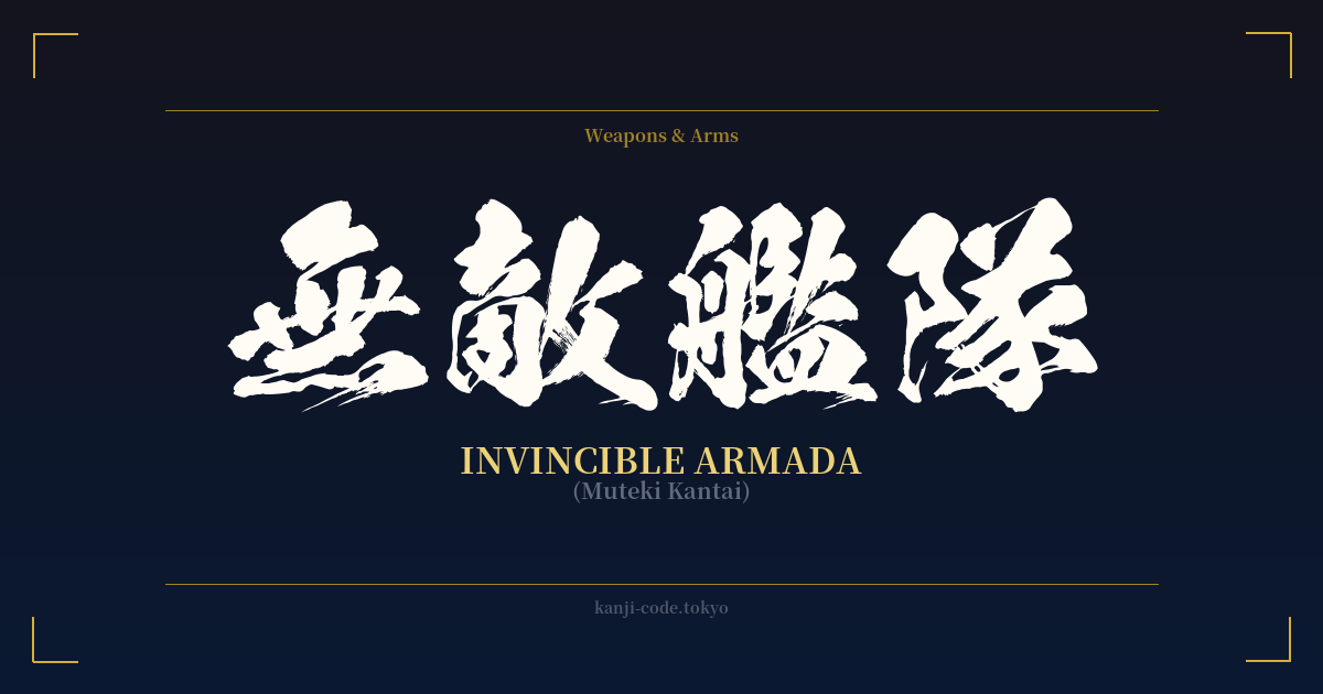
✍️ 無敵艦隊 (Muteki Kantai) — Cultural Context
The Japanese term 無敵艦隊 (Muteki Kantai) translates directly to “Invincible Armada” or “Invincible Fleet.” Its origin is famously tied to one of the most significant naval confrontations in European history: the Spanish Armada. In 1588, Spain sent a massive fleet, dubbed the “Grande y Felicísima Armada” (Great and Most Fortunate Navy), to invade England. The Japanese name, 無敵艦隊, became the standard way to refer to this historical force.
However, the term’s usage in Japan has long since transcended its historical roots. It has evolved into a powerful and widely understood metaphor for any group, team, or organization that is considered overwhelmingly dominant and unbeatable. It’s a staple of sports commentary, where a championship team on a long winning streak might be hailed as a “Muteki Kantai.” It evokes the image of an unstoppable force systematically crushing all opposition.
This metaphorical power has also made it a popular trope in Japanese pop culture. In anime, manga, and video games, you'll often encounter villainous empires or heroic factions whose military strength is described with this exact term. It immediately communicates to the audience that this is a formidable power, a final boss-level threat, or an ultimate ally. It carries a weight of finality and absolute strength that few other words can match.
Unlike more philosophical concepts of strength, such as 不動心 (Fudōshin, Immovable Mind) or 武士道 (Bushidō, Way of the Warrior), 無敵艦隊 is concrete, modern, and collective. It’s not about inner spiritual fortitude; it’s about tangible, external, and overwhelming group power. The feeling it conveys is not one of quiet confidence but of loud, undeniable dominance. It represents a force so mighty that the very concept of an enemy ceases to exist, as captured by the first two characters, 無敵 (muteki), meaning “no enemy” or “invincible.”
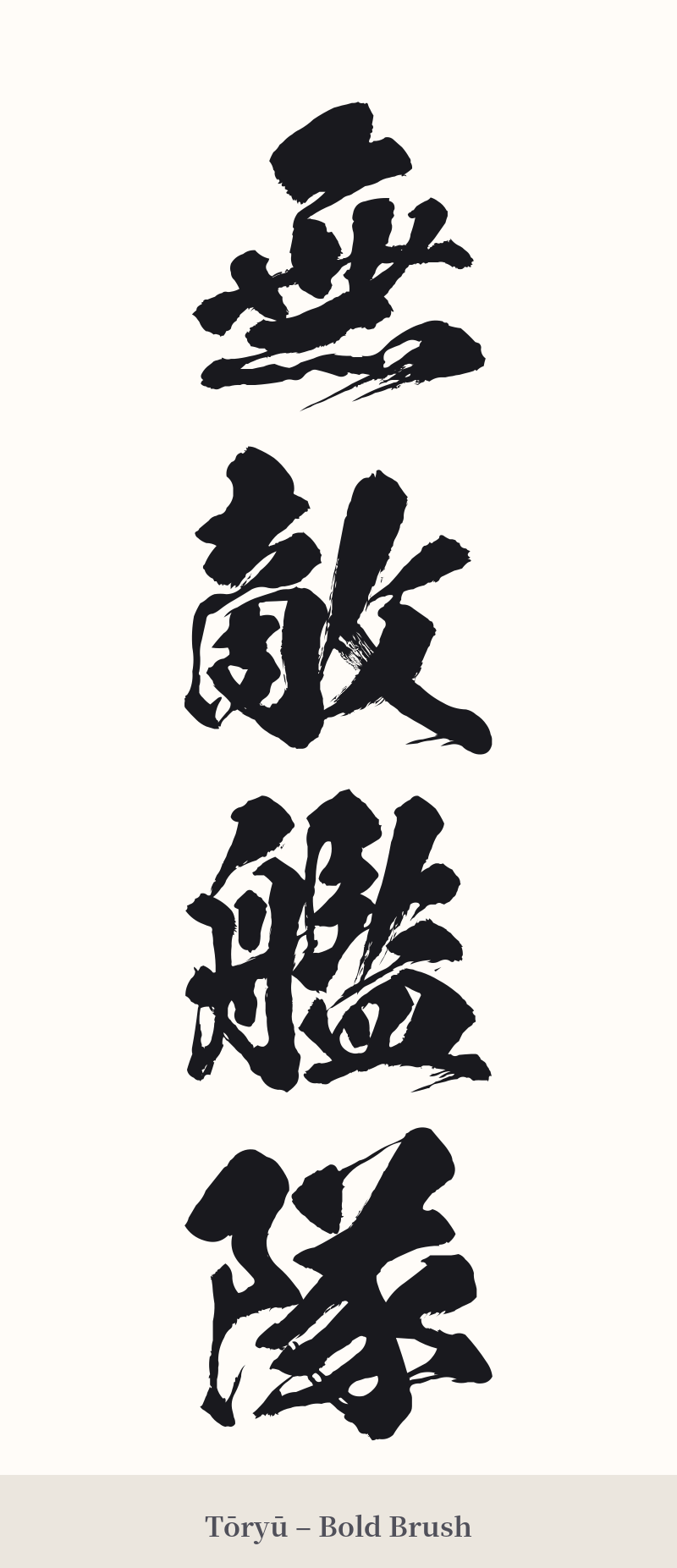
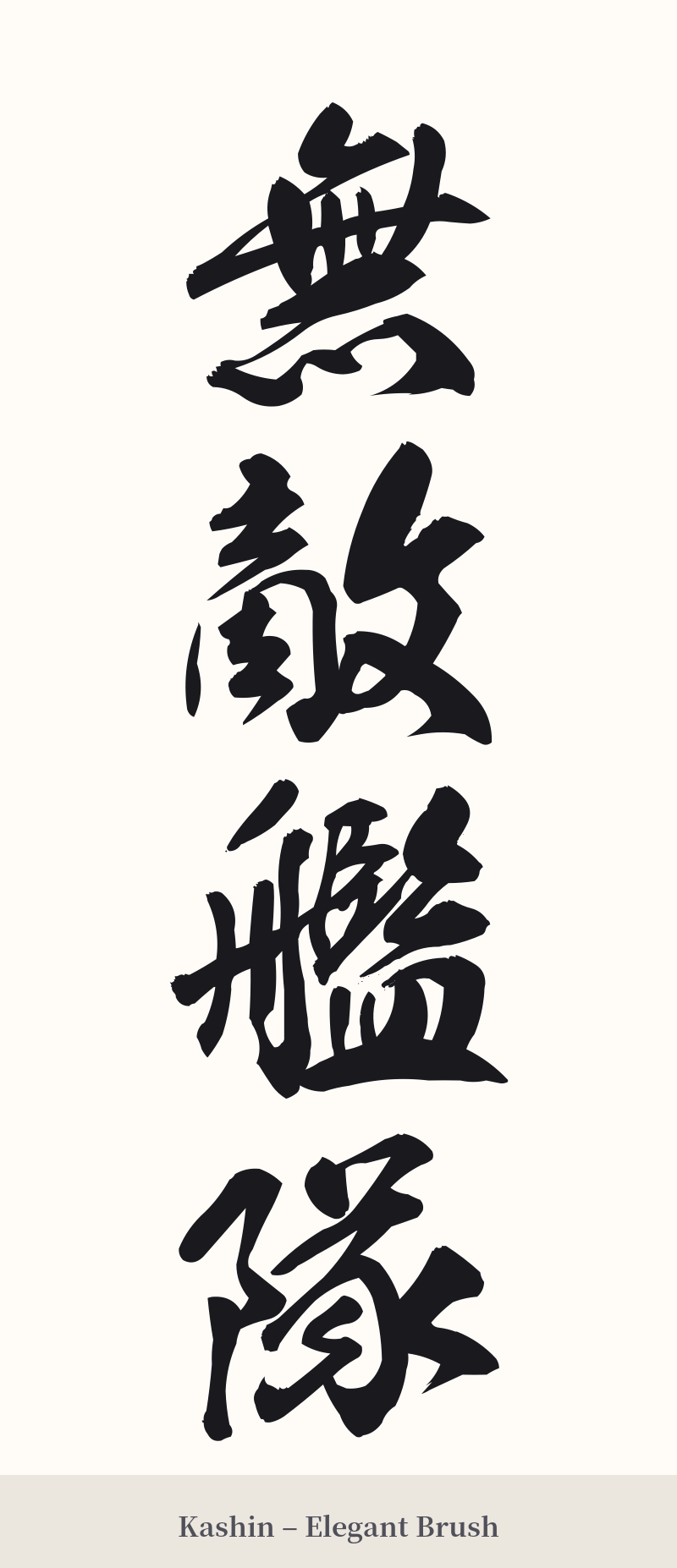
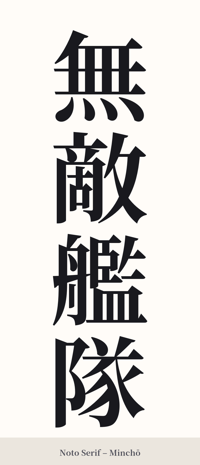
🖌️ Font Styles for 無敵艦隊
The same kanji can look dramatically different depending on the calligraphy style. Choose a font that matches the mood you want for your tattoo or design.
🎨 Tattoo Suitability
📐 Tattoo Design Guide
A design for 無敵艦隊 demands presence and space due to its complexity and powerful meaning. This is not a subtle tattoo; it's a statement piece.
For placement, prioritize large, flat areas where the four characters can be displayed clearly. A vertical arrangement down the spine, along the forearm, or on the thigh is classic and visually striking. A horizontal placement across the chest or upper back also works well, creating a sense of an unbreakable line.
When choosing a font style, consider the feeling you want to convey: – Blocky, angular scripts like Kaisho (regular script) or bold Mincho styles emphasize the military precision and unyielding power of the term. – More dynamic, semi-cursive styles like Gyosho can add a sense of motion and aggression, as if the fleet is charging into battle through stormy seas.
To enhance the design, you could incorporate related imagery. Subtle background elements like stylized ocean waves, storm clouds, or even a silhouette of a traditional Japanese warship can complement the kanji without overpowering it. Ensure your artist leaves enough negative space around each character to prevent them from looking cramped, which is crucial given the high stroke count.
Comments