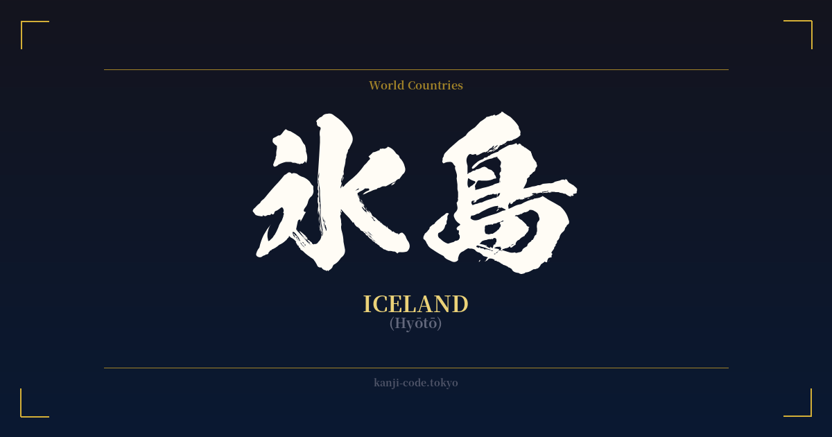
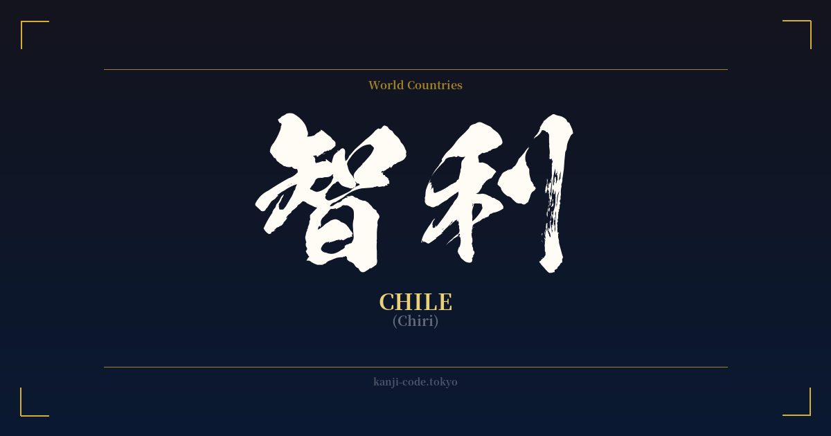
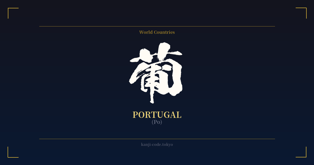
✍️ 氷島 (Hyōtō) — Cultural Context
氷島 (Hyōtō) is the Japanese kanji representation for the country of Iceland. Unlike many foreign country names that were phonetically transcribed using ateji kanji, 氷島 is a direct and beautifully literal translation. The name is composed of two characters: 氷 (hyō), meaning 'ice,' and 島 (tō), meaning 'island.' Together, they form 'Ice Island,' a name that perfectly captures the essence of the nation's stunning geography.
This method of naming provides a stark contrast to the more common modern practice of using katakana. Today, you will almost always see Iceland written as アイスランド (Aisurando), which is a phonetic rendering of the English name. The use of 氷島 has become less frequent in daily life, now carrying a more formal, literary, or even poetic weight. It’s akin to referring to Ireland as 'The Emerald Isle' in English—everyone understands the reference, but it's not the standard term.
The creation of such descriptive names was common during the Meiji Restoration (1868-1912), a period when Japan was rapidly modernizing and absorbing Western culture and geography. Scholars and officials were tasked with creating Japanese terms for new concepts and places. For some countries, they chose phonetic ateji (like 亜米利加 for America), while for others, they opted for semantic translations like 氷島. This choice reflects a desire not just to name, but to understand and categorize the world through a Japanese lens.
To the Japanese, the word 氷島 conjures a powerful and immediate image: a remote, pristine land dominated by glaciers, stark landscapes, and a crisp, cold beauty. It taps into a deep appreciation for nature (自然, shizen) that is fundamental to Japanese aesthetics. The name evokes a sense of serene isolation and the raw power of the elements, aligning with the global perception of Iceland as a land of fire and ice. While the kanji only explicitly mentions 'ice,' the implied volcanic nature of an island (島) completes the picture for many, creating a term that is both simple and deeply evocative.
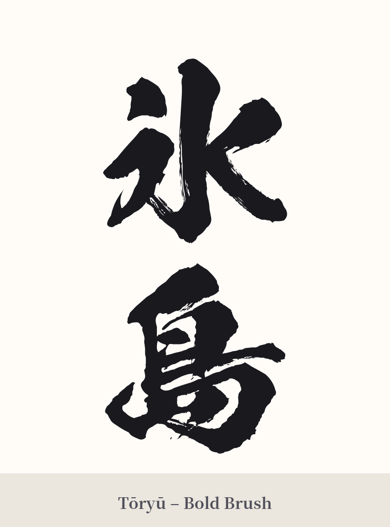
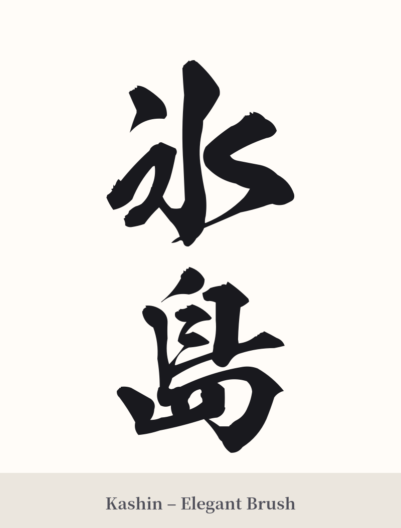
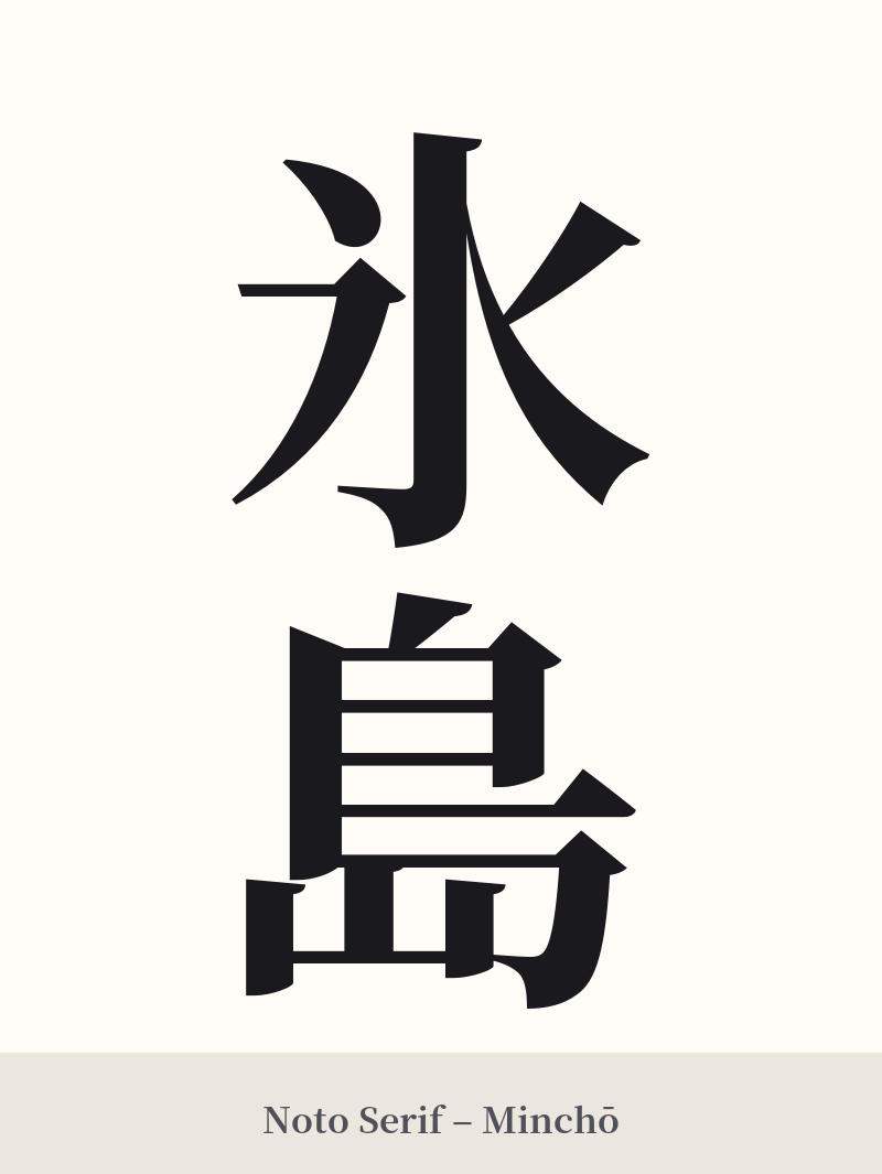
🖌️ Font Styles for 氷島
The same kanji can look dramatically different depending on the calligraphy style. Choose a font that matches the mood you want for your tattoo or design.
🎨 Tattoo Suitability
📐 Tattoo Design Guide
The two-character composition of 氷島 offers great flexibility for a tattoo design. Its balanced structure works well both horizontally and vertically.
– Placement: For a vertical design, the spine, forearm, or calf are excellent choices, allowing the characters to flow downwards. A horizontal arrangement fits perfectly across the chest, on the back of the neck, or along the inner bicep.
– Font Style: A crisp, angular font like Kaisho (block script) can emphasize the sharp, crystalline nature of 'ice' (氷). For a more organic feel that evokes natural landscapes, a semi-cursive style like Gyōsho can add a sense of movement, like wind sweeping over a barren island.
– Visual Elements: Consider pairing the kanji with imagery related to Iceland. A few snowflakes, a minimalist wave pattern, a silhouette of a volcanic mountain, or even subtle hints of the aurora borealis can frame the characters and enrich the narrative of the design.
Comments