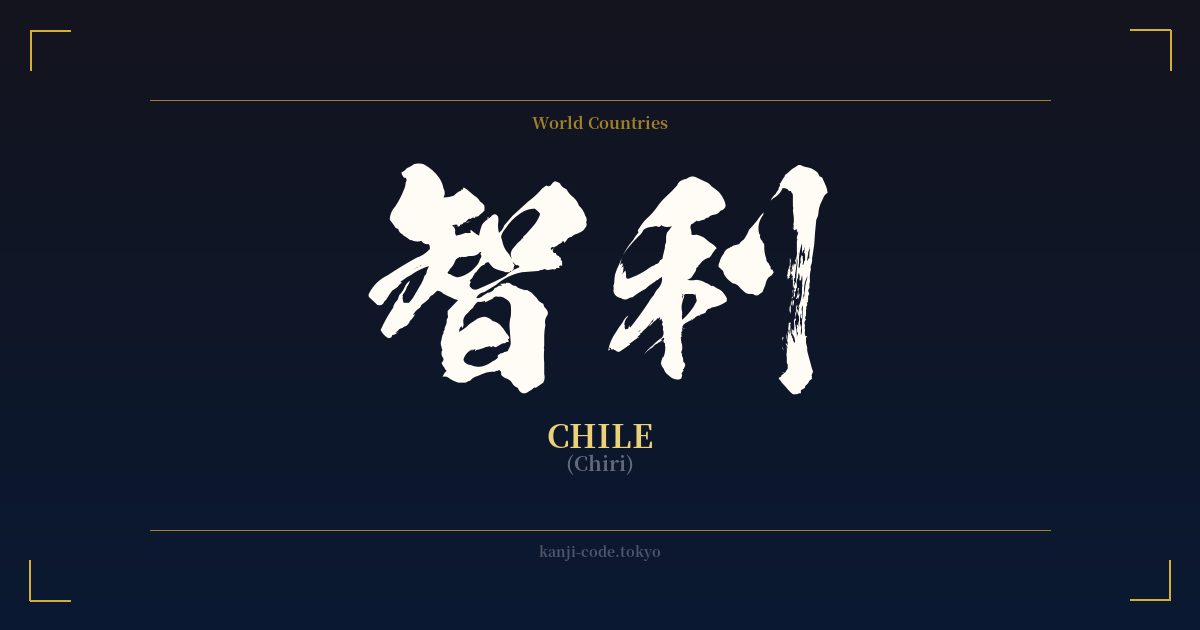
✍️ 智利 (Chiri) — Cultural Context
The Japanese language has a fascinating method for incorporating foreign words called 'ateji' (当て字), where kanji are used for their phonetic value rather than their literal meaning. The word 智利 (Chiri) is a classic example of this practice, representing the nation of Chile.
Historically, when Japan began interacting more with the West, it needed ways to write foreign names and places. While the katakana script is the modern standard for this, ateji was common in the Meiji era and beyond. Instead of creating new symbols, existing kanji were assigned to foreign sounds. For 'Chile,' the sounds 'chi' and 'ri' were matched with the characters 智 and 利.
What makes ateji intriguing is that the characters chosen are often auspicious or carry a positive connotation, even if their selection is primarily phonetic. In this case, 智 (chi) means 'wisdom' or 'intellect,' and 利 (ri) means 'profit,' 'advantage,' or 'benefit.' Together, they create a name that sounds like 'Chile' but has an underlying, albeit coincidental, positive feeling of a 'wise and prosperous' place. This was a common courtesy when naming foreign lands, a sort of linguistic diplomacy.
However, it's crucial to understand that in contemporary Japan, the use of 智利 is rare. You might encounter it in historical texts, formal diplomatic documents, or perhaps in artistic contexts where a classical feel is desired. For everyday use—in news, on maps, and in conversation—the katakana script チリ (Chiri) is universally preferred for its simplicity and clarity.
The existence of 智利 serves as a window into the linguistic history of Japan and its relationship with the outside world. It shows a creative and pragmatic approach to language, borrowing the phonetic power of kanji to bridge cultural gaps. While the literal meaning of 'wisdom-profit' is not the intended message, it adds a layer of richness to what is otherwise a simple geographic name.
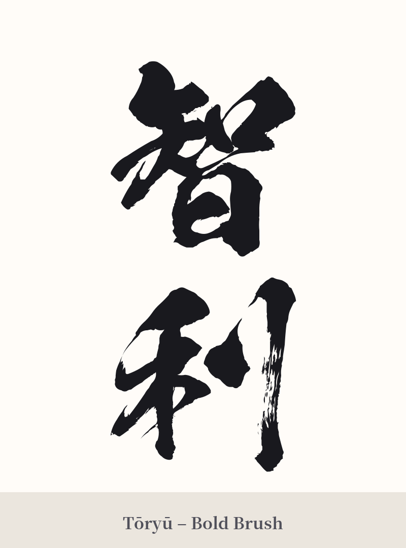
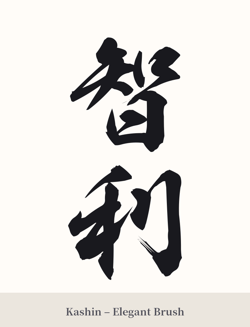
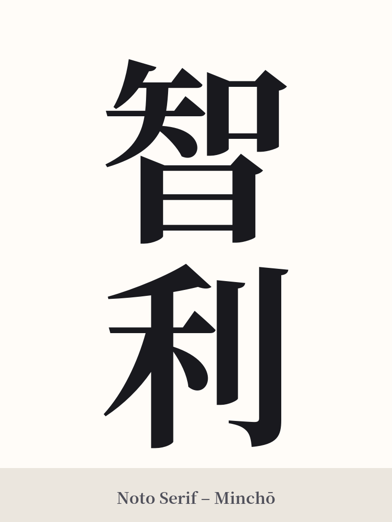
🖌️ Font Styles for 智利
The same kanji can look dramatically different depending on the calligraphy style. Choose a font that matches the mood you want for your tattoo or design.
🎨 Tattoo Suitability
📐 Tattoo Design Guide
If you have a strong personal connection to Chile and appreciate the historical nature of ateji, 智利 can be a visually interesting tattoo. Here are some design considerations:
– Placement: A vertical orientation is classic for multi-kanji words. The inner forearm, calf, or along the spine can provide a great canvas for this arrangement. For a horizontal design, the chest or upper back works well.
– Font Style: A formal, crisp Kaisho (block script) font will emphasize the stately, historical nature of the word. For a more fluid and artistic look, a semi-cursive Gyosho script can add a sense of movement and elegance.
– Visual Tips: The character 智 is more complex (12 strokes) than 利 (7 strokes). A skilled tattoo artist can use this difference to create visual balance, ensuring the top character doesn't feel overly heavy. Consider the negative space within and around the characters to ensure legibility, especially at smaller sizes.
Comments