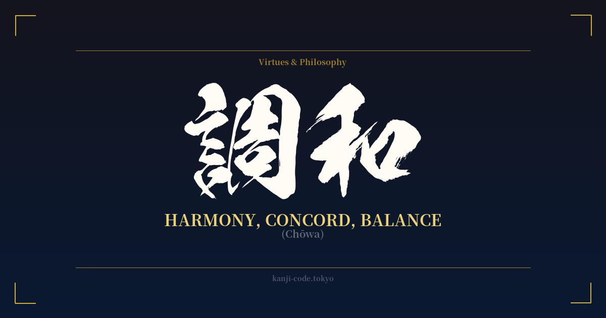
✍️ 調和 (Chōwa) — Cultural Context
調和 (Chōwa) is one of the most essential concepts in Japanese culture, translating to harmony, concord, or balance. However, its meaning goes far beyond a simple dictionary definition. It represents a core social and aesthetic principle that shapes everything from personal relationships to national identity.
The second character, 和 (wa), is key to understanding this depth. 'Wa' itself means harmony and peace, and is so fundamental that it's also an ancient name for Japan itself (大和, Yamato). It embodies the ideal of a peaceful, cooperative society where the needs of the group are prioritized to maintain social balance. This isn't about forced conformity, but about a conscious effort by individuals to work together smoothly.
Chōwa, therefore, is the active state of achieving this 'Wa'. It's a dynamic balance, not a static one. It implies the skillful blending of different, sometimes opposing, elements to create a beautiful and functional whole. This principle is visible everywhere in Japan. In business and social interactions, it manifests as 'reading the air' (空気を読む, kūki o yomu) — the ability to sense the mood of a situation and act in a way that promotes harmony rather than causing friction.
This ideal also permeates Japanese aesthetics. A traditional Japanese garden (日本庭園, Nihon teien) is a perfect example of Chōwa. Rocks, water, plants, and empty space are carefully arranged to create a miniature, idealized version of nature that feels both natural and perfectly balanced. The goal isn't to tame nature, but to work in harmony with it. Similarly, in Japanese cuisine (和食, washoku), Chōwa is achieved through the balancing of flavors, colors, textures, and cooking methods, creating a meal that is a harmonious experience for all the senses.
Ultimately, Chōwa is a philosophical aspiration. It reflects a worldview rooted in Shinto and Buddhist beliefs, where humans are not separate from nature but an integral part of it. To live in Chōwa is to live in balance with one's community, with the natural world, and within oneself. It's a concept that speaks to a desire for peace, integration, and a life where all parts contribute to a greater, more beautiful whole.
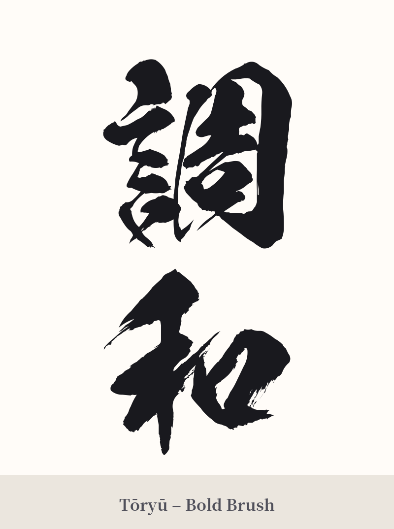
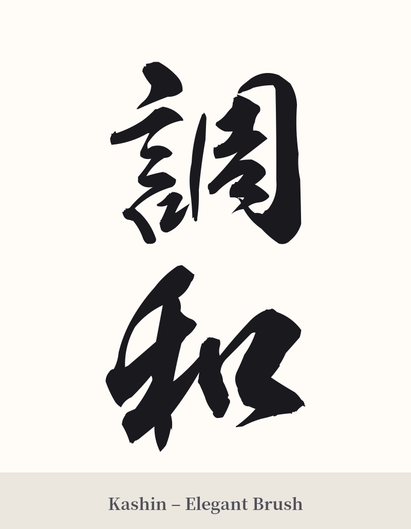
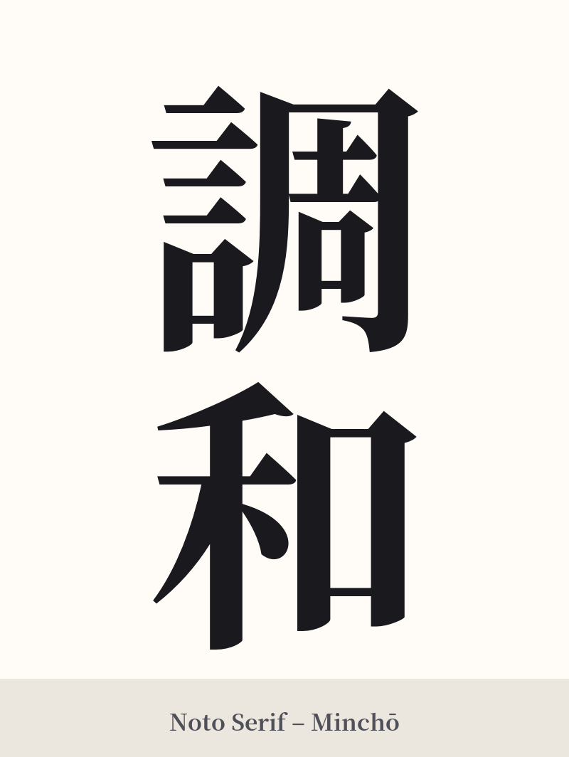
🖌️ Font Styles for 調和
The same kanji can look dramatically different depending on the calligraphy style. Choose a font that matches the mood you want for your tattoo or design.
🎨 Tattoo Suitability
📐 Tattoo Design Guide
調和 offers a graceful and meaningful design. Its two-character structure provides excellent balance for various placements.
– Placement: A vertical orientation is classic and works beautifully along the forearm, the calf, or down the spine. For a horizontal design, it fits well across the chest, collarbone, or on the upper back.
– Font Style: The meaning of harmony lends itself to elegant and flowing scripts. A semi-cursive style like Gyosho would be perfect, balancing readability with artistic flair. For a more traditional and clear look, a standard Kaisho (block) script is always a strong choice. A highly cursive Sosho script can also work if you desire a more abstract, painterly feel.
– Visual Tips: Consider incorporating the kanji into a larger piece. It pairs wonderfully with elements that symbolize peace and balance, such as an Enso circle (Zen circle), a lotus flower, a koi fish, or a calm water motif. Leaving ample negative space around the characters will enhance their presence and reinforce the theme of balance.
Comments