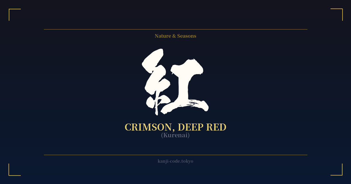
✍️ 紅 (Kurenai) — Cultural Context
The kanji 紅, most poetically read as 'kurenai,' is more than just a word for a color; it's a vessel of deep cultural and historical significance in Japan. It represents a specific, luxurious shade of crimson or deep red, distinct from the more common word for red, 赤 (aka).
The character's origin tells a story of craftsmanship. It is composed of the radical 糸 (ito), meaning 'silk' or 'thread,' and 工 (kō), meaning 'craft' or 'work.' Together, they evoke the ancient process of dyeing silk threads a vibrant, precious crimson. This dye was traditionally extracted from the petals of the safflower (紅花, benibana), a labor-intensive and costly process that made the color a symbol of wealth and status.
Perhaps the most iconic association of 'kurenai' is with the world of geisha. The traditional crimson lipstick, known as 'beni,' was painted onto the lips of geisha and maiko. This wasn't just makeup; it was an art form and a status symbol. The intensity and style of the application could signify a geisha's rank and experience. This connection imbues the kanji with an aura of elegance, mystery, and refined beauty.
Beyond aesthetics, 'kurenai' captures the fleeting, intense beauty of nature. It is the color of 紅葉 (kōyō), the crimson leaves of autumn maples that draw crowds across Japan for 'momiji-gari' (maple leaf viewing). It's the color of a deep, dramatic sunset or the first light of dawn. This poetic usage fills Japanese literature and art, where 'kurenai' often symbolizes powerful emotions—passion, love, vitality, and even the beautiful tragedy of a life cut short, like a blooming flower that must eventually fall.
In modern pop culture, the kanji has retained its power. The famous Studio Ghibli film 'Porco Rosso' is titled 'Kurenai no Buta' in Japanese, which translates to 'The Crimson Pig.' Here, the color isn't about feminine beauty but about the protagonist's unique, defiant identity and his vibrant red seaplane. This demonstrates the versatility of 紅, capable of representing both refined elegance and bold, passionate individualism.
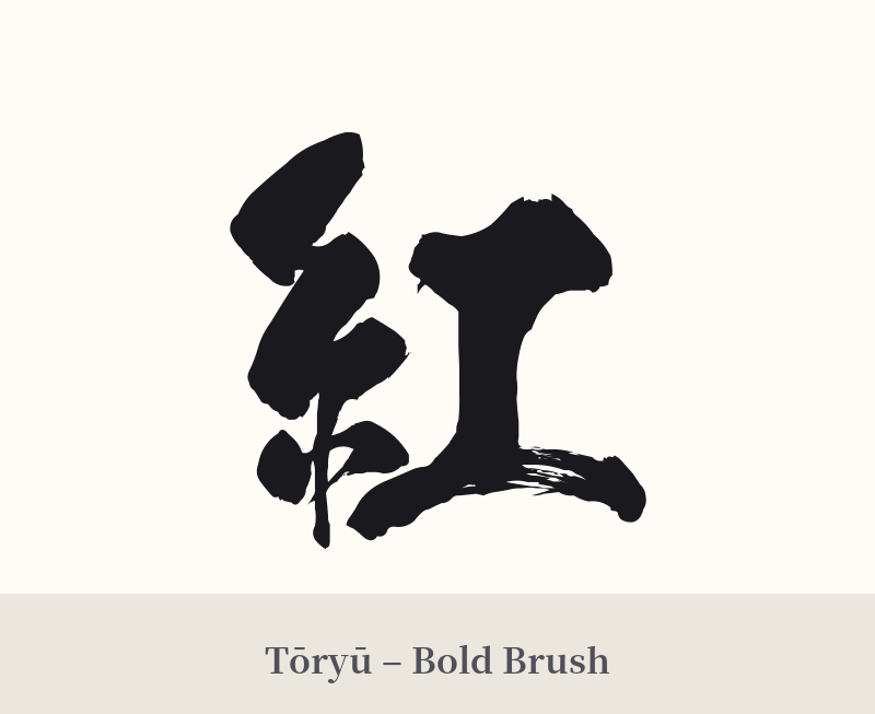
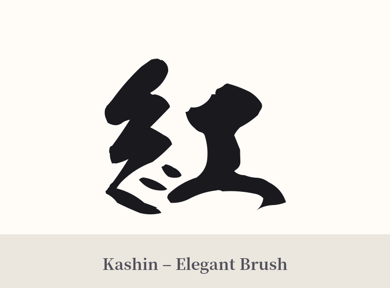
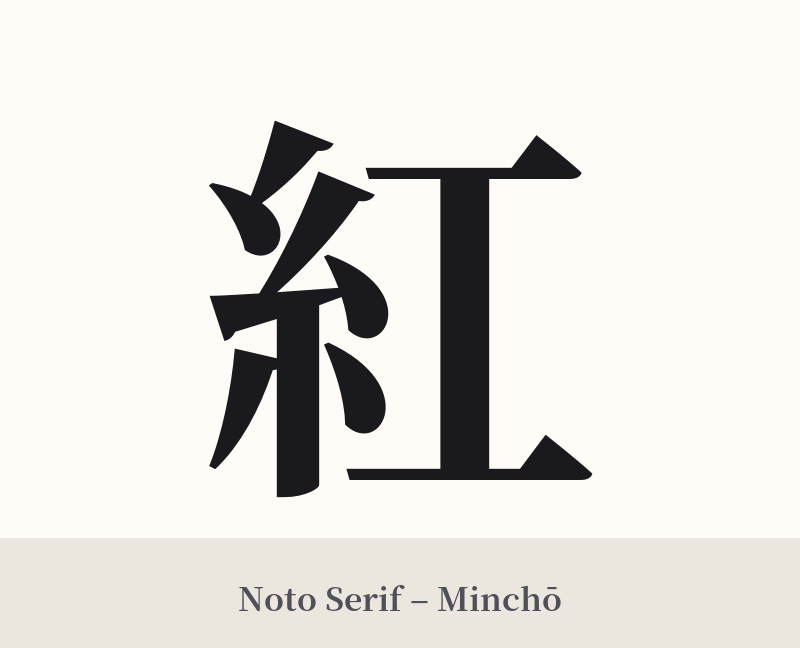
🖌️ Font Styles for 紅
The same kanji can look dramatically different depending on the calligraphy style. Choose a font that matches the mood you want for your tattoo or design.
🎨 Tattoo Suitability
📐 Tattoo Design Guide
For a 紅 (kurenai) tattoo, the design should enhance its inherent elegance and meaning.
– Placement: Vertical placements work exceptionally well for this character. Consider the spine, the length of the forearm, or the back of the calf to allow the character's form to flow.
– Font Style: A semi-cursive (gyōsho) or cursive (sōsho) calligraphic style can emphasize its poetic and fluid nature. For a stronger, more impactful statement, a bold, clean block script (kaisho) provides a sense of gravity and power.
– Visual Tips: Consider integrating a subtle color element. A small, vibrant splash of crimson watercolor behind the black ink can make the design pop. You could also pair the kanji with complementary imagery like a single maple leaf, a koi fish, or a few falling sakura petals to add another layer of meaning.
Comments