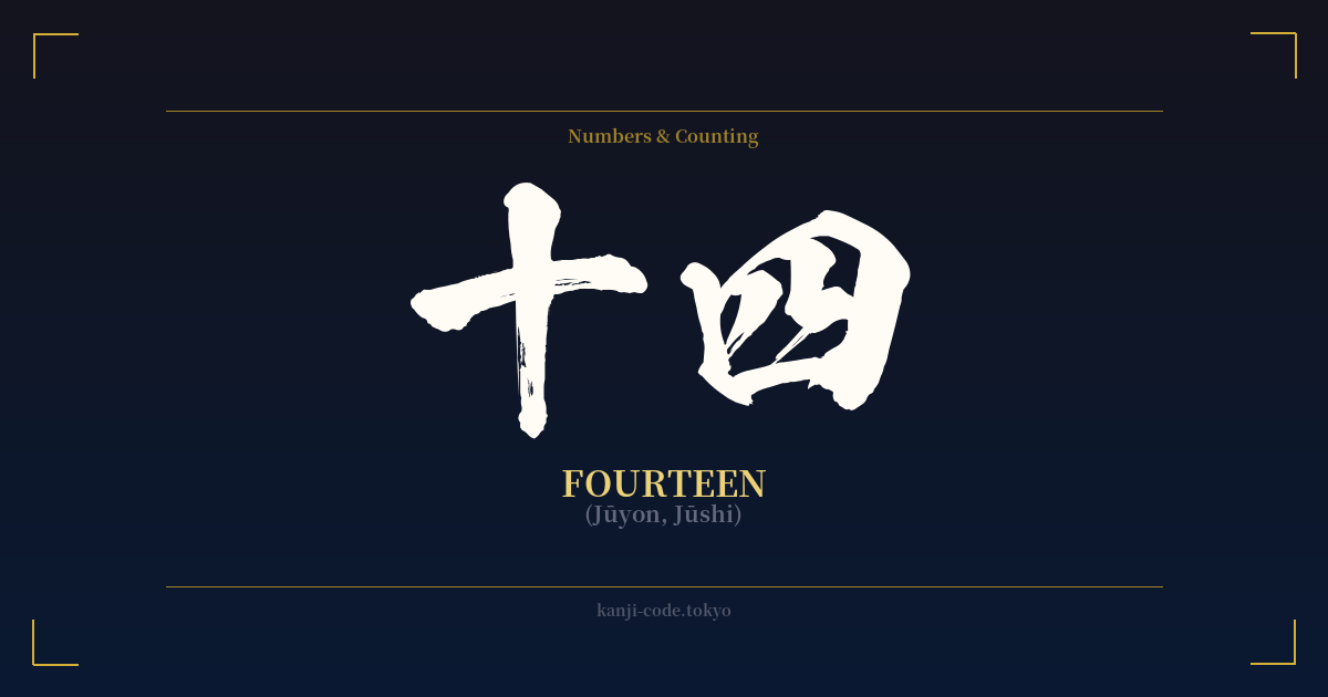
✍️ 十四 (Jūyon, Jūshi) — Cultural Context
The kanji 十四 represents the number 'fourteen' in Japanese. Its structure is perfectly logical and transparent, combining the character for ten (十) and the character for four (四). This straightforward composition is typical of how numbers are formed in the Japanese writing system, making it easy to understand at a glance.
However, the simplicity of its meaning belies a deep cultural complexity, centered entirely on the pronunciation of the number four. The character 四 has two common readings: a native Japanese reading, 'yon', and a Chinese-derived reading, 'shi'. The problem arises because 'shi' is a perfect homophone for the kanji for death, 死.
This phonetic similarity has given rise to a widespread superstition known as tetraphobia—the fear of the number four. This isn't just a minor quirk; it has tangible effects on daily life in Japan and other East Asian cultures. You will often find that building floors, hospital rooms, and hotel rooms skip the number four, and by extension, numbers containing four, like fourteen.
Consequently, the number fourteen (十四) has two readings: 'jūshi' and 'jūyon'. While 'jūshi' is a valid reading, it is often consciously avoided in everyday speech because it sounds uncomfortably close to phrases that could imply death. The reading 'jūyon' is far more common and is used specifically to sidestep the negative connotation. For example, when telling someone your age is 14, you would almost always say 'jūyon-sai' (十四歳).
The main exception is the 14th day of the month, which uses a special irregular reading: 'jūyokka' (十四日). This unique pronunciation helps to distinguish the date from the general number and its unlucky associations.
For anyone considering this kanji, understanding this superstition is critical. While it is just a number, its cultural baggage is significant. In a context where numbers can carry weight and fortune—good or bad—fourteen is firmly in the 'unlucky' category. It's a prime example of how language, sound, and culture intertwine to give a simple concept a much more nuanced and perilous meaning.
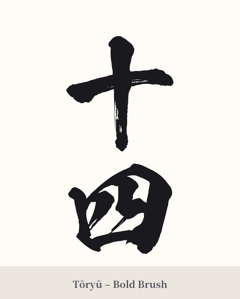
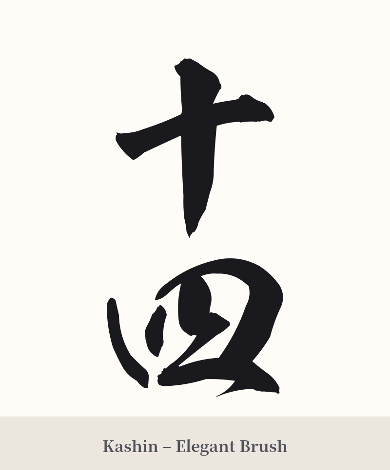
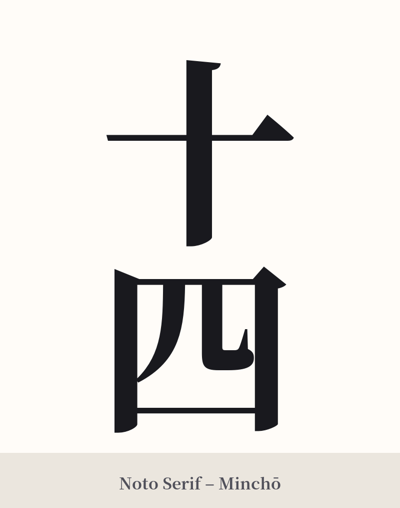
🖌️ Font Styles for 十四
The same kanji can look dramatically different depending on the calligraphy style. Choose a font that matches the mood you want for your tattoo or design.
🎨 Tattoo Suitability
📐 Tattoo Design Guide
Given its superstitious baggage, 十四 is not a common tattoo choice. If you are set on it for personal reasons, a minimalist approach is best to avoid drawing undue attention to its negative connotations.
– Placement: Small, discreet placements like the inner wrist, behind the ear, or on an ankle are suitable. It's not a centerpiece kanji.
– Font Style: A clean, standard font such as Mincho (serif) or a simple Gothic (sans-serif) style works well. These styles match the straightforward, numerical nature of the kanji without adding unnecessary drama.
– Visual Tips: A vertical arrangement (十 above 四) is a classic and aesthetically pleasing option. Consider incorporating it as part of a significant date or a sequence of other numbers to give it more context and dilute its standalone negative meaning.
Comments