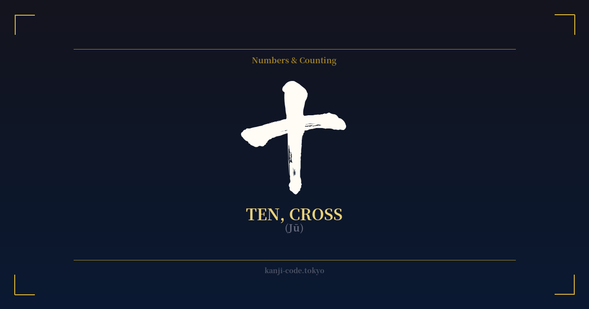
✍️ 十 (Jū) — Cultural Context
The kanji 十 (jū) is one of the most fundamental characters in the Japanese language, yet its simplicity hides a wealth of symbolic meaning. At its core, it represents the number ten. Its origin is believed to be a pictograph of a single vertical line representing a full count of fingers, with a horizontal line added to signify a bundled, complete set. This idea of completion is central to its meaning.
In Japanese and East Asian thought, the number ten often signifies totality, perfection, and the culmination of a cycle. This concept is embedded in the language itself. The word 十分 (jūbun), for instance, combines 'ten' and 'divide' to mean 'sufficient,' 'enough,' or 'plentiful,' implying a state of fullness. Similarly, the popular idiom 十人十色 (jūnintoiro), literally 'ten people, ten colors,' expresses the idea that diversity is a natural part of a whole, meaning 'to each their own.'
The character’s shape—a perfect cross—is also profoundly significant. It is the character used to describe a crossroads, 十字路 (jūjiro), a place of meeting, intersection, and decision. This imbues the character with a sense of destiny, choice, and the convergence of different paths. In this way, 十 transcends its numerical value to become a symbol of life's pivotal moments and connections.
Historically, the cross shape has been used in Japanese family crests (kamon), such as the famous Shimazu clan's 'cross in a circle,' long before widespread contact with the West. However, it's impossible to ignore the visual parallel with the Christian cross. Following the introduction of Christianity to Japan in the 16th century, the symbol gained a new layer of association. For modern audiences, especially in the West, this visual overlap is the most significant source of potential misinterpretation.
Today, 十 remains a ubiquitous part of daily life in Japan, appearing in dates, addresses, and countless compound words. It represents a foundational pillar of the writing system, a simple mark that carries the weight of completion, intersection, and fundamental order.
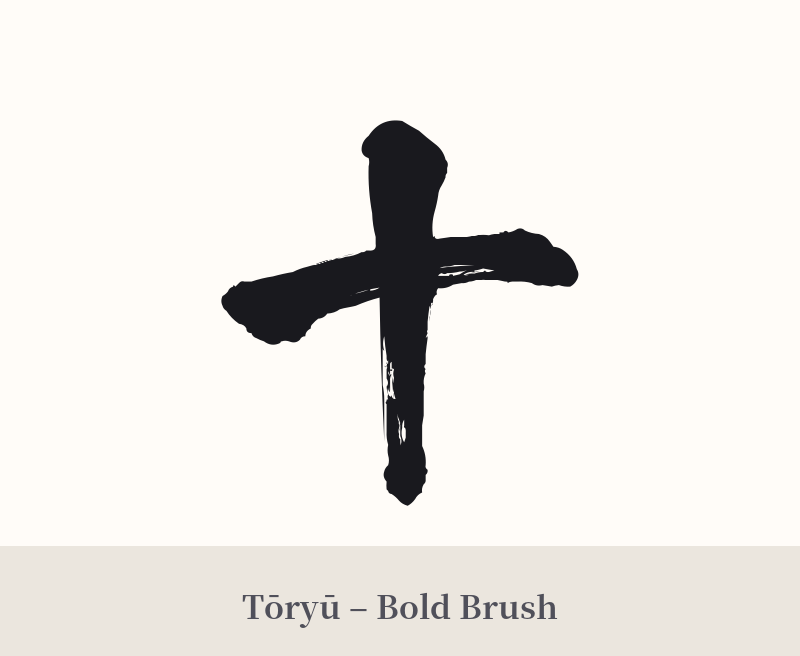
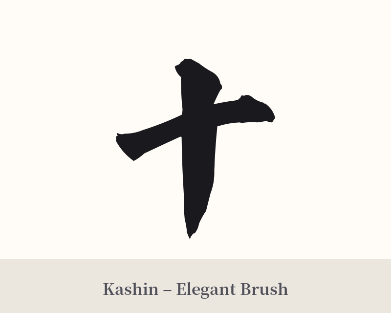
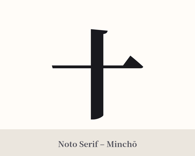
🖌️ Font Styles for 十
The same kanji can look dramatically different depending on the calligraphy style. Choose a font that matches the mood you want for your tattoo or design.
🎨 Tattoo Suitability
📐 Tattoo Design Guide
The simplicity of 十 makes the choice of style and placement critical for a successful tattoo design.
– Placement: Due to its small and symmetrical nature, 十 works well in discreet locations. Consider the wrist, behind the ear, on a finger, or the ankle. For a more prominent piece, it can serve as the central point of a larger geometric or abstract design.
– Font Style: Style is everything for this kanji. A standard, blocky font can look sterile, like a plus sign. To give it character, opt for a dynamic calligraphy style like Gyosho (semi-cursive) or Sosho (cursive). These styles introduce movement and personality, emphasizing its origin as a brush-drawn character.
– Visual Tips: To avoid it looking like a simple cross, consider artistic embellishments. You could have it brushed within an Enso (Zen circle) to amplify the theme of completeness. Adding a small, colored detail, like a red stamp (hanko) mark nearby or a dot of color at the intersection, can create a focal point and add a layer of visual interest.
Comments