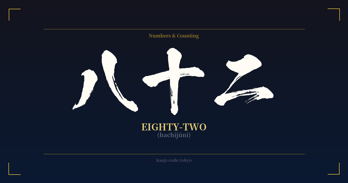
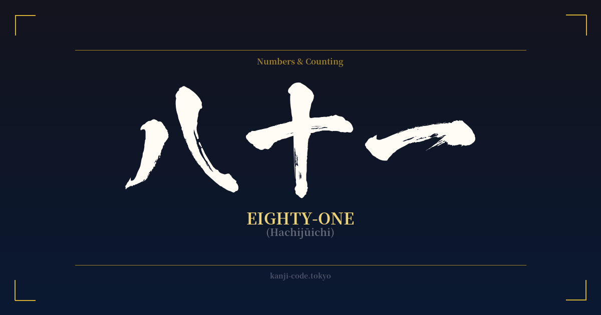
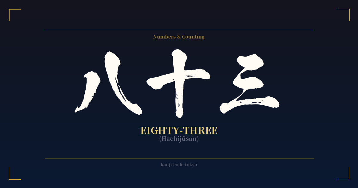
✍️ 八十二 (hachijūni) — Cultural Context
The Japanese word for eighty-two, 八十二 (hachijūni), is a straightforward and logical construction. It is composed of three fundamental kanji: 八 (hachi) for eight, 十 (jū) for ten, and 二 (ni) for two. The structure literally translates to 'eight-tens-two,' reflecting the mathematical logic embedded within the Japanese numbering system. This method of forming numbers is consistent across the language, making it elegant and easy to understand.
Unlike certain numbers in Japanese culture that carry heavy symbolic weight, such as four (四, shi), which is a homophone for death (死), or eight (八, hachi), often considered lucky due to its shape suggesting expansion, the number eighty-two itself holds no strong inherent superstition or universal meaning. It is a neutral number, a blank slate. This neutrality is both its biggest weakness and its greatest strength. It doesn't come with cultural baggage, allowing it to be purely a vessel for personal significance.
Someone might choose 八十二 to represent a birth year (like 1982), a cherished age, the number on an athlete's jersey, a significant address, or any other milestone tied to this specific value. In this sense, the meaning of a 八十二 tattoo is not found in ancient Japanese folklore or Zen philosophy, but in the individual's own life story. It becomes a deeply personal statement rather than a shared cultural symbol.
While Arabic numerals (82) are used for most everyday purposes in modern Japan, kanji numerals are still prevalent in traditional contexts. You will see them on formal certificates (like martial arts rankings), in traditional restaurant menus, in historical texts, and in vertical writing. Choosing the kanji form 八十二 over the number '82' for a design is an aesthetic choice that connects a personal number to the elegance and tradition of Japanese calligraphy, transforming a simple value into a piece of art.
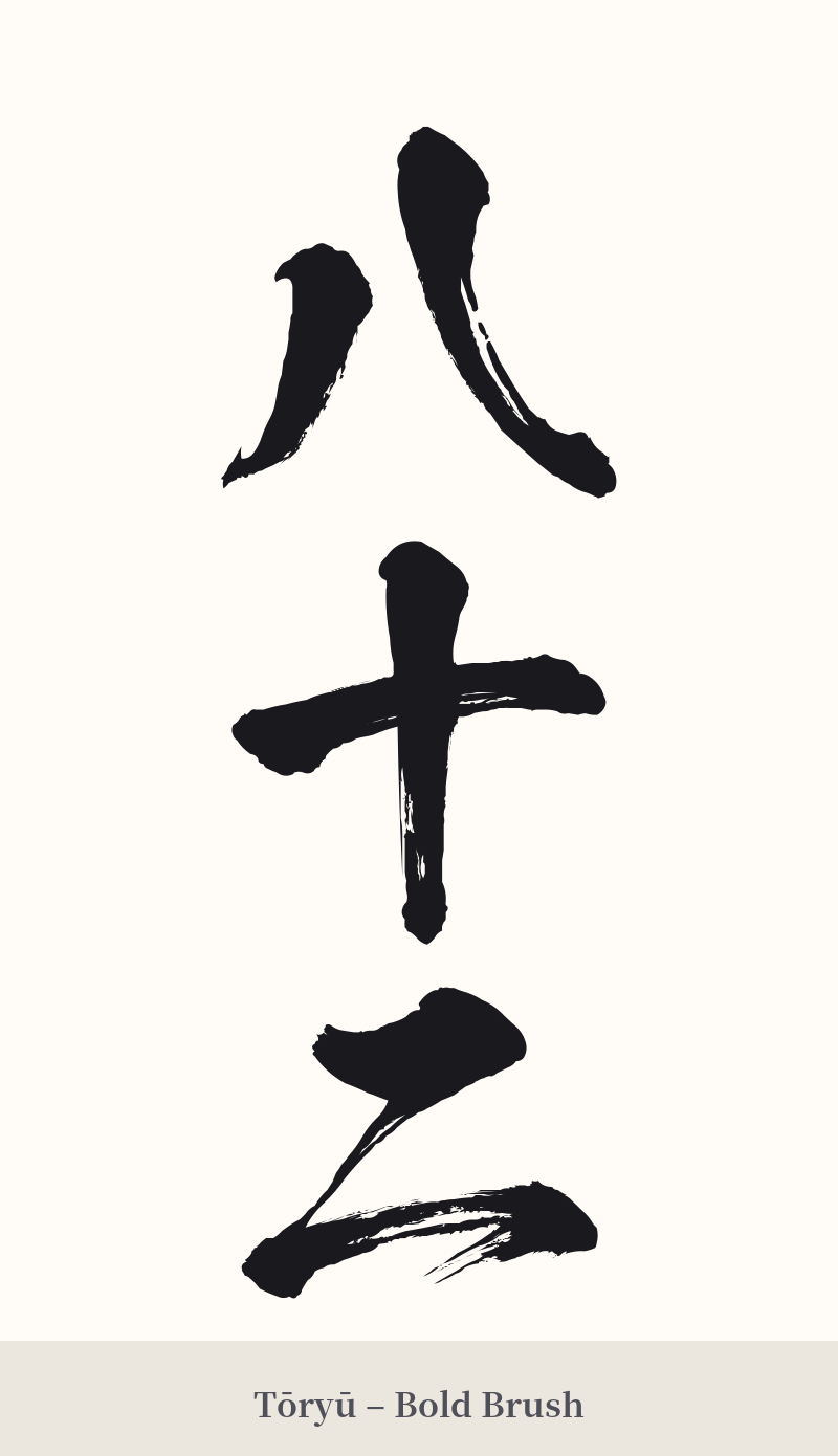
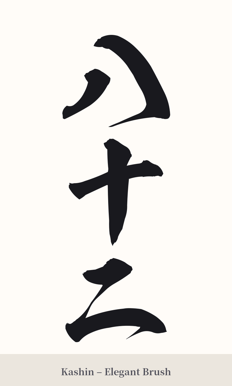
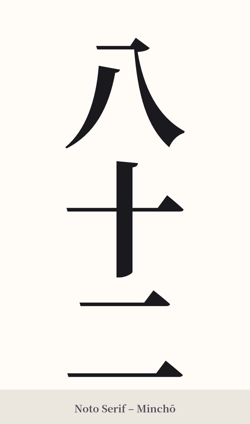
🖌️ Font Styles for 八十二
The same kanji can look dramatically different depending on the calligraphy style. Choose a font that matches the mood you want for your tattoo or design.
🎨 Tattoo Suitability
📐 Tattoo Design Guide
The beauty of 八十二 lies in its simplicity. The three characters are composed of only two strokes each, creating a clean, balanced, and minimalist aesthetic.
– Placement: A vertical orientation (八 on top, followed by 十, then 二) is the most traditional and visually appealing arrangement. This looks excellent along the spine, forearm, or ribs. A horizontal layout can work well across the chest or on the upper back.
– Style: For a modern, clean look, a crisp Mincho (serif) or Gothic (sans-serif) font is effective. To add a sense of history and artistry, consider a flowing cursive (Gyōsho) or semi-cursive (Sōsho) calligraphy style. This can inject life and movement into the very simple strokes.
– Visual Tips: Because the meaning is personal, you could consider incorporating a small, subtle element that hints at its significance. For example, if it represents a year, perhaps a tiny enso circle or a specific flower bud could be placed nearby. However, the three characters are strong enough to stand alone as a minimalist statement.
Comments