✍️ 露 (Tsuyu, Ro) — Cultural Context
The kanji 露 holds a dual identity that is deeply woven into the fabric of Japanese culture. At its most common, read as 'tsuyu', it means 'dew'. This isn't just water on grass; it's a powerful symbol of purity, freshness, and the quiet beauty of the early morning.
In Japanese art and literature, dew is intrinsically linked to the concept of 'mono no aware' (物の哀れ), the gentle sadness and awareness of the transient nature of all things. Dew appears in the cool morning, sparkles beautifully, and then vanishes with the first rays of sun. This fleeting existence serves as a poignant metaphor for the ephemeral nature of life, beauty, and youth. Countless haiku and waka poems have been written about 'tsuyu', capturing this delicate, melancholic beauty.
The character's structure itself tells a story. It is composed of the radical 雨 (ame) for 'rain' on top, and the character 路 (ro) for 'road' or 'path' below. This paints a vivid picture of moisture from the sky gathering on the ground, a 'rain on the path'.
However, the character has a second, equally important meaning when read as 'ro': 'to expose', 'to reveal', or 'to be open'. This is seen in words like 露天風呂 (rotenburo), an open-air bath, where one is exposed to the elements. It can also mean revealing something hidden, like the truth. For instance, the word 発露 (hatsuro) means the expression or manifestation of a feeling or idea.
This duality is what makes 露 so compelling. It is both the delicate, hiding dew and the act of bringing something into the open. This contrast between the hidden and the revealed, the natural and the declared, speaks to a core tension in aesthetics and philosophy. The word 露骨 (rokotsu), meaning 'blunt' or 'frank', perfectly illustrates this; it describes something that is so 'exposed' it lacks subtlety. Thus, 露 encapsulates both the beauty of what is temporary and the power of what is brought to light.
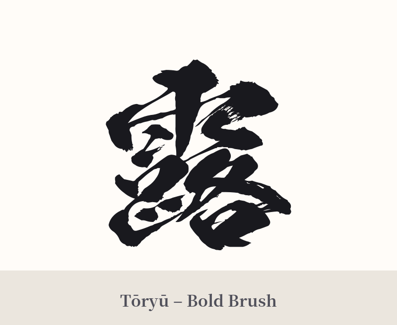
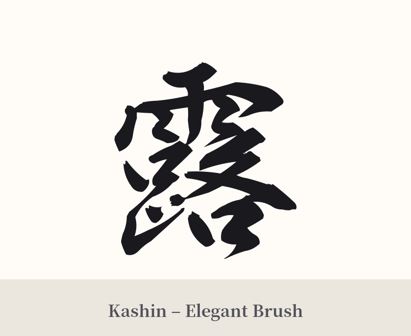
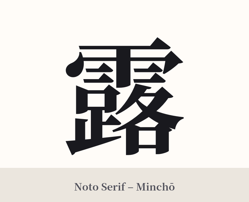
🖌️ Font Styles for 露
The same kanji can look dramatically different depending on the calligraphy style. Choose a font that matches the mood you want for your tattoo or design.
🎨 Tattoo Suitability
📐 Tattoo Design Guide
A tattoo of the kanji 露 requires thoughtful consideration due to its complexity and dual meanings.
– Placement: Choose a larger, flatter area to accommodate the 21 strokes. The forearm, calf, upper back, or shoulder blade are excellent choices. Avoid small or highly curved areas like the wrist or fingers, where the detail can blur over time.
– Style: A semi-cursive (gyōsho) or cursive (sōsho) calligraphy style is highly recommended. These fluid styles can beautifully render the complex strokes, echoing the feeling of water and dew. A standard block font (kaisho) can work, but it must be done with precision by a skilled artist to avoid looking like a dense black blob.
– Visual Reinforcement: To emphasize the 'dew' meaning and avoid ambiguity, consider incorporating related imagery. A design featuring 露 on a lotus leaf, a blade of grass, or a spiderweb with dewdrops can create a stunning and clear visual narrative. This helps guide the viewer to the poetic meaning rather than the more literal 'expose' meaning.
Comments