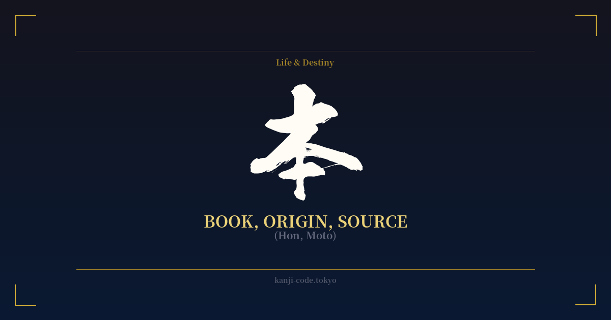
✍️ 本 (Hon, Moto) — Cultural Context
The kanji 本 (hon/moto) is one of the most fundamental and versatile characters in the Japanese language, embodying a fascinating duality of the mundane and the profound.
Its origin is beautifully simple and illustrative. The character is a pictograph derived from the kanji for tree, 木 (ki). A horizontal stroke was added at the bottom to indicate the tree's roots. From this visual, we get its primary, foundational meaning: 'moto' (もと), which translates to 'origin,' 'source,' 'root,' or 'foundation.' This concept of getting back to the essential source is a cornerstone of many Eastern philosophies.
This idea of 'origin' is powerfully displayed in the name for Japan itself: 日本 (Nihon or Nippon). Composed of the characters for 'sun' (日) and 'origin' (本), the name literally means 'the origin of the sun,' a poetic reference to Japan's location to the east of the Asian mainland.
So how did a character meaning 'origin' come to mean 'book' (hon)? The connection lies in the history of writing. Ancient records and knowledge were inscribed on wooden tablets or bamboo scrolls. These materials, the physical 'source' of information, became synonymous with the information they held. Thus, 'hon' evolved to mean 'book,' the vessel of knowledge.
This connection is why we see 本 in words like 基本 (kihon – foundation, basics), 本当 (hontō – true, real, from 'the real origin'), and 本質 (honshitsu – essence, true nature). In all these cases, the kanji points to something fundamental, authentic, and original.
However, this depth is contrasted with its very common, everyday uses. It functions as a prefix for 'this' or 'main,' as in 本日 (honjitsu – this day) or 本社 (honsha – main office). Perhaps most famously for language learners, it's the counter for long, cylindrical objects. One pencil is 'ippon,' two are 'nihon,' and three are 'sanbon.'
This wide range of uses, from the name of a country to a simple grammatical counter, makes 本 a perfect example of the layered nature of kanji. It represents the source of a river, the root of a tree, the essence of an idea, and the book on your shelf, all at once. It is a symbol of both the starting point and the knowledge we gather along the way.
🖌️ Font Styles for 本
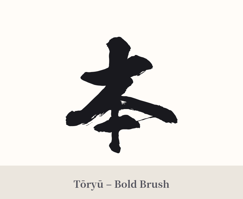
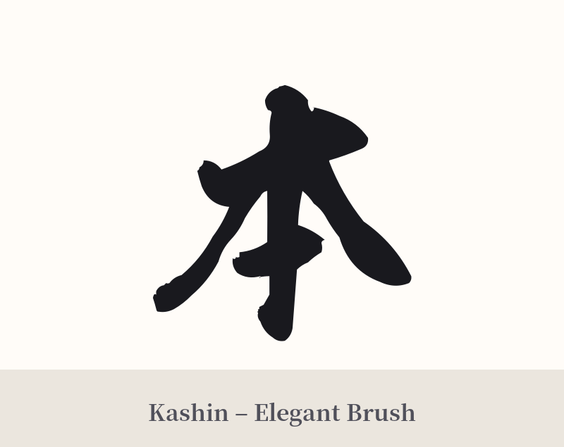
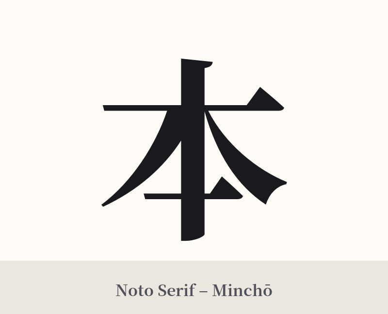
The same kanji can look dramatically different depending on the calligraphy style. Choose a font that matches the mood you want for your tattoo or design.
🎨 Tattoo Suitability
📐 Tattoo Design Guide
Due to its simplicity and potential for ambiguity, the design and placement of a 本 tattoo are crucial for conveying its intended meaning.
– Placement: This character works well in smaller, more discreet locations where its minimalist nature feels intentional. Consider the inner wrist, behind the ear, on the ankle, or along the collarbone. A large-scale version on a back or chest might look sparse or unfinished unless integrated into a larger piece.
– Font Style: A classic shodō (Japanese calligraphy) style is a fantastic choice. A swift, confident brushstroke can capture the kanji's energy and history. Alternatively, a clean, geometric, or minimalist sans-serif font can highlight its structural simplicity and modern appeal. Avoid overly ornate or complex styles that would contradict the character's fundamental nature.
– Visual Tips: To steer the meaning towards 'origin' or 'source' and away from 'book,' consider incorporating a subtle related element. A small enso circle behind the kanji can symbolize wholeness and the universe. Faint lines suggesting roots extending from the bottom stroke can visually reinforce the 'moto' meaning. Another option is a simple red circle (representing the sun) placed near it to evoke the 'Nihon' (Japan) connection.
Comments