✍️ 令和 (Reiwa) — Cultural Context
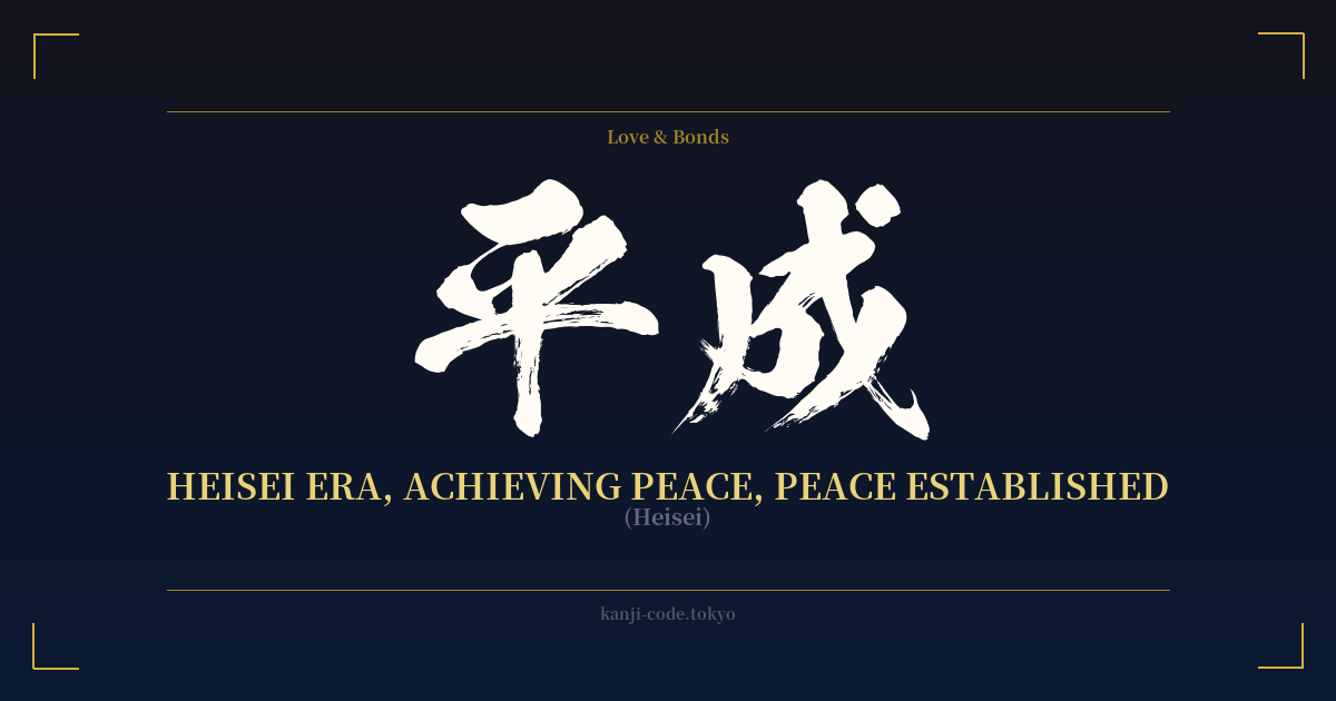
令和 (Reiwa) is a term that resonates with every person in modern Japan, as it is the name of the current imperial era that began on May 1, 2019. The accession of Emperor Naruhito marked the end of the Heisei (平成, 'Achieving Peace') era and the beginning of a new chapter for the nation, one defined by this hopeful and poetic name.
The selection of an era name, or 'gengō' (元号), is a momentous occasion in Japan, steeped in tradition and deliberation. For centuries, these names were chosen from classic Chinese literature. In a historic shift, Reiwa was the first era name to be sourced from a classic work of Japanese literature: the Man'yōshū (万葉集), the oldest existing anthology of Japanese poetry, compiled in the 8th century.
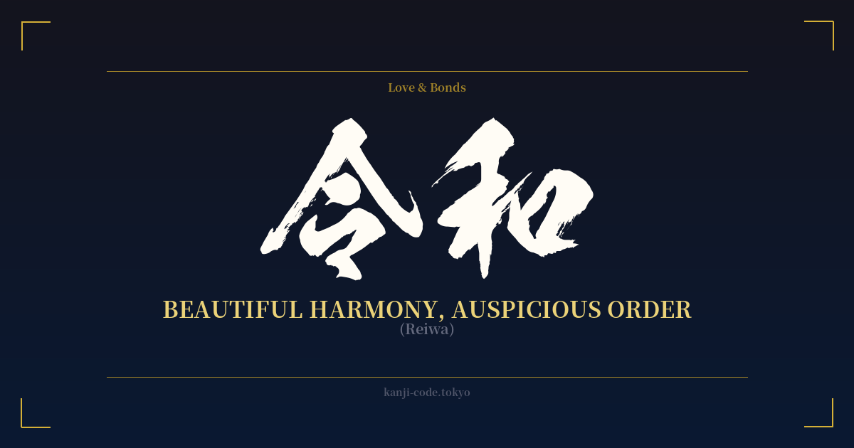
The characters were taken from a preface to a series of 32 poems about plum blossoms. The passage describes a beautiful early spring day where the 'gentle' (令月, reigetsu) breeze is 'soft' (和, yawaragi), and the plum blossoms are in full bloom. The government's official interpretation of Reiwa is 'culture will be born and nurtured as people's hearts are beautifully drawn together.' This broke from the initial, more literal English translation of 'Order and Harmony.'
The choice of 'Beautiful Harmony' was a deliberate message. It signaled a desire to move forward into a future where Japanese culture and unity flourish, inspired by the beauty of nature and the nation's own literary heritage. It was presented as a name for the people, reflecting a hope for a peaceful and prosperous time where each individual can blossom like the plum flowers after a cold winter.
Today, Reiwa is more than just a calendar marker. It has become a symbol of Japan's identity in the 21st century—a blend of deep respect for tradition and a forward-looking optimism. It represents a collective aspiration for a society that is both harmonious and culturally vibrant, a sentiment that resonates far beyond Japan's borders.
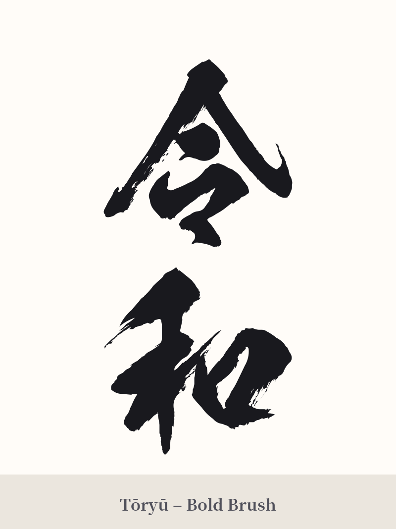
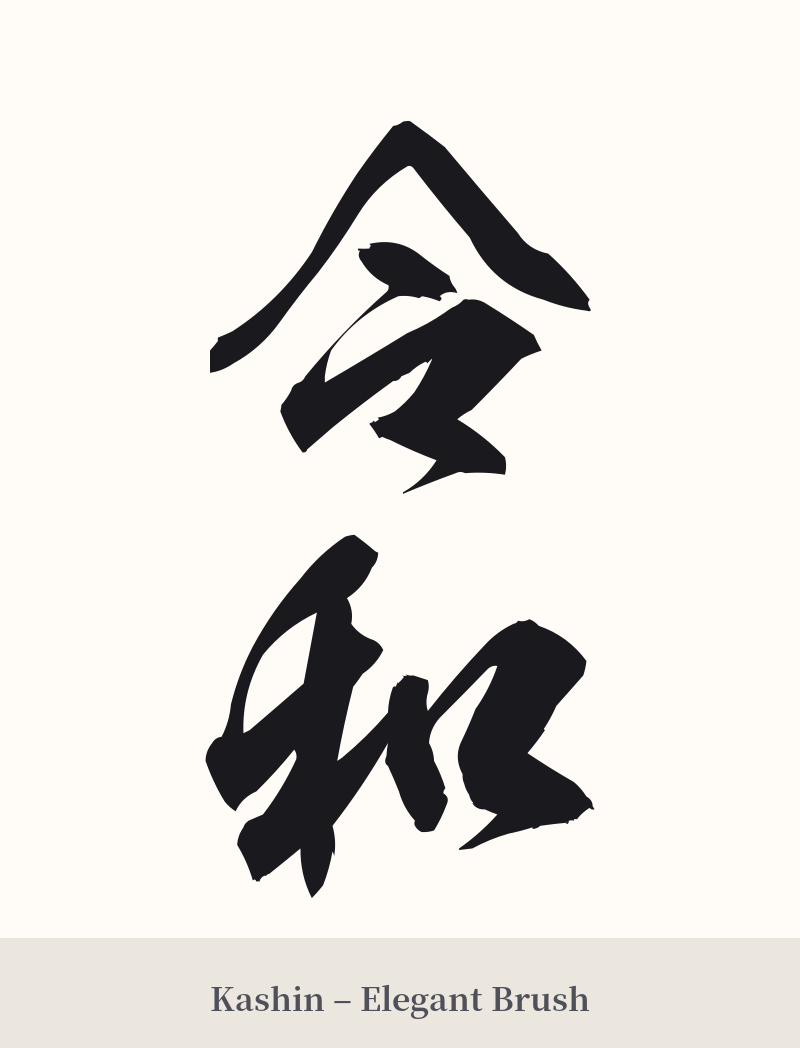
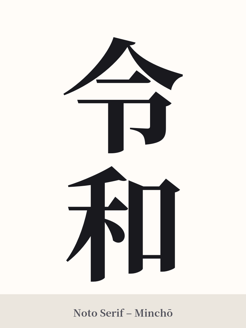
🖌️ Font Styles for 令和
The same kanji can look dramatically different depending on the calligraphy style. Choose a font that matches the mood you want for your tattoo or design.
🎨 Tattoo Suitability
📐 Tattoo Design Guide
The two characters of 令和 (Reiwa) offer a clean and balanced aesthetic that works well for a variety of tattoo designs.
– Placement: A vertical orientation is the most traditional and visually appealing for this two-character compound. It suits placements like the forearm, the back of the calf, or along the spine or ribs. A horizontal design can also work well on the chest, back of the neck, or inner bicep.
– Font Style: The font choice can dramatically alter the feel of the tattoo. A standard Kaisho (block) script gives it a modern, crisp, and official feel. For a more artistic and poetic touch, a flowing Gyosho (semi-cursive) script would beautifully echo its origins in classical poetry. Avoid overly complex or illegible fonts that could obscure the characters' simple elegance.
– Visual Elements: To enhance the meaning, consider incorporating imagery from its source poem. Adding plum blossoms (ume) is a very popular and fitting choice, symbolizing resilience, beauty, and the arrival of spring. A subtle watercolor background in soft pinks or purples can also evoke the gentle atmosphere described in the Man'yōshū.
Comments