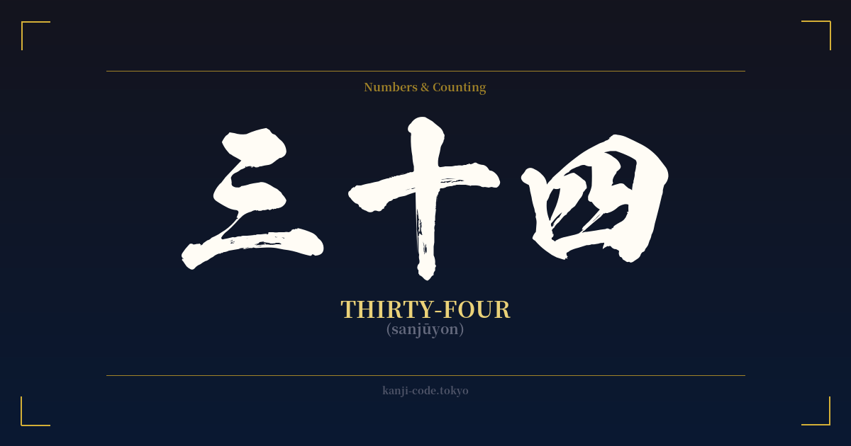
✍️ 三十四 (sanjūyon) — Cultural Context
The Japanese writing system for numbers is a model of logical construction, and 三十四 (sanjūyon) is a perfect example. Rather than having a unique word, it is built compositionally: 三 (san, three) followed by 十 (jū, ten) and 四 (yon, four). This structure translates literally to "three tens and four," or 30 + 4. This additive and multiplicative system was adopted from Chinese and provides a clear and scalable way to represent any number.
Each character within 三十四 has its own simple origin. The kanji 三 is a pictograph, representing the number three with three horizontal strokes—a direct and intuitive symbol used since ancient times. The character 十, a simple cross, represents ten and acts as the multiplier in this context. It's a foundational element for all numbers from ten upwards.
The most culturally significant character here is 四 (four). In Japan, as in many other East Asian cultures, there is a strong aversion to the number four known as tetraphobia. This is because one of its primary readings, 'shi,' is a direct homophone for the word for death (死). To circumvent this unlucky association, the native Japanese reading 'yon' is frequently used in its place, especially when counting or in compound numbers. The choice to read 三十四 as 'sanjūyon' instead of 'sanjūshi' is a direct reflection of this cultural practice.
Because of this, the number four is often skipped in hospital room numbers, hotel floors, and product sets. While thirty-four itself doesn't carry a strong independent meaning, the presence of 'four' tinges it with this cultural nuance. It’s not considered overtly unlucky in the same way the number four is in isolation, but the awareness is always there. In modern Japan, 三十四 is simply a number, used to denote age, a date, a chapter, or any other numerical value. Its significance is almost always purely contextual rather than symbolic.
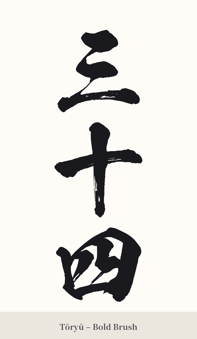
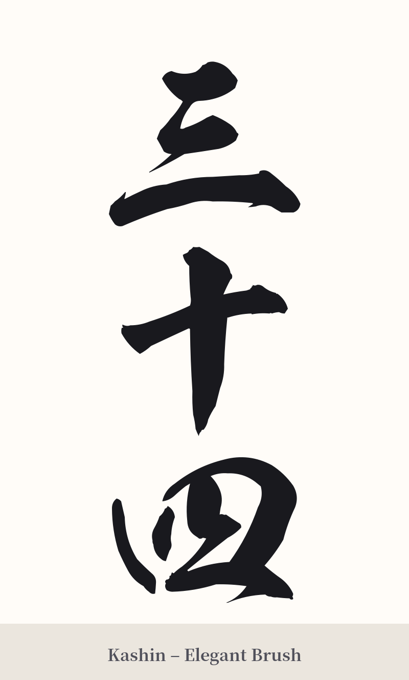
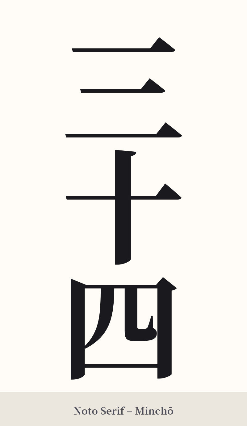
🖌️ Font Styles for 三十四
The same kanji can look dramatically different depending on the calligraphy style. Choose a font that matches the mood you want for your tattoo or design.
🎨 Tattoo Suitability
📐 Tattoo Design Guide
For a tattoo of 三十四, the design should emphasize its clean, structural nature. The characters are simple and lend themselves well to a variety of styles.
– Placement: A vertical arrangement (縦書き, tategaki) is the most traditional and visually balanced choice for Japanese text, especially numbers. This looks excellent along the spine, forearm, or the side of the calf. A horizontal layout is also possible and more modern, suitable for the chest or upper back.
– Font Style: The choice of font dramatically affects the vibe. A crisp, bold Kaisho (block script) will give it a strong, clear, and formal appearance. For a more artistic and fluid feel, a Gyōsho (semi-cursive) style can connect the characters slightly, adding a sense of movement. A Mincho style provides a classic, print-like elegance.
– Visual Tips: Pay attention to the spacing and balance between the three characters. When written vertically, they should appear as a single, cohesive unit. Because the meaning is so literal, it's generally best kept as a standalone piece unless the number relates to a larger visual theme you're incorporating, like a date on a memorial piece.
Comments