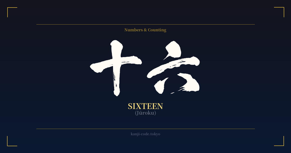
✍️ 十六 (Jūroku) — Cultural Context
The Japanese word for sixteen, 十六 (Jūroku), is a straightforward combination of the kanji for ten (十) and six (六). While it may seem like a simple numeral, the age of sixteen holds a distinct and transitional place in Japanese society, marking a pivot point between childhood and the responsibilities of adulthood.
In Japan, compulsory education concludes at age fifteen, with the completion of junior high school. Therefore, sixteen is the year when teenagers typically enter high school (高等学校, kōtō gakkō), a new and more specialized chapter of their academic lives. This step represents a greater degree of personal choice and a glimpse into future career paths, making it a significant milestone.
Furthermore, turning sixteen grants a new form of freedom: the ability to obtain a license for a moped or small motorcycle (under 50cc). In a country with superb public transportation, this might seem minor, but especially in more rural areas, it’s a powerful symbol of independence, mobility, and the first taste of adult-like autonomy.
Historically, the age of sixteen carried even more weight. During the samurai era, a young man's coming-of-age ceremony, the Genpuku (元服), often took place around this age. It was a formal rite of passage where he would receive his adult name and be recognized as a full member of the warrior class. This historical context imbues the age with a sense of stepping into one's designated role in society.
A more poetic layer of meaning is found in the term 十六夜 (Izayoi). This refers to the sixteenth night of the lunar month, the night just after the full moon. The Izayoi moon rises slightly later than the full moon, as if hesitating. This has become a classic theme in Japanese literature and art, symbolizing a beauty that is subtly imperfect, the melancholy of waiting, and a moment of quiet contemplation. This adds a layer of aesthetic depth to a number that might otherwise seem purely functional.
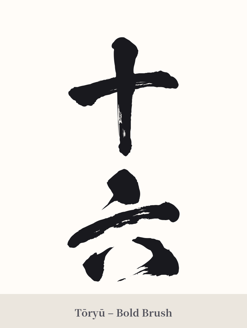
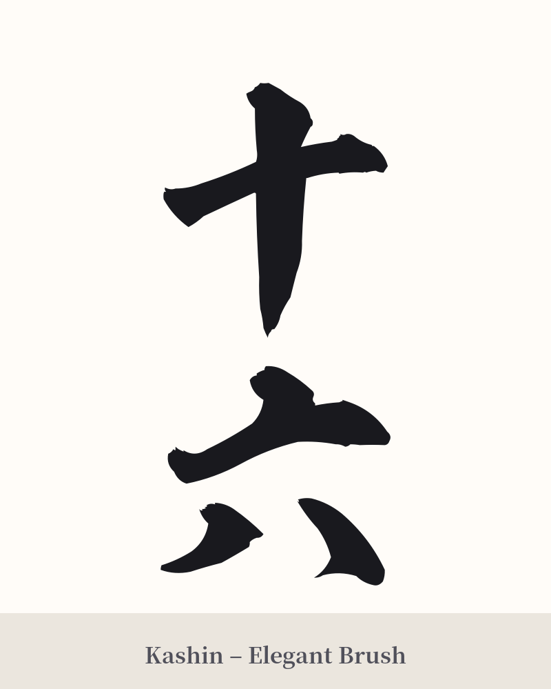
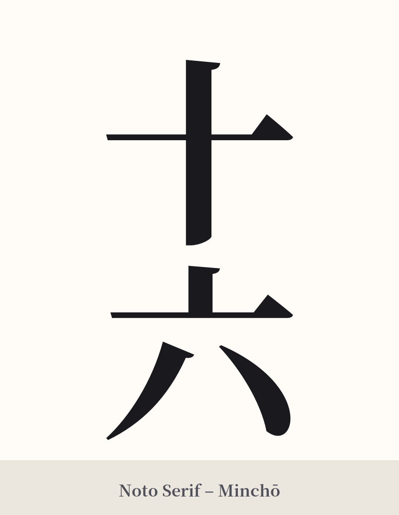
🖌️ Font Styles for 十六
The same kanji can look dramatically different depending on the calligraphy style. Choose a font that matches the mood you want for your tattoo or design.
🎨 Tattoo Suitability
📐 Tattoo Design Guide
The two-character structure of 十六 (Jūroku) lends itself well to classic kanji design principles. Its simplicity is both a strength and a challenge, requiring thoughtful execution to create an impactful tattoo.
– Placement: Due to its simple, compact nature, 十六 is well-suited for smaller, more discreet placements like the wrist, ankle, behind the ear, or along the collarbone. For a larger piece, consider incorporating it as part of a significant date or embedding it within a larger image that explains its personal meaning.
– Orientation: A vertical alignment is the most traditional and aesthetically pleasing for two-character kanji compounds. Placing 十 (jū) directly above 六 (roku) creates a balanced, elegant flow that follows the natural stroke direction of calligraphy.
– Font Style: The choice of font dramatically alters the mood. A bold, angular Kaisho (block script) will give it a strong, clear, and modern feel. For a more artistic and personal touch, a semi-cursive Gyosho or a fully cursive Sosho script can add dynamism and flow, making the simple characters feel more like a unique piece of art.
Comments