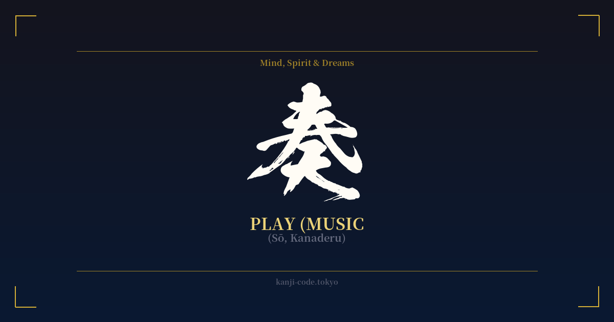
✍️ 奏 (Sō, Kanaderu) — Cultural Context
The kanji 奏 (sō) is a character steeped in artistry, reverence, and performance. While its simplest translation is 'to play an instrument,' its essence goes much deeper, capturing the formal and dedicated act of creating music.
The character’s origin story provides a beautiful insight into its meaning. It is a combination of pictographs: the top portion is said to represent two hands offering something, while the bottom character is 天 (ten), meaning 'heaven.' Together, they form the image of presenting or offering something to a divine or imperial authority. This historical root is still present in the word 奏上する (sōjō suru), which means 'to report to the emperor.'
This original sense of a formal offering directly informs its primary modern meaning, 奏でる (kanaderu), 'to play a musical instrument.' It isn't used for casual, playful strumming. Instead, it evokes the image of a musician performing with skill and focus, whether it's a pianist in a concert hall, a koto player in a traditional Japanese room, or an orchestra performing a symphony. The act of 'kanaderu' is an offering of music to an audience, a tribute to the art form itself.
This connection to performance is reinforced in many common Japanese words. 演奏 (ensō) means 'a musical performance,' 合奏 (gassō) refers to an 'ensemble' or 'orchestra,' and 協奏曲 (kyōsōkyoku) is a 'concerto.' In each case, 奏 provides the core concept of organized, skillful musical expression.
Beyond music, the kanji carries a feeling of harmony and successful execution. For example, the phrase 功を奏す (kō o sōsu) means 'to be successful' or 'to bear fruit,' implying that one's efforts have come together in a harmonious and effective result. This broadens the character's symbolism to represent the beautiful culmination of dedicated effort.
In essence, 奏 is not merely about action but about artistry. It represents the bridge between the human performer and the sublime experience of music, a disciplined and beautiful offering that creates harmony.
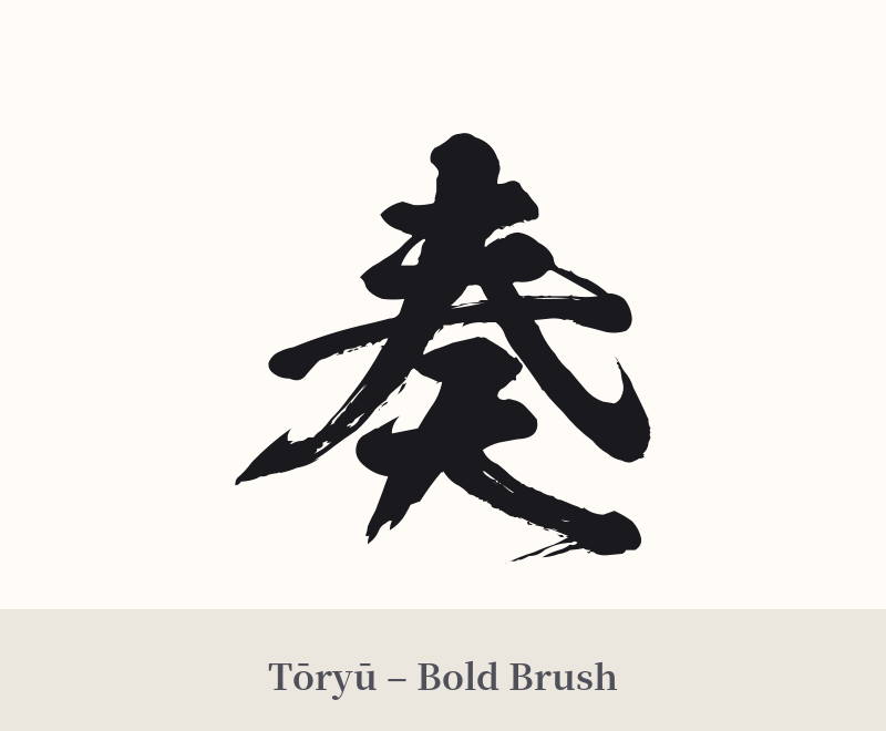
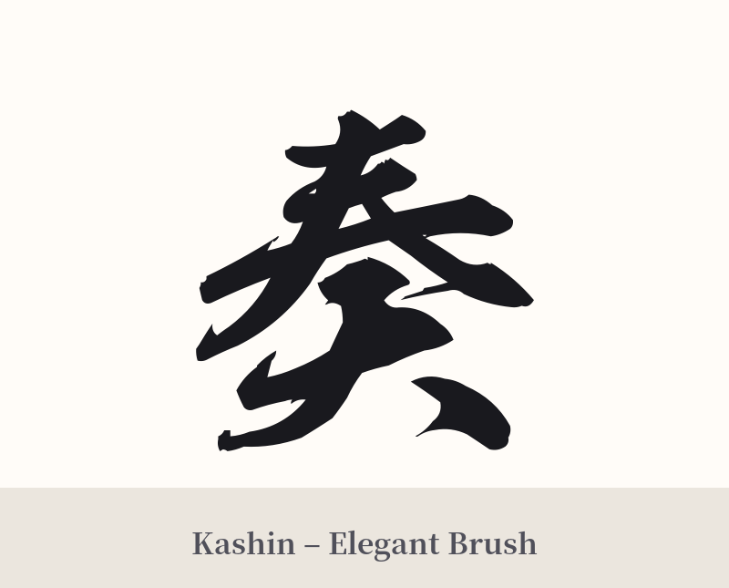
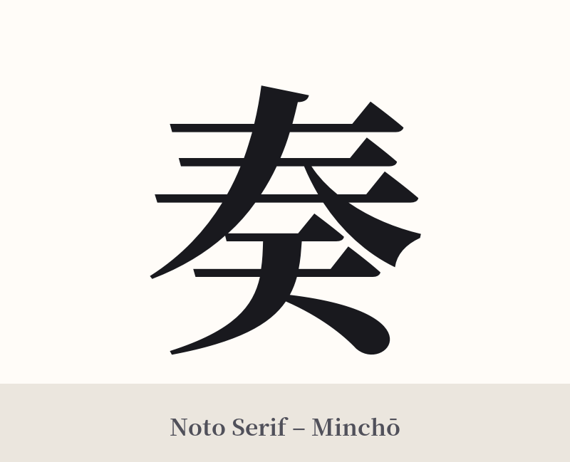
🖌️ Font Styles for 奏
The same kanji can look dramatically different depending on the calligraphy style. Choose a font that matches the mood you want for your tattoo or design.
🎨 Tattoo Suitability
📐 Tattoo Design Guide
The kanji 奏 offers a graceful and balanced aesthetic for a tattoo. Its structure is neither too simple nor too complex, making it versatile for various designs.
– Placement: This character works beautifully in vertical orientations. Consider the inner forearm, the back of the neck along the spine, or the ribs. For a smaller, more subtle piece, the wrist or behind the ear are excellent choices.
– Font Style: To emphasize the flowing, artistic nature of music, a semi-cursive (gyōsho) or cursive (sōsho) calligraphy style is highly recommended. These styles capture a sense of movement and elegance. For a more modern and crisp look, a clean Mincho (serif) font can provide a sharp, classic feel.
– Visual Tips: As a standalone character, 奏 is strong enough to not require additional elements. However, if you wish to add context, consider pairing it with subtle imagery like a single flowing musical note, a stylized soundwave, or a few falling cherry blossom petals to enhance its poetic quality without overwhelming the kanji itself.
Comments