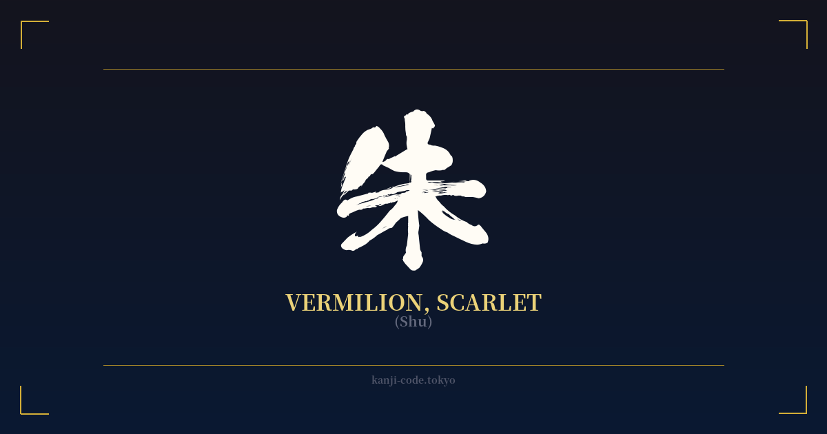
✍️ 朱 (Shu) — Cultural Context
The kanji 朱, read as 'Shu,' translates to vermilion or scarlet. But to call it just a color would be a profound understatement. In Japanese culture, 朱 is not merely a shade on the spectrum; it is a symbol imbued with centuries of spiritual significance, protective power, and sacred identity.
Its most iconic and visible application is on the torii gates that mark the entrance to Shinto shrines. These vibrant, red-orange gateways are a quintessential image of Japan. The choice of 朱 for torii is deliberate and deeply symbolic. The color is believed to be a powerful ward against malevolent forces and evil spirits, creating a purified space within the shrine grounds.
This protective quality is linked to the color of fire and the sun, both sources of life, energy, and purification in Shinto belief. The famous Fushimi Inari Shrine in Kyoto, with its thousands of vermilion torii forming tunnels up the mountainside, is a breathtaking testament to this tradition. Walking through them is considered a pilgrimage and an act of spiritual cleansing.
The influence of 朱 extends into Japanese Buddhism as well. Many temple buildings, pagodas, and statues are painted in this distinctive color. While one practical reason was the preservative quality of the mineral cinnabar (the source of the pigment), which helped protect wood from decay and insects, the spiritual symbolism was never lost. The color represents life force and vitality, creating a visual link between the earthly and the divine.
Beyond religious architecture, 朱 holds a place of honor in secular and artistic life. The red ink paste used for personal and official seals, known as 'shuiniku' (朱肉), uses this character and color. Stamping a document with a vermilion seal is an act of authentication and importance. Traditional Japanese lacquerware, or 'shunuri' (朱塗り), often features a brilliant vermilion finish, transforming everyday objects like bowls and boxes into works of art. This association with important documents and fine crafts lent the color an air of prestige and authority.
It's crucial to distinguish 朱 (Shu) from the more common character for red, 赤 (Aka). While 赤 is a general term for red, 朱 refers specifically to this luminous, slightly orange-tinted vermilion. It carries a weight and a sacredness that 'aka' does not. Choosing 朱 is to invoke a specific heritage—one of sacred gates, temple halls, and the very lifeblood of spiritual protection.
🖌️ Font Styles for 朱
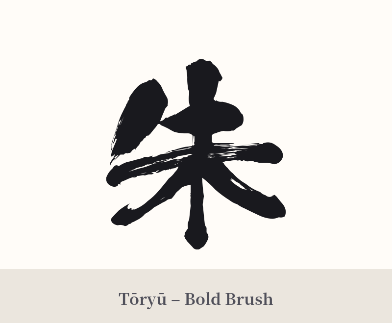
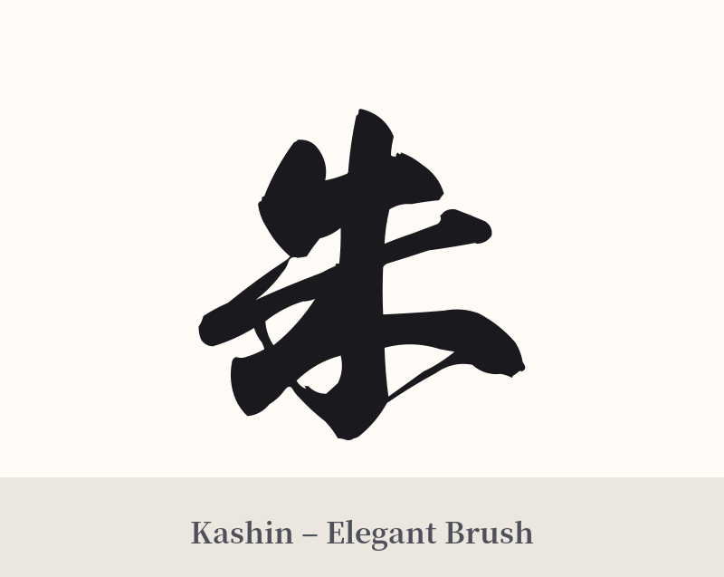
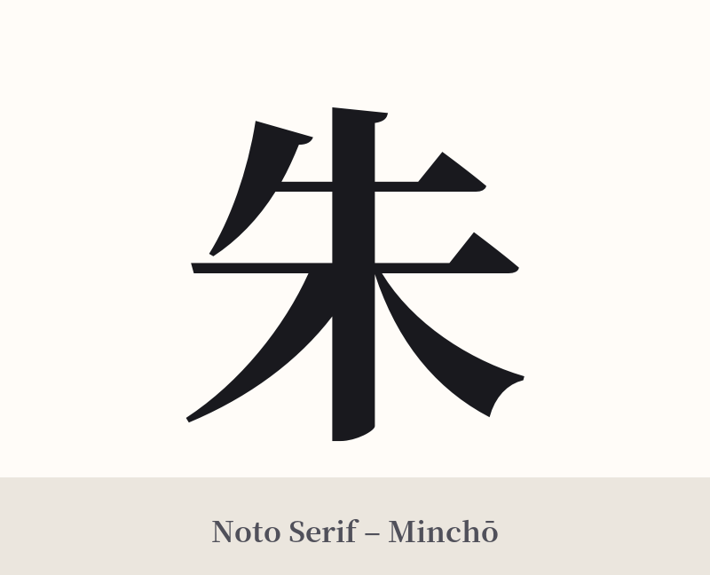
The same kanji can look dramatically different depending on the calligraphy style. Choose a font that matches the mood you want for your tattoo or design.
🎨 Tattoo Suitability
📐 Tattoo Design Guide
The kanji 朱 is both simple and profound, offering great flexibility in tattoo design.
– Placement: Its elegant, vertical structure works well on the forearm, wrist, ankle, or behind the ear for a smaller, subtle piece. For a more prominent statement, it looks striking centered on the back of the neck or along the spine.
– Style: A traditional 'shodō' (Japanese calligraphy) style is a natural fit, emphasizing the brush strokes and energy of the character. A bold, thick 'kaisho' (block script) style will highlight its architectural form. A minimalist design with clean, sharp lines can also be very effective.
– Visual Tips: Consider getting the tattoo in red ink to directly honor its meaning. Another powerful option is to have the character in black ink with a red watercolor splash or 'ensō' circle behind it to represent its vibrant energy.
Comments