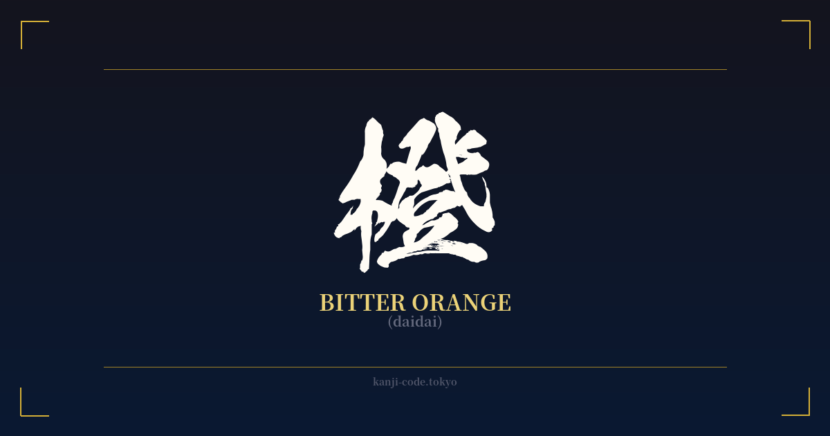
✍️ 橙 (daidai) — Cultural Context
The kanji 橙, read as 'daidai', refers to a specific type of Japanese citrus: the bitter orange. While it might seem like a simple character for a fruit, its cultural significance is deeply woven into one of Japan's most important traditions, the New Year celebration (Oshōgatsu).
The character itself is a combination of 木 (ki), meaning 'tree', on the left, and 登 (tō/noboru), meaning 'to ascend' or 'to present', on the right. This composition suggests a fruit from a tree that is presented as a ceremonial offering, hinting at its special status beyond just being a food source.
The true depth of 橙 lies in a clever play on words. The name of the fruit, 'daidai', is a homophone for the word 代々, also read 'daidai', which means 'from generation to generation'. This linguistic link has transformed the bitter orange into a powerful symbol of family continuity, prosperity, and longevity.
This symbolism is most famously displayed in the 'kagami mochi', a traditional New Year decoration. The kagami mochi consists of two round rice cakes stacked on top of each other, with a daidai placed on the very top. The stacked mochi represent the passing of the old year and the coming of the new, while the daidai crowning the structure symbolizes the continuation of the family line into the future, wishing for the family to prosper for generations to come.
Adding to this symbolism is the nature of the daidai tree itself. Unusually, the fruit can remain on the branches for several years. New fruits will grow on the same branch as fruits from previous seasons, creating a living illustration of multiple generations existing together. This natural phenomenon beautifully reinforces the meaning of 'daidai' (代々).
In modern Japanese, this kanji is also used to write 'daidai-iro' (橙色), the color orange. While the katakana word オレンジ (orenji) is now more common for both the sweet orange fruit and the color, 橙 retains its traditional, poetic, and ceremonial significance. It represents not just a color, but a deep-seated cultural wish for endurance and family heritage.
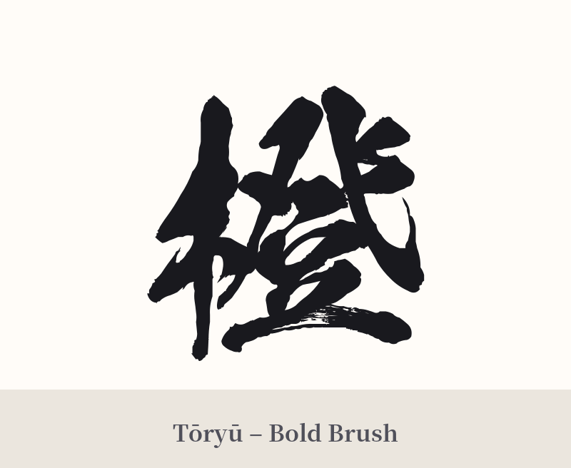
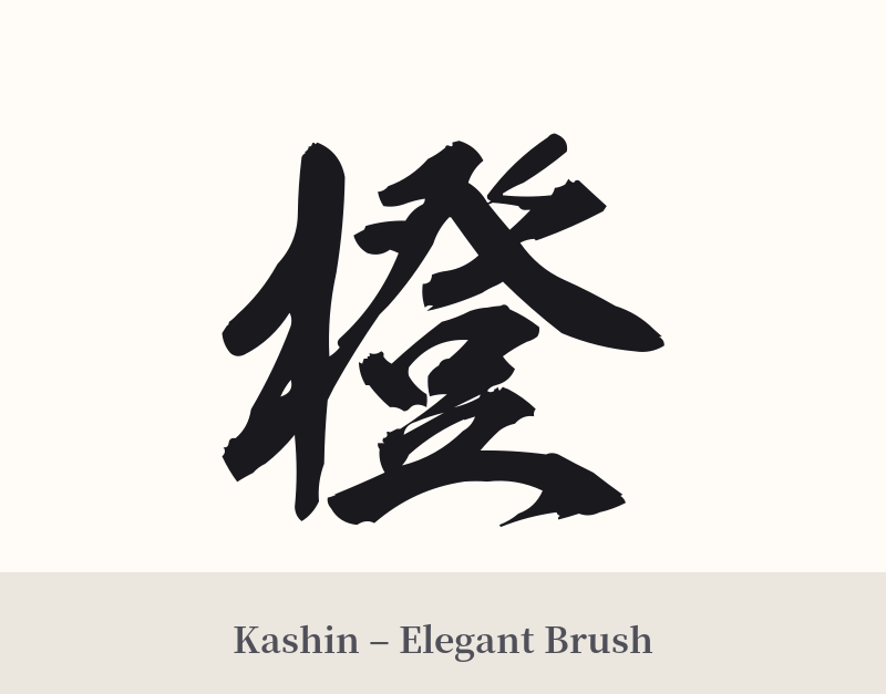
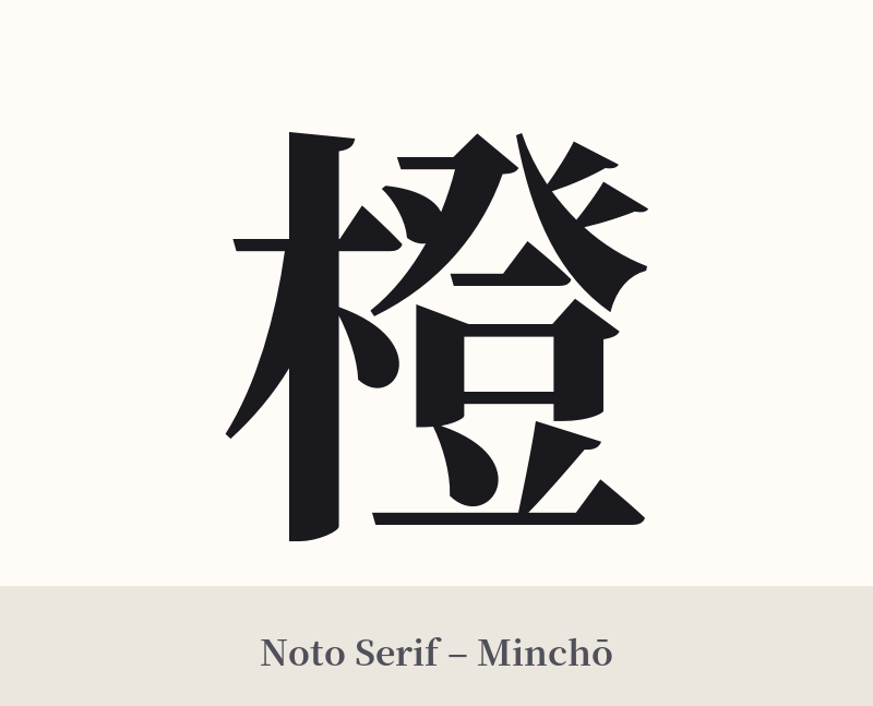
🖌️ Font Styles for 橙
The same kanji can look dramatically different depending on the calligraphy style. Choose a font that matches the mood you want for your tattoo or design.
🎨 Tattoo Suitability
📐 Tattoo Design Guide
For a tattoo of 橙, the design needs space to breathe due to its 16 strokes. Placing it on a flat, broad area allows the details to remain clear over time.
– Placement: The forearm, calf, back of the shoulder, or upper back are excellent choices. Avoid small or highly curved areas like the wrist or fingers, where the strokes could blur together.
– Font Style: A traditional Japanese calligraphy style works best. A clean, balanced Kaisho (block script) emphasizes its structure, while a slightly more fluid Gyosho (semi-cursive) can add a touch of elegance and movement. Avoid overly ornate or modern fonts that might compromise legibility.
– Visual Tips: To enhance its meaning, consider pairing 橙 with other symbolic elements. Placing it above an Enso (Zen circle) can underscore the theme of continuity. Alternatively, a subtle watercolor splash of orange behind the black kanji can add a visual pop without being too literal. Incorporating it into a larger design with a kagami mochi is also a powerful, though more complex, option.
Comments