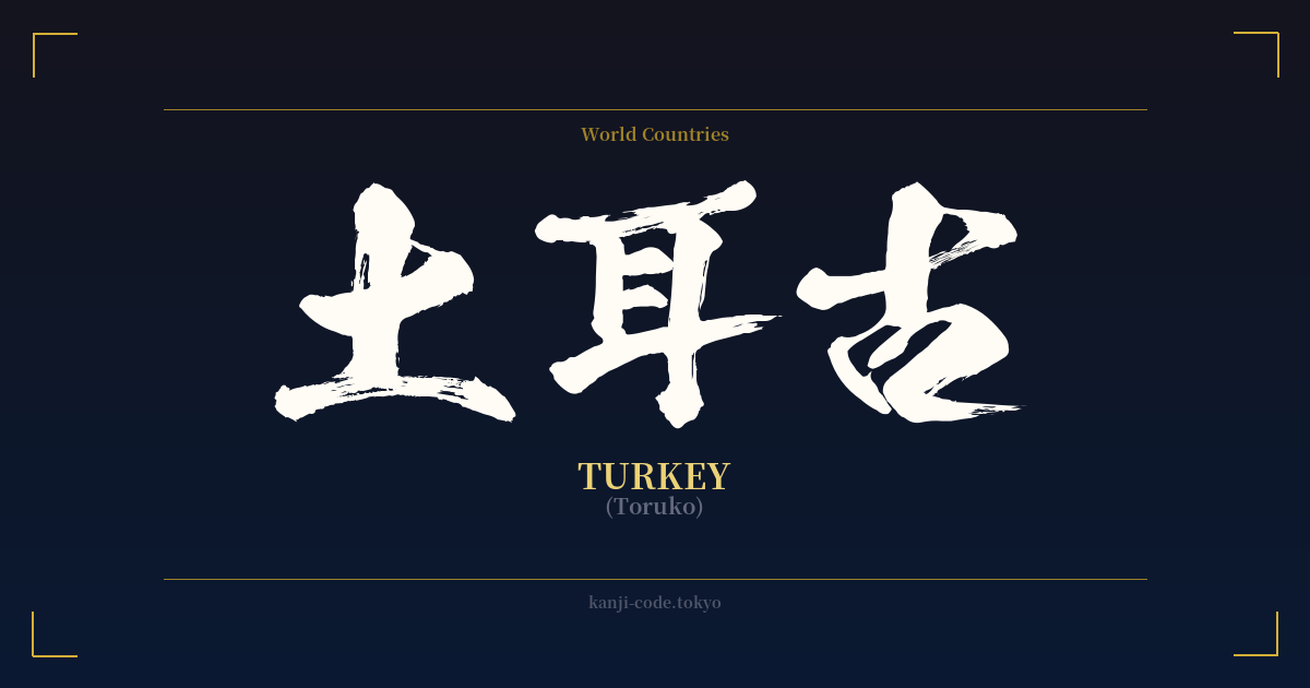
✍️ 土耳古 (Toruko) — Cultural Context
The word 土耳古 (Toruko) is a fascinating window into a specific period of Japanese history when the nation was rapidly absorbing foreign concepts and words. This is a prime example of 'ateji' (当て字), the practice of using kanji characters for their phonetic sounds rather than their meanings. When Japan opened up to the world during the Meiji Restoration in the late 19th century, it needed ways to write the names of other countries. The solution was often to find kanji that approximated the foreign pronunciation.
In this case, the name 'Turkey' was transliterated as 'To-ru-ko'. The characters were chosen to match these syllables: 土 (to), 耳 (ru), and 古 (ko). The literal meanings of these characters—'soil,' 'ear,' and 'old'—are completely irrelevant. They are simply phonetic building blocks. This was a common practice, and you can see it in the old names for many Western countries, such as 亜米利加 (A-me-ri-ka) for the United States or 仏蘭西 (Fu-ran-su) for France.
Over time, this practice fell out of favor for most foreign words. The Japanese developed the katakana syllabary specifically for this purpose, as it is a cleaner, more direct way to represent foreign sounds without the baggage of kanji meanings. Today, the country Turkey is universally written as トルコ (Toruko) in katakana. You will almost never see 土耳古 used in modern newspapers, television, or daily conversation.
So where does that leave 土耳古? It has been relegated to the realm of history and style. You might encounter it in historical novels, academic texts discussing Meiji-era diplomacy, or perhaps as a stylistic choice on a restaurant sign aiming for a retro, old-world feel. It carries a distinctly archaic and scholarly nuance. While the Turkish government officially requested its English name be changed to 'Türkiye' in 2022, the Japanese name 'Toruko' has remained unchanged in common parlance, though the kanji version feels even more distant from the modern reality.
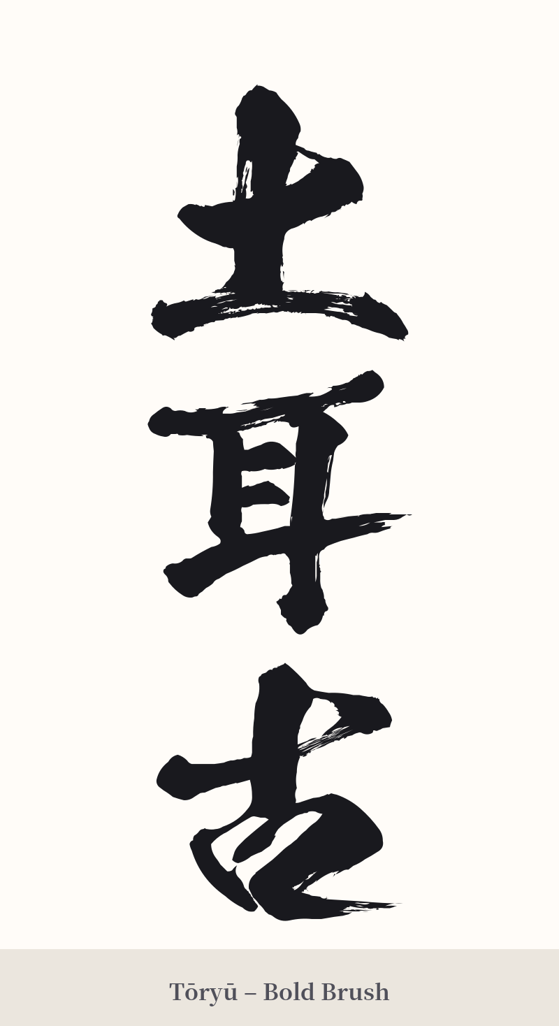
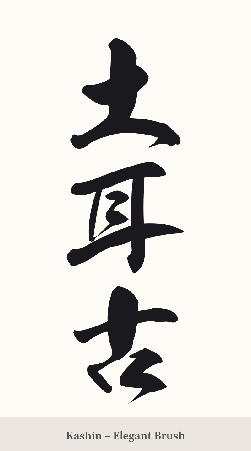
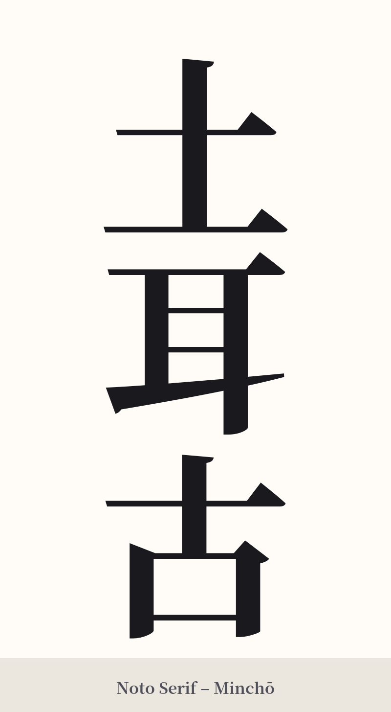
🖌️ Font Styles for 土耳古
The same kanji can look dramatically different depending on the calligraphy style. Choose a font that matches the mood you want for your tattoo or design.
🎨 Tattoo Suitability
📐 Tattoo Design Guide
Given the historical and multi-character nature of 土耳古, the design should honor its traditional roots.
– Placement: This word works exceptionally well in a vertical orientation, making it ideal for the forearm, the side of the calf, or along the spine. A horizontal placement across the collarbone or upper back could also be effective.
– Style: Lean into the archaic feel. A traditional calligraphy script like Kaisho (block style) or Gyosho (semi-cursive) would be most appropriate. These styles complement the historical context of the word. Avoid modern, geometric, or sans-serif fonts, as they would clash with the classic nature of the kanji.
– Visual Tips: Because the characters' meanings are unrelated to Turkey, consider incorporating a subtle visual element to provide context. A small, stylized tulip (a flower with deep roots in Turkish culture) or a crescent moon could be woven into the composition to bridge the visual and thematic gap.
Comments