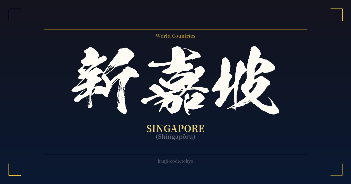
✍️ 新嘉坡 (Shingapōru) — Cultural Context
新嘉坡 (Shingapōru) is a prime example of a concept known as ateji, where kanji are used for their phonetic values to represent foreign words, rather than for their literal meanings. This practice was especially common in the Meiji era (1868-1912) as Japan rapidly modernized and needed ways to write the influx of foreign names and concepts.
The characters were chosen to phonetically approximate the sound of 'Singapore.' 新 provides the 'Shin' sound, 嘉 the 'ga' (originally 'ka'), and 坡 the 'po' (originally 'ha'). This method of transliteration was an art form in itself, as scholars and officials often tried to select kanji that also imparted a positive or fitting nuance to the place being named.
In this case, the selection is particularly artful. 新 means 'new,' 嘉 means 'auspicious' or 'praiseworthy,' and 坡 means 'slope' or 'hill.' Together, they create a secondary, poetic meaning: 'the new, auspicious slope.' This paints a picture of a promising and blessed place, a far more elegant solution than a simple phonetic transcription.
It is crucial to understand that the Japanese adoption of these characters is directly borrowed from the established Chinese name for Singapore, 新加坡 (pronounced Xīnjiāpō in Mandarin). This shared script allowed for a seamless and meaningful transfer of the name between the two cultures. In both languages, the characters serve the dual purpose of phonetic representation and semantic suggestion.
Today, the use of 新嘉坡 in Japan is rare and considered archaic or highly formal. The standard, everyday method for writing 'Singapore' is with the Katakana script: シンガポール (Shingapōru). Katakana is now used for almost all foreign loanwords and names, as it clearly signals the word's foreign origin. Seeing 新嘉坡 might occur in historical texts, on formal diplomatic documents, or as a deliberate stylistic choice in art or branding to evoke a sense of history, tradition, and pan-Asian heritage.
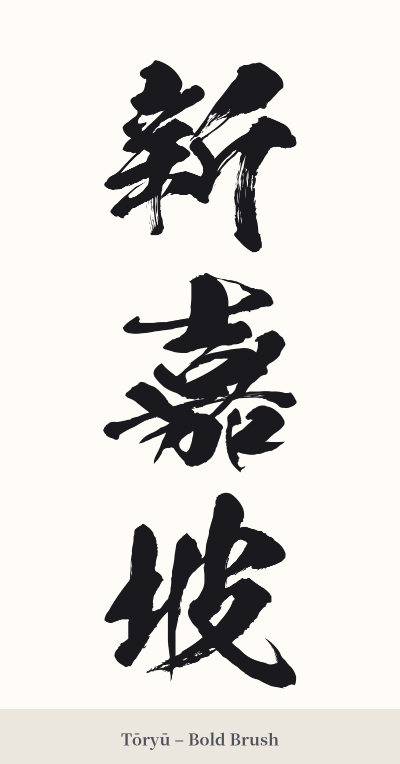
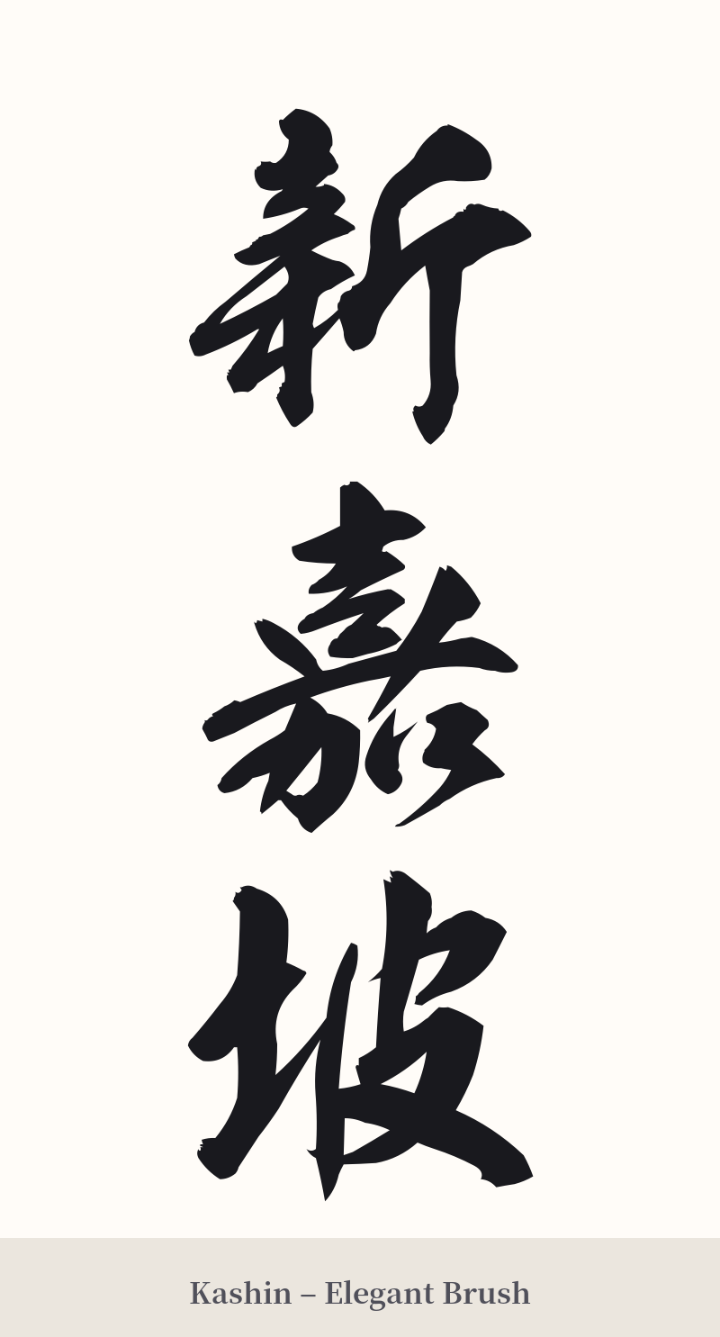
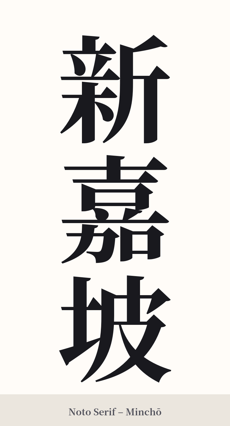
🖌️ Font Styles for 新嘉坡
The same kanji can look dramatically different depending on the calligraphy style. Choose a font that matches the mood you want for your tattoo or design.
🎨 Tattoo Suitability
📐 Tattoo Design Guide
For a tattoo of 新嘉坡, the design should honor its traditional and formal nature. A vertical orientation is strongly recommended, as this is the classic arrangement for multi-character kanji compounds. This layout looks particularly powerful along the spine, forearm, or calf.
Consider these font styles: – Kaisho (block script): This style offers excellent clarity and a bold, formal presence. Each stroke is distinct, which is important for the complex characters of 新 and 嘉. – Gyosho (semi-cursive script): For a more fluid and artistic feel, Gyosho connects the characters with flowing energy. It softens the hard edges of the block script while remaining legible and elegant. – Reisho (clerical script): This ancient, wider style can give the design a historical, almost seal-like quality, emphasizing its archaic roots.
Given the high stroke counts of the first two characters (13 and 14 strokes), the tattoo needs to be of a sufficient size. If it's too small, the intricate details will blur together over time. Work with your artist to ensure the design has room to breathe, preserving its legibility and beauty for years to come.
Comments