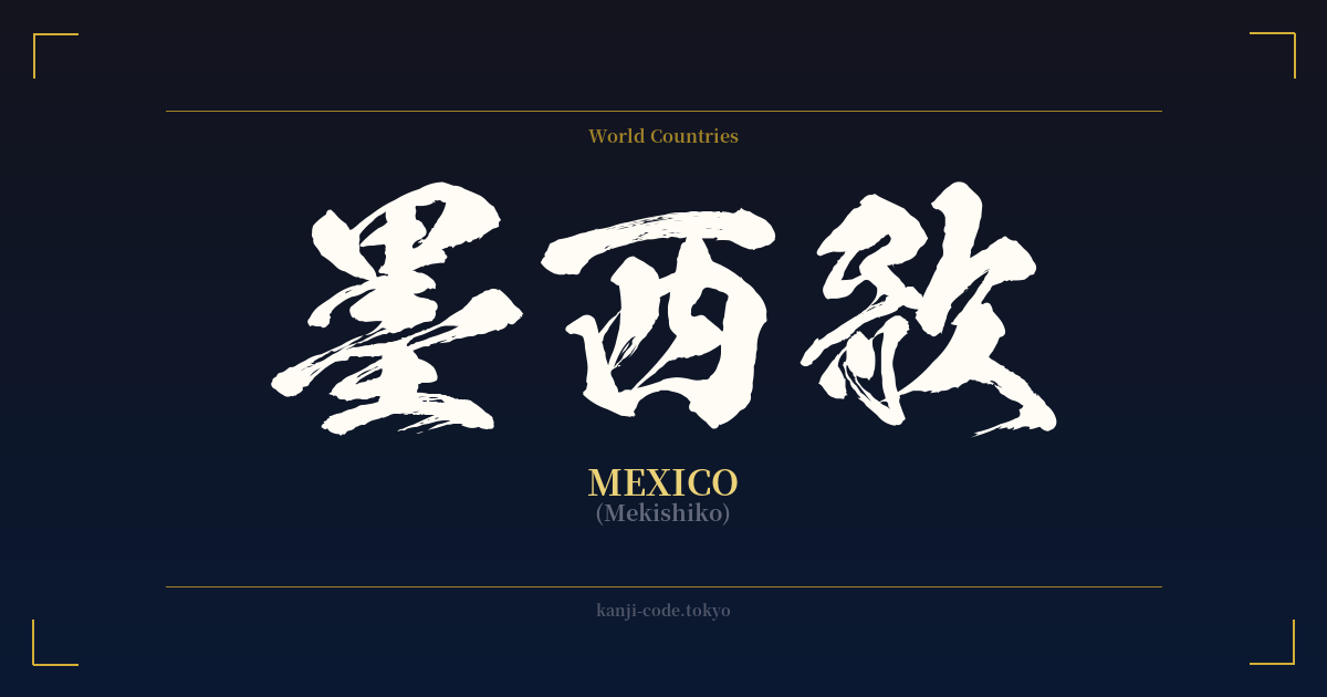
✍️ 墨西歌 (Mekishiko) — Cultural Context
The word 墨西歌 (Mekishiko) is a fascinating window into a specific period of Japanese linguistic history. It’s a prime example of ‘ateji’ (当て字), a practice where kanji are used for their phonetic value to represent a foreign word, with their literal meanings being secondary or entirely ignored.
This method was common during the Meiji Restoration (late 19th century) when Japan was rapidly absorbing Western culture, technology, and ideas. Before the katakana script was firmly established as the standard for foreign loanwords, ateji was the go-to solution for transcribing names of people, places, and concepts. Country names were a frequent subject of this linguistic creativity.
In the case of 墨西歌, the characters were chosen to approximate the sound of "Me-ki-shi-ko." The first character, 墨 (boku, moku, sumi), means 'ink.' Its sound was likely used to represent the 'Me' or 'Meki' syllable. The second character, 西 (sei, sai, nishi), means 'west' and was used for the 'shi' sound. The third character, 歌 (ka, uta), means 'song,' and its sound was used for the final 'ko' syllable.
This combination creates an accidentally beautiful and poetic literal reading: "Ink West Song." It evokes romantic images of dark, artistic expressions from a Western land. However, it's crucial to understand that this meaning is a complete coincidence. The Japanese scribes who created this term were focused solely on sound, not on creating a poetic phrase. The goal was phonetic representation, not semantic poetry.
Today, 墨西歌 is considered archaic and is almost never used in modern Japanese. You might encounter it in historical texts or as a piece of trivia, but for all practical purposes, the country of Mexico is written in katakana as メキシコ. This shift reflects the standardization of the Japanese writing system, which now clearly designates katakana for foreign terms, making them instantly recognizable and avoiding the confusion that ateji could sometimes cause.
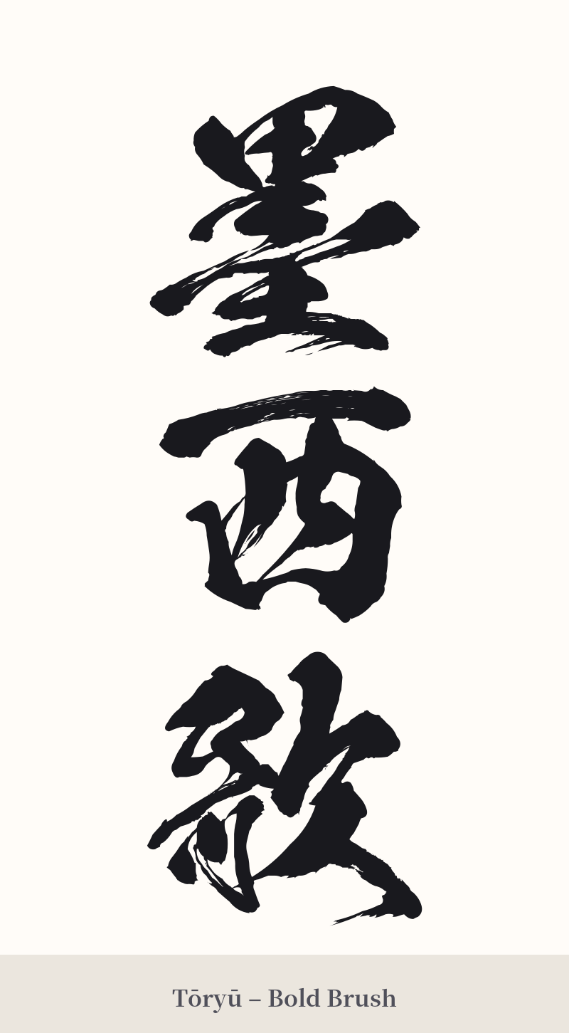
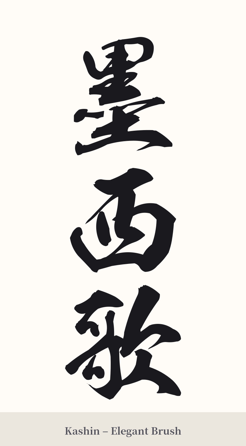
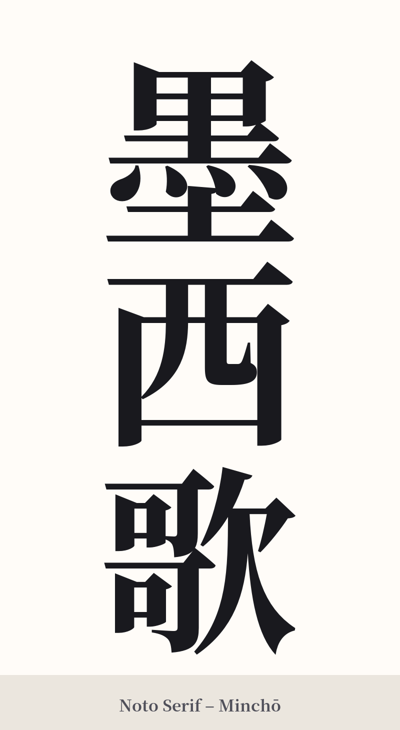
🖌️ Font Styles for 墨西歌
The same kanji can look dramatically different depending on the calligraphy style. Choose a font that matches the mood you want for your tattoo or design.
🎨 Tattoo Suitability
📐 Tattoo Design Guide
If you are drawn to the historical and phonetic nature of 墨西歌 for a tattoo, despite its low suitability, design choices can help convey its intended context.
– Placement: This three-character compound requires a larger canvas to be legible and appreciated. Consider a vertical placement along the forearm, calf, or spine. A horizontal layout on the chest or back could also work well.
– Style: A traditional calligraphy script like Kaisho (block script) or Gyosho (semi-cursive) would honor the 'ink' character (墨) and the historical origin of the word. This style connects it visually to the art of shodo (calligraphy).
– Visual Tips: To embrace the 'ateji' concept, you could incorporate subtle design elements that hint at Mexican culture alongside the kanji, such as patterns inspired by Aztec art or a stylized eagle. This provides context that the kanji alone lacks. Ensure the characters are well-spaced to prevent the more complex ones (墨 and 歌) from becoming illegible blots, especially as the tattoo ages.
Comments