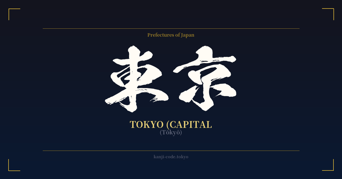
✍️ 東京 (Tōkyō) — Cultural Context
The name 東京 (Tōkyō) is more than just a label for Japan's bustling capital; it's a declaration of a pivotal moment in the nation's history. The two kanji characters, 東 (tō, meaning 'east') and 京 (kyō, meaning 'capital'), literally combine to mean 'Eastern Capital.' This name was chosen in 1868 at the dawn of the Meiji Restoration, a period of rapid modernization and political change.
Before it was known as Tokyo, the city was called Edo (江戸), which translates to 'bay-entrance' or 'estuary.' For over 250 years, Edo was the seat of power for the Tokugawa shogunate, the military government that ruled Japan. While the Emperor resided in the official imperial capital of Kyoto (京都, the 'Capital City'), real political power was centered in Edo. The city grew from a small fishing village into one of the largest cities in the world.
The Meiji Restoration marked the end of the shogunate and the return of political power to the Emperor. Emperor Meiji moved his court from Kyoto to Edo, signifying a monumental shift. To reflect this change and establish the city as the new heart of the nation, its name was changed to Tokyo, the 'Eastern Capital,' in direct contrast to Kyoto, which could now be seen as the former, or western, capital.
Today, the word 東京 evokes a powerful image of a hyper-modern metropolis where towering skyscrapers and neon lights coexist with ancient temples and serene gardens. It represents the fusion of cutting-edge technology and deep-rooted tradition, a global hub for finance, fashion, and pop culture. The name itself is a symbol of Japan's ability to innovate and transform while honoring its past. It stands for ambition, resilience, and the relentless forward momentum of modern Japan.
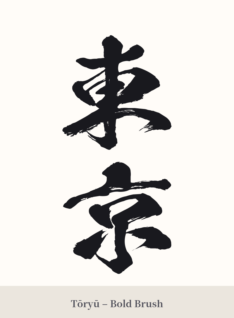
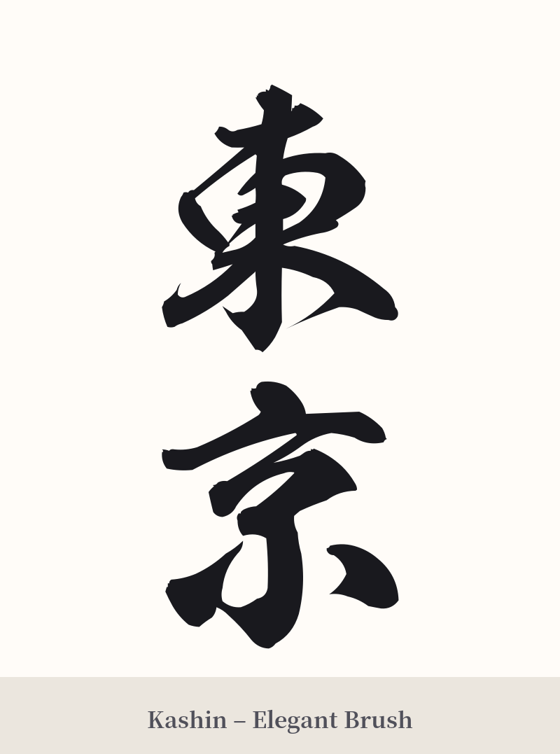
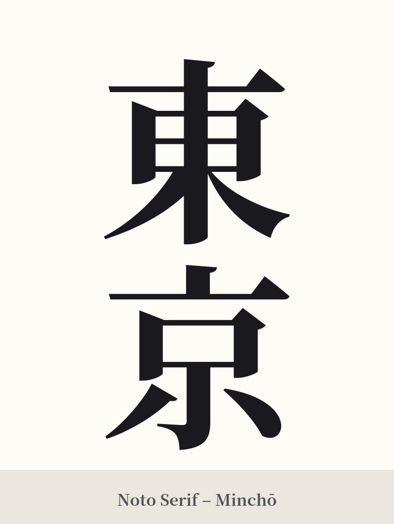
🖌️ Font Styles for 東京
The same kanji can look dramatically different depending on the calligraphy style. Choose a font that matches the mood you want for your tattoo or design.
🎨 Tattoo Suitability
📐 Tattoo Design Guide
The kanji for Tokyo, 東京, is iconic and offers great versatility in tattoo design. Its balanced structure works well in various placements and styles.
– Placement: A vertical orientation is classic and looks excellent along the spine, forearm, or calf. For a horizontal design, the back of the neck, chest, or inner bicep are strong choices.
– Font Style: To capture the city's modern, urban energy, consider a bold, angular font like a blocky Kaisho (block script) or a clean Mincho style. For a more traditional or artistic feel, a flowing Gyosho (semi-cursive) or a dynamic Sosho (cursive) script can add a sense of history and elegance.
– Visual Elements: Consider pairing the kanji with imagery associated with the city. This could include a silhouette of the Tokyo skyline, the red circle of the Japanese flag (Hinomaru), a branch of cherry blossoms (sakura), or even a subtle wave pattern reminiscent of its origins as Edo, the 'bay-entrance.'
Comments