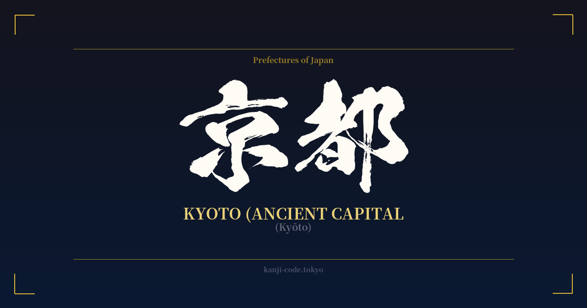
✍️ 京都 (Kyōto) — Cultural Context
The name 京都 (Kyōto) is more than just a pin on a map; it's a symbol of Japan's soul. For over a thousand years, from 794 to 1868, it served as the imperial capital, the residence of the Emperor, and the vibrant heart of Japanese culture, religion, and politics. The two kanji that form its name, 京 (kyō) and 都 (to), both mean 'capital,' a redundancy that powerfully underscores its supreme status.
Originally named Heian-kyō (平安京), 'The Capital of Peace and Tranquility,' the city was laid out in a grid pattern modeled after the ancient Chinese capital of Chang'an. This meticulously planned city became the stage for the flourishing of classical Japanese high culture. It was here that Murasaki Shikibu penned The Tale of Genji, the world's first novel, and where the refined aesthetics of the imperial court gave rise to arts like the tea ceremony (sadō), flower arranging (ikebana), and Noh theater.
When the seat of political power moved to Edo, which was renamed Tōkyō (東京), or the 'Eastern Capital,' in 1868, Kyoto could have faded into obscurity. Instead, it transitioned into its modern role as the nation's cultural custodian. While Tokyo raced into modernity, Kyoto preserved the archipelago's artistic and spiritual traditions. It became a living museum, its streets lined with traditional wooden machiya townhouses, its hillsides dotted with over 2,000 temples and shrines.
Today, invoking the name 'Kyoto' conjures images of vermilion torii gates at Fushimi Inari, the golden reflection of Kinkaku-ji temple, the serene rock gardens of Ryōan-ji, and the elusive grace of geishas in the Gion district. It represents a deliberate pace of life, a deep connection to the seasons, and the quiet pursuit of perfection. To choose the kanji for Kyoto is to embrace a concept of elegance, history, and the enduring power of Japanese tradition.
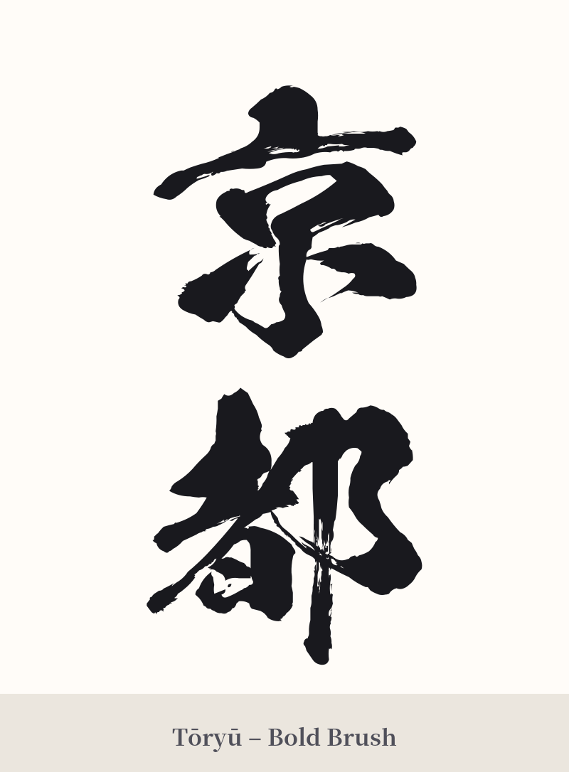
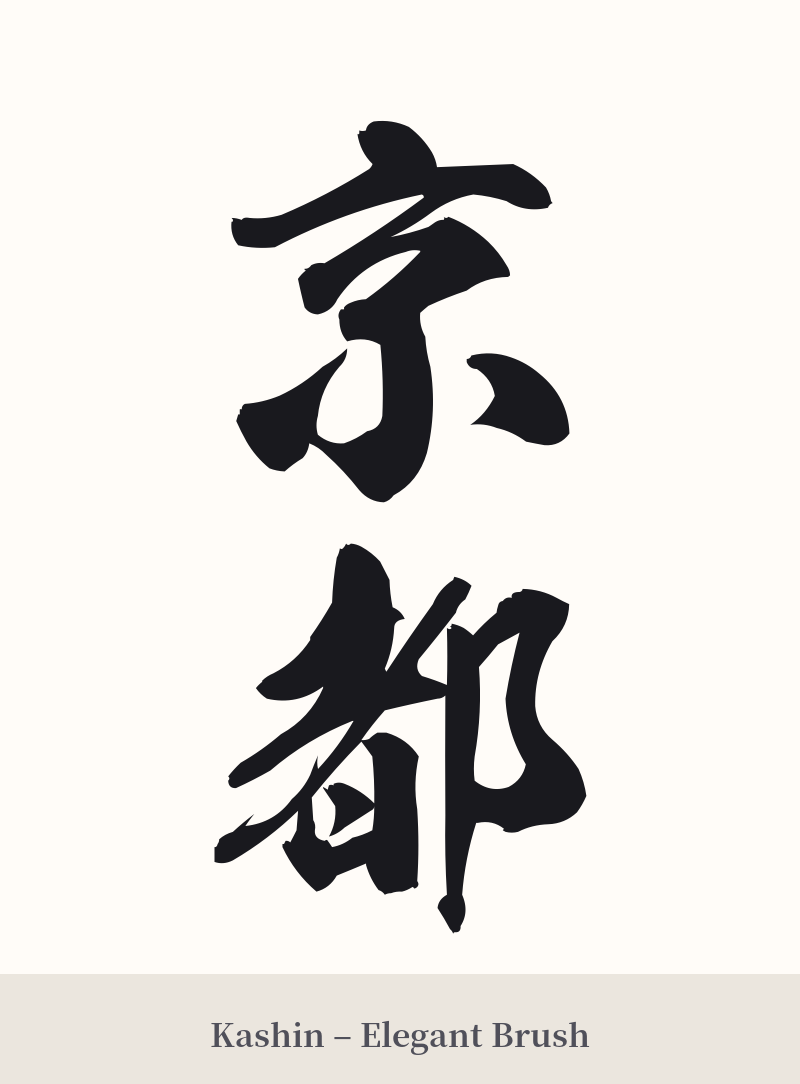
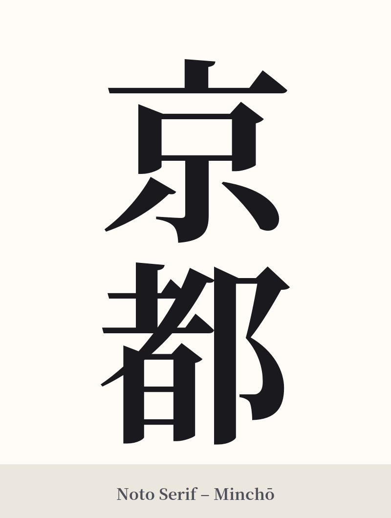
🖌️ Font Styles for 京都
The same kanji can look dramatically different depending on the calligraphy style. Choose a font that matches the mood you want for your tattoo or design.
🎨 Tattoo Suitability
📐 Tattoo Design Guide
The kanji for Kyoto lends itself to designs that are both elegant and steeped in meaning. Its classic form is a statement in itself.
– Placement: A vertical orientation is highly recommended as it echoes traditional Japanese calligraphy. This looks particularly striking along the forearm, the calf, or down the spine. A horizontal placement can also work well across the chest, upper back, or below the collarbone.
– Font Styles: Consider a classic script to honor the city's heritage. Kaisho (block script) provides a formal, architectural feel that mirrors the city's ancient grid layout. For a more fluid and artistic touch, Gyosho (semi-cursive script) captures the grace and natural beauty found in Kyoto's gardens and art forms.
– Visual Tips: While the characters are powerful enough to stand alone, they can be paired with subtle, related imagery. Consider incorporating a single red maple leaf (momiji), a few cherry blossom petals (sakura), or the silhouette of a five-storied pagoda. The goal should be to complement the kanji, not overpower it.
Comments