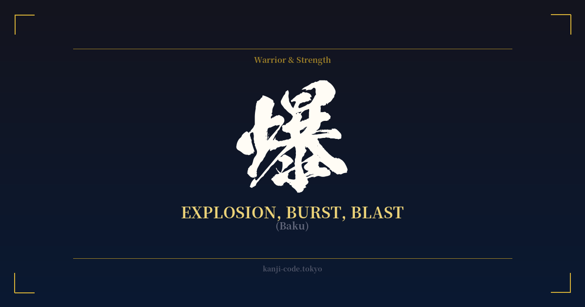
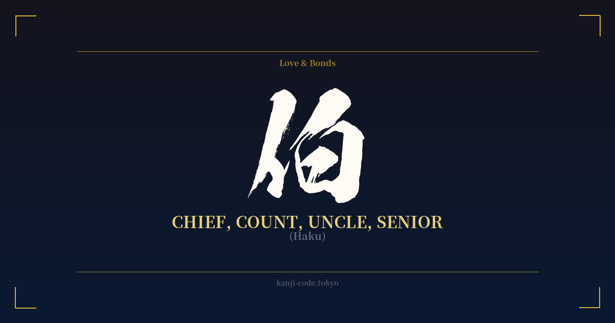
✍️ 爆 (Baku) — Cultural Context
The kanji 爆 (Baku) is a powerful and visually evocative character, immediately conjuring images of a sudden and violent release of energy. Its composition tells a clear story: the left-side radical, 火 (hi), means 'fire,' while the right-side component, 暴 (bō), means 'violent' or 'sudden.' Together, they create an unambiguous symbol for an explosion, a blast, or a burst.
In its most literal sense, 爆 is used in words related to explosives and destruction. The word for bomb is 爆弾 (bakudan), and a volcanic eruption can be described as a 爆発 (bakuhatsu). This direct association with destructive force gives the kanji an intense, aggressive, and somewhat dangerous aura. It’s the raw, untamed power of combustion and detonation captured in a single ideogram.
However, Japanese culture, particularly in the modern era, has embraced the metaphorical power of 爆. It has become a popular prefix to describe anything that happens with sudden, overwhelming intensity. In pop culture, especially manga and anime, 爆 is a common onomatopoeic element used in action scenes to denote a massive impact or explosion, often drawn with dynamic, bursting lines. The character Katsuki Bakugo from 'My Hero Academia' is a perfect embodiment of this, with a name and personality centered on explosions.
This metaphorical usage extends into everyday language. The term 爆笑 (bakushō) literally means 'exploding laughter' and describes an uncontrollable burst of hilarity. If you've ever slept so deeply you felt like you were knocked unconscious, you experienced 爆睡 (bakusui), or 'explosion sleep.' In the 2010s, the word 爆買い (bakugai), or 'explosive shopping,' was coined to describe the massive shopping sprees of tourists in Japan. These uses soften the kanji's violent edge, reframing it as a symbol of overwhelming, all-consuming experience, whether it's joy, commerce, or sheer exhaustion.
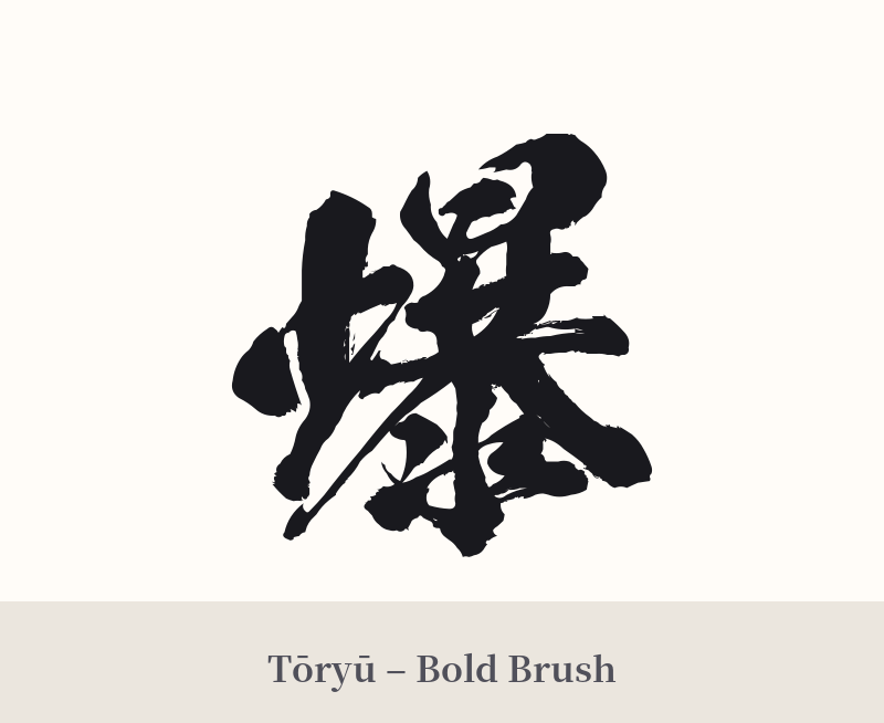
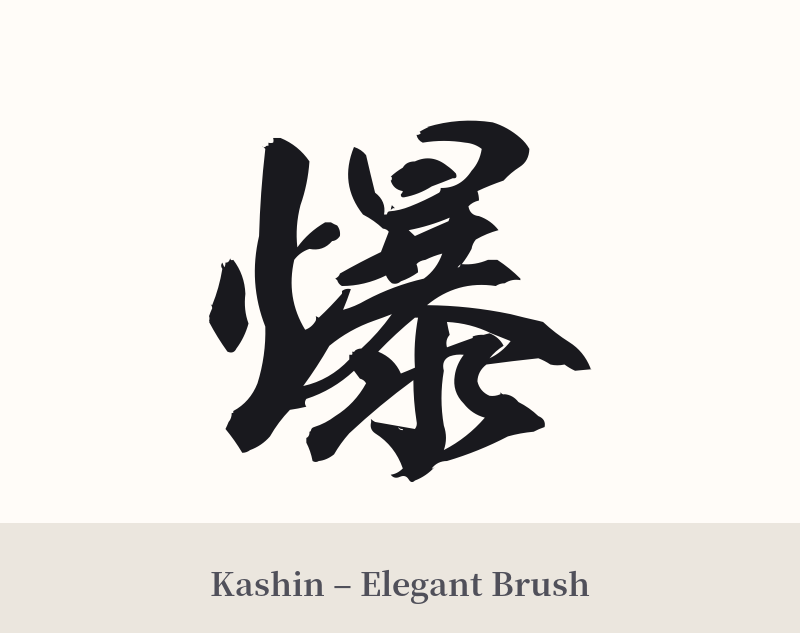
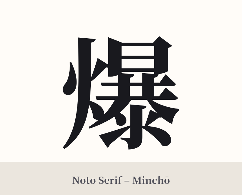
🖌️ Font Styles for 爆
The same kanji can look dramatically different depending on the calligraphy style. Choose a font that matches the mood you want for your tattoo or design.
🎨 Tattoo Suitability
📐 Tattoo Design Guide
A tattoo of 爆 demands attention and careful planning due to its complexity and aggressive nature. To ensure it looks powerful and not just messy, consider the following design tips:
– Placement: This kanji needs space. Choose larger, flatter areas of the body like the back, the outer thigh, the calf, or the forearm. Avoid small or highly curved areas where the design could become distorted or cramped.
– Font Style: A bold, dynamic calligraphy style is ideal. A thick Gyosho (semi-cursive) or a strong, angular Kaisho (block script) can emphasize the explosive energy. Avoid thin, delicate fonts, as the 19 strokes will become illegible.
– Size: Go big. A small 爆 tattoo is almost guaranteed to blur into an unreadable smudge over time. A larger size allows the artist to maintain clear separation between the strokes, preserving the character's integrity for years to come.
– Visual Flair: Enhance the theme by having your artist incorporate visual elements like flames, shockwave lines, or a 'shattered' effect around the kanji. This can integrate the character into a larger piece and amplify its meaning.
Comments