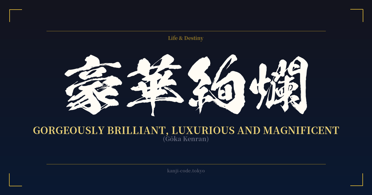
✍️ 豪華絢爛 (Gōka Kenran) — Cultural Context
豪華絢爛 (Gōka Kenran) is a four-character idiom, or 'yojijukugo', that paints a picture of breathtaking, almost overwhelming, beauty. It goes beyond simple 'luxury' (豪華, gōka) to describe something that is both magnificent and brilliantly dazzling. Think of a scene so opulent and intricately detailed that your eyes don't know where to look first—that is the essence of Gōka Kenran.
This aesthetic finds its historical roots in Japan's Azuchi-Momoyama period (1573-1603), an era of unification following a long civil war. The powerful shoguns and samurai lords of the time, like Oda Nobunaga and Toyotomi Hideyoshi, sought to display their newfound power and wealth through grandiose castle architecture, lavish screen paintings with gold leaf, and ornate tea rooms. This bold, unapologetic splendor was a declaration of dominance and cultural sophistication, and it's this very spirit that Gōka Kenran captures.
In practice, the term is used to describe things of exceptional and vibrant beauty. One might use it to characterize the interior of a grand temple like Nikkō Tōshō-gū, with its riot of colorful carvings and gold leaf. It perfectly describes a bride's wedding kimono (uchikake), heavily embroidered with auspicious symbols in shimmering silk threads, or the spectacular floats (dashi) paraded during festivals like the Gion Matsuri in Kyoto.
Interestingly, Gōka Kenran stands in stark contrast to another famous Japanese aesthetic, 'wabi-sabi' (侘寂), which celebrates quiet simplicity, imperfection, and the transient beauty of nature. Where wabi-sabi finds beauty in a cracked teacup or a moss-covered stone, Gōka Kenran finds it in a perfectly executed masterpiece of human artistry, designed to awe and inspire. It represents the peak of craftsmanship, a sensory feast of color, light, and intricate detail. Choosing this term is to embrace a love for the magnificent, the brilliant, and the unapologetically beautiful.
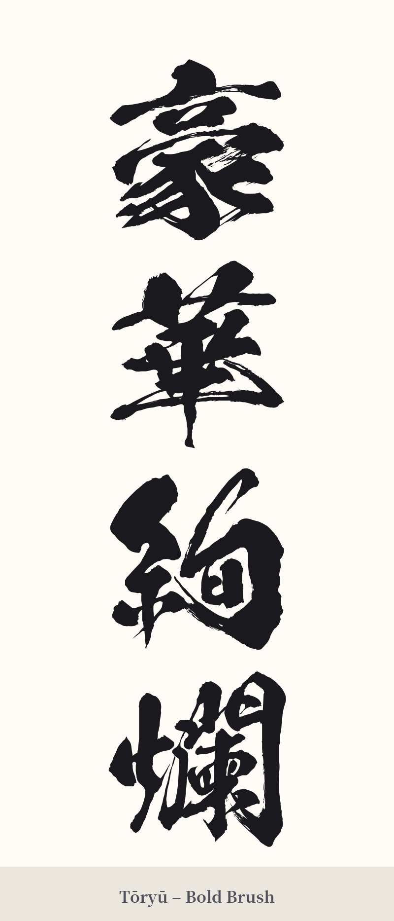
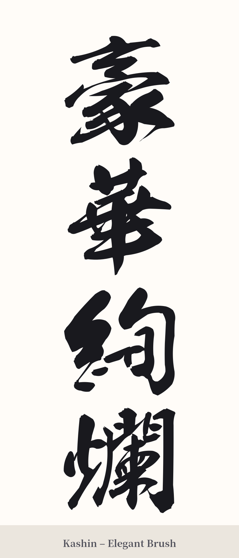
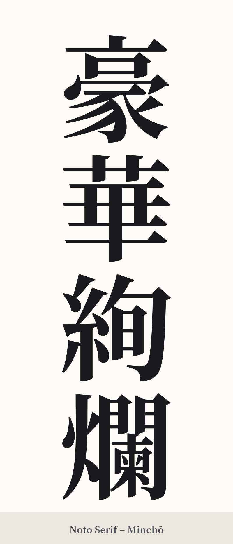
🖌️ Font Styles for 豪華絢爛
The same kanji can look dramatically different depending on the calligraphy style. Choose a font that matches the mood you want for your tattoo or design.
🎨 Tattoo Suitability
📐 Tattoo Design Guide
For a 豪華絢爛 tattoo, the primary consideration is scale and clarity. The complexity of the four characters requires space to be appreciated.
– Placement: This design is best suited for large, flat areas of the body. A vertical column down the spine, along the forearm, or down the side of the thigh would be stunning. Avoid small or highly curved areas like the wrist or ankle.
– Orientation: Vertical orientation is traditional and visually striking for four-character idioms. It allows the characters to flow into one another, creating a sense of a single, powerful statement.
– Font Style: A bold, clear script is essential. A standard block script (Kaisho) ensures legibility, while a dynamic semi-cursive script (Gyosho) can add a sense of artistry and flow. Avoid overly complex or thin scripts, as they may become muddled over time.
– Visual Embellishments: While the kanji alone are powerful, you could incorporate subtle background elements that echo the meaning. Think golden splashes, shimmering patterns reminiscent of silk brocade, or a few stylized peony petals. The key is to keep these elements in the background so they don't overwhelm the kanji themselves.
Comments