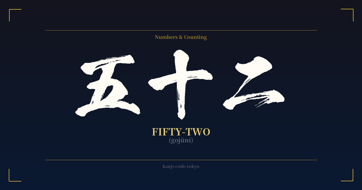
✍️ 五十二 (gojūni) — Cultural Context
The Japanese word 五十二 (gojūni) translates directly and literally to 'fifty-two'. Unlike many kanji that carry layers of philosophical meaning, historical weight, or poetic nuance, 五十二 is purely functional. Its beauty lies not in symbolism, but in the logical elegance of the Japanese counting system.
The construction of the word is a perfect illustration of this system. It is not a unique symbol but a compound of three basic numerical characters: 五 (go – five), 十 (jū – ten), and 二 (ni – two). The structure reads as '(five x ten) + two', a straightforward mathematical expression embedded in the language. This system, inherited from Chinese, is consistent and makes learning larger numbers relatively intuitive.
In Japanese culture, certain numbers are imbued with significant meaning, often due to phonetic similarities with other words. For example, the number four (四, shi) is often avoided because it sounds like the word for death (死, shi). Conversely, the number eight (八, hachi) is considered lucky because its shape, widening at the bottom, suggests prosperity and growth. The number seven (七, shichi) is also widely seen as fortunate.
The number fifty-two, however, holds no such special status. It does not feature prominently in Japanese folklore, religion, or superstition. It is simply a number, used for counting age, money, or days, devoid of the cultural baggage that makes other kanji so compelling. While one could search for connections, such as the 52 cards in a Western playing deck (a concept imported into Japan), these associations are not native to Japanese culture and don't lend the number any special significance.
This lack of inherent symbolism is precisely what makes 五十二 an interesting case study. It highlights the difference between functional language and symbolic language. While many seek kanji for their profound meanings—like 'courage' (勇気) or 'love' (愛)—五十二 serves as a reminder that some words are just tools. Their purpose is clarity and precision, not poetry. Therefore, its primary context is mathematical and quantitative, a clean and clear representation of a value within a highly organized numerical framework.
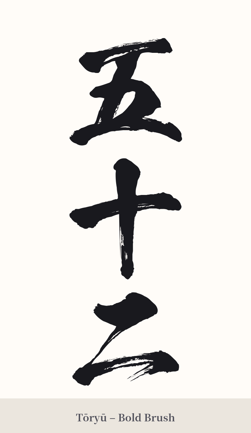
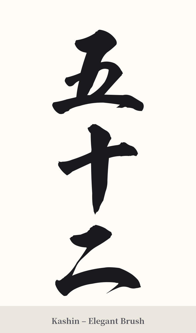
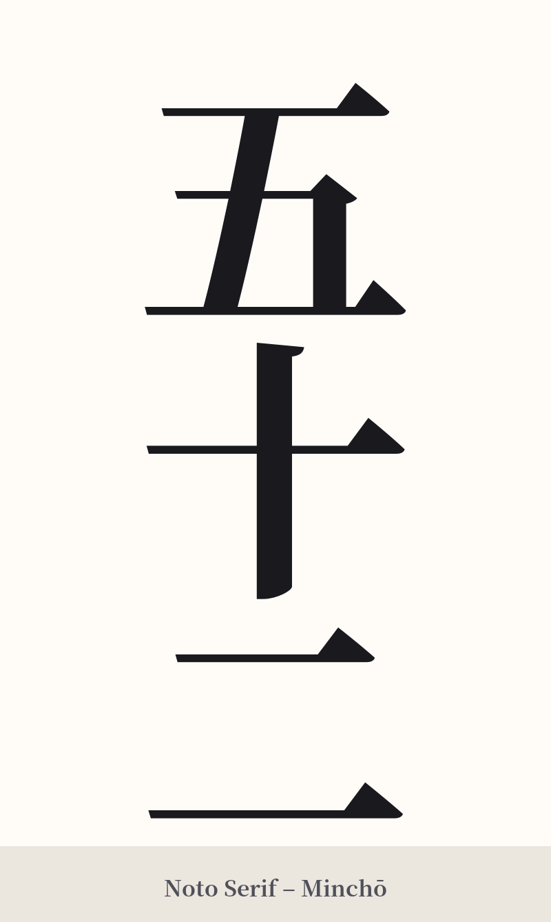
🖌️ Font Styles for 五十二
The same kanji can look dramatically different depending on the calligraphy style. Choose a font that matches the mood you want for your tattoo or design.
🎨 Tattoo Suitability
📐 Tattoo Design Guide
While 五十二 is generally not recommended for a tattoo, if you have a deeply personal and significant reason tied to this specific number, a minimalist approach is best. The design should honor the kanji's functional simplicity rather than trying to impose a meaning that isn't there.
– Placement: Opt for a small, discreet location. The inner wrist, ankle, or behind the ear could work well, reflecting the personal nature of the number.
– Font Style: A clean, standard font like Mincho (a serif style) or a simple Gothic (sans-serif) style would be most appropriate. These fonts emphasize clarity and readability, which aligns with the kanji's purpose. A highly stylized or overly complex calligraphic script might look out of place with such simple characters.
– Orientation: A vertical alignment (五 on top, then 十, then 二) is the most traditional and aesthetically pleasing arrangement for multi-character kanji compounds. This creates a balanced, elegant column.
– Visual Tips: Avoid adding extra artistic elements like dragons, cherry blossoms, or waves. These symbols carry their own strong meanings and would clash with the stark, literal nature of 'fifty-two', creating a confusing and disjointed design.
Comments