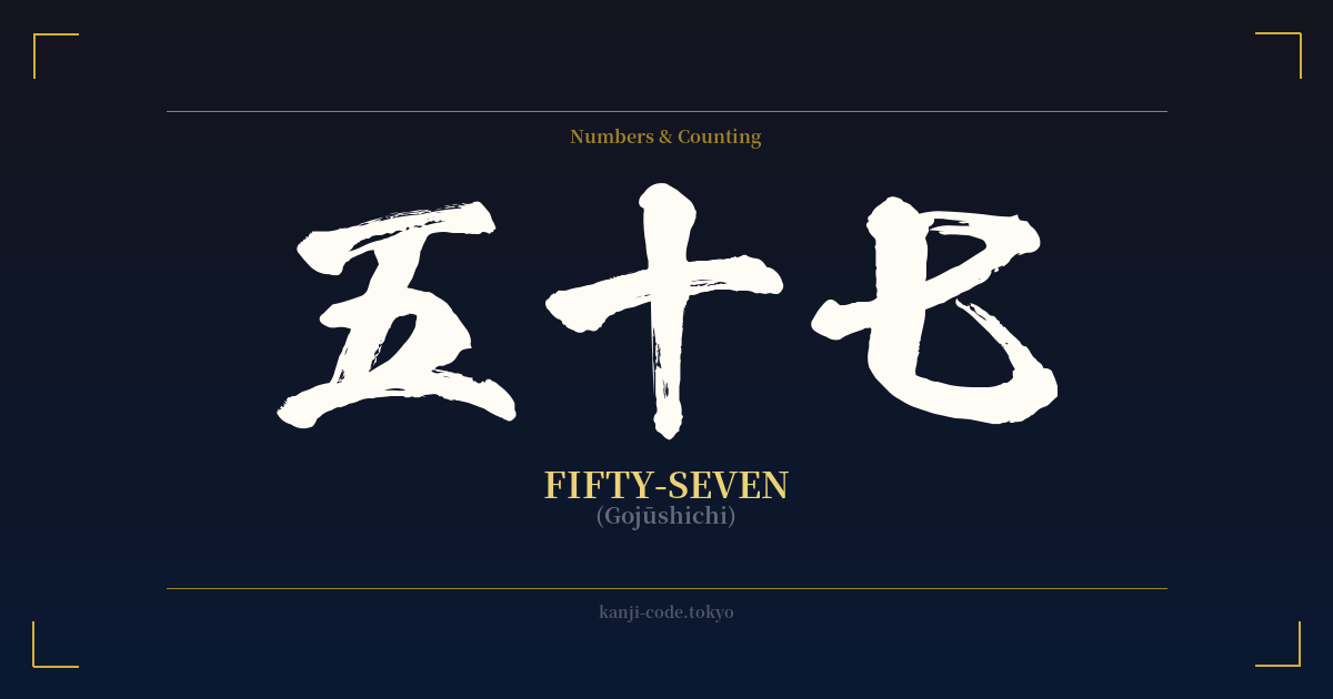
✍️ 五十七 (Gojūshichi) — Cultural Context
The Japanese word for fifty-seven, 五十七 (Gojūshichi), is a perfect example of the logical and systematic nature of kanji-based numbers. Unlike the irregularities of English number words, the Japanese system is straightforward. It is constructed as 五 (go, five) followed by 十 (jū, ten) and then 七 (shichi, seven), literally translating to "five tens plus seven."
This structure, borrowed from ancient Chinese mathematics, forms the backbone of counting in Japan. You see this pattern across all numbers, making it easy to understand large figures once you know the basic characters from one to ten, plus the multipliers for hundred (百), thousand (千), and so on. For everyday use, Arabic numerals (57) are now common, but kanji numbers remain essential for formal contexts.
You will find kanji numbers on legal documents, financial instruments, and official certificates. This tradition serves two purposes: it adds a layer of formality and gravitas, and the more complex characters help prevent forgery. In traditional arts like calligraphy (shodō) and vertical writing (tategaki), kanji numbers are used for their aesthetic harmony with the surrounding text.
While the number 57 itself doesn't hold a major symbolic weight in Japanese culture—unlike the lucky number seven (七) or the unlucky numbers four (四, shi, sounds like death) and nine (九, ku, sounds like suffering)—numbers can be part of a playful form of wordplay called 'goroawase'. In this system, numbers can be read in various ways to create puns. For example, 5 (go) and 7 (na) could be read together as 'gona' or 'kona', with 粉 (kona) meaning 'powder' or 'flour'. This is more of a casual linguistic game than a deep cultural meaning.
Ultimately, 五十七 is a functional and descriptive term. Its cultural significance lies not in the number 57 itself, but in the elegant system of counting it represents—a system that has been a cornerstone of Japanese language and society for centuries, blending practicality with artistic tradition.
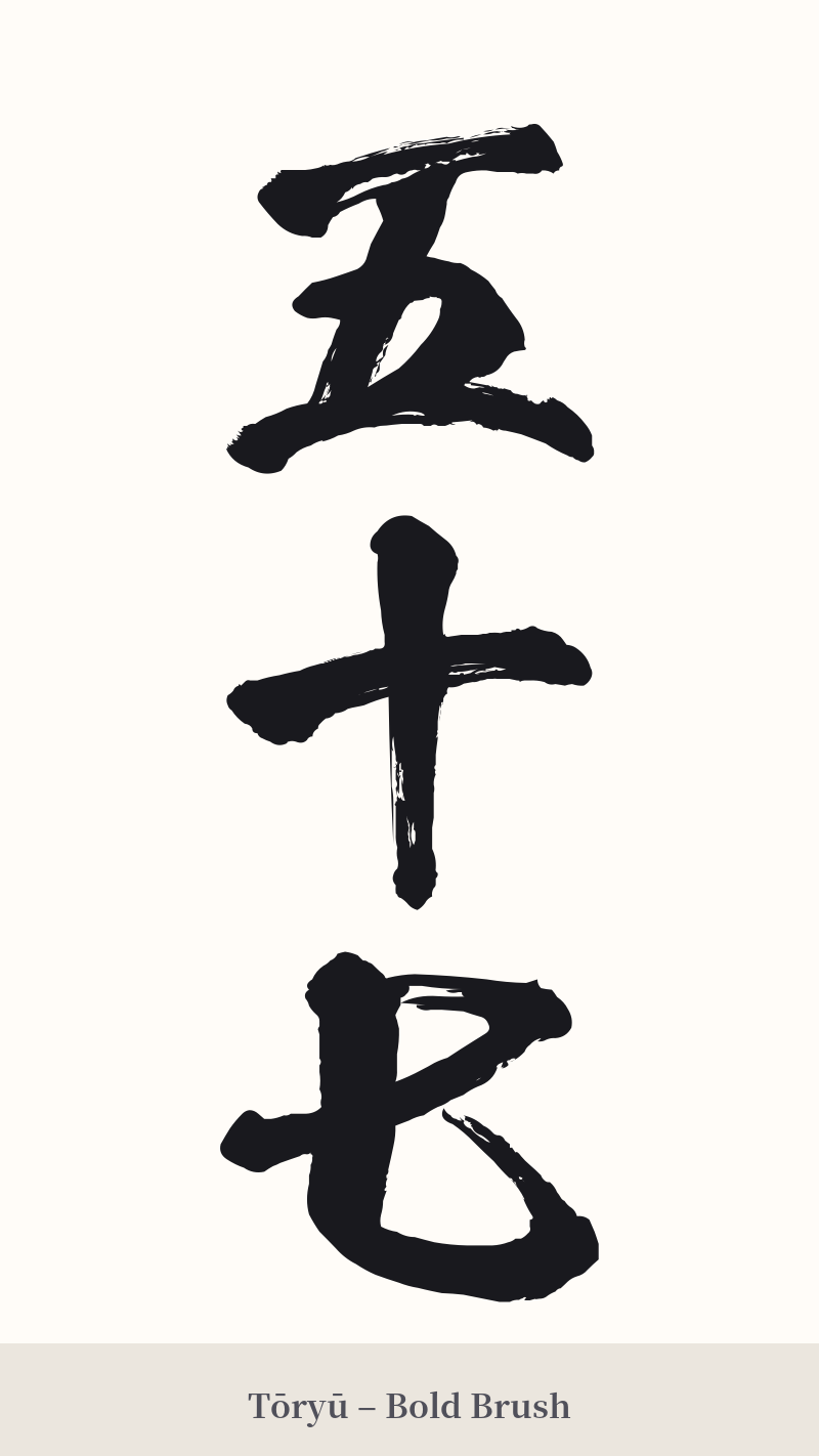
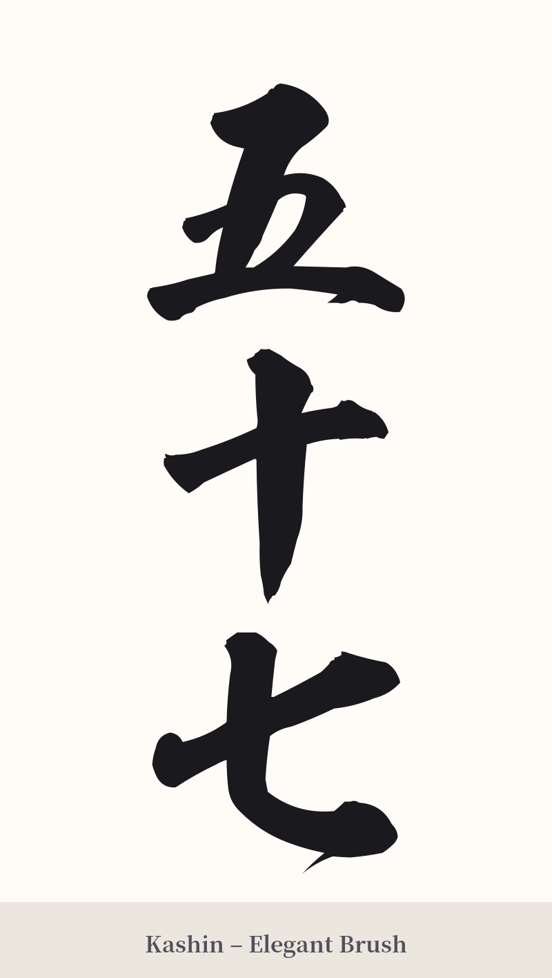
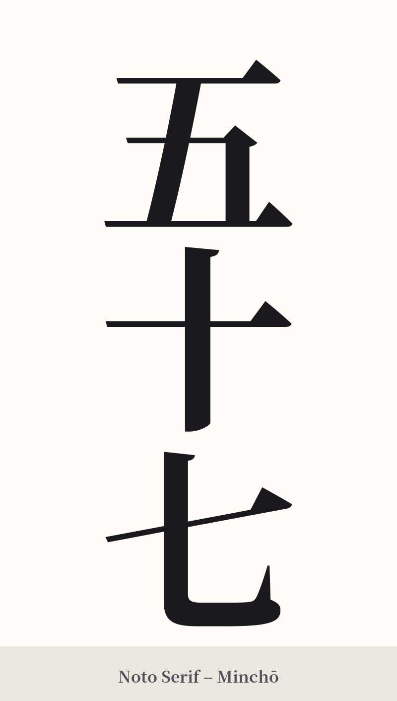
🖌️ Font Styles for 五十七
The same kanji can look dramatically different depending on the calligraphy style. Choose a font that matches the mood you want for your tattoo or design.
🎨 Tattoo Suitability
📐 Tattoo Design Guide
While not a recommended standalone tattoo due to its literal meaning, if 五十七 holds deep personal significance (such as a memorial date, an age, or a jersey number), the design should be approached with care.
– Placement: Vertical alignment is the most traditional and aesthetically pleasing way to write multi-character kanji words. Consider placing it on the forearm, the back of the calf, or along the spine for a clean, linear look.
– Font Style: Simplicity is key. A standard, crisp Kaisho (block) script will emphasize clarity and the fundamental shapes of the characters. For a slightly more artistic touch, a Gyōsho (semi-cursive) script can add a sense of flow and personality without sacrificing legibility.
– Visual Tips: Because the characters themselves are simple (totaling only eight strokes), the artistry lies in the execution. The focus should be on the quality of the brushwork—the balance, the spacing between characters, and the subtle texture of the ink. Consider incorporating it as a small part of a larger, more meaningful image rather than as the central focus.
Comments