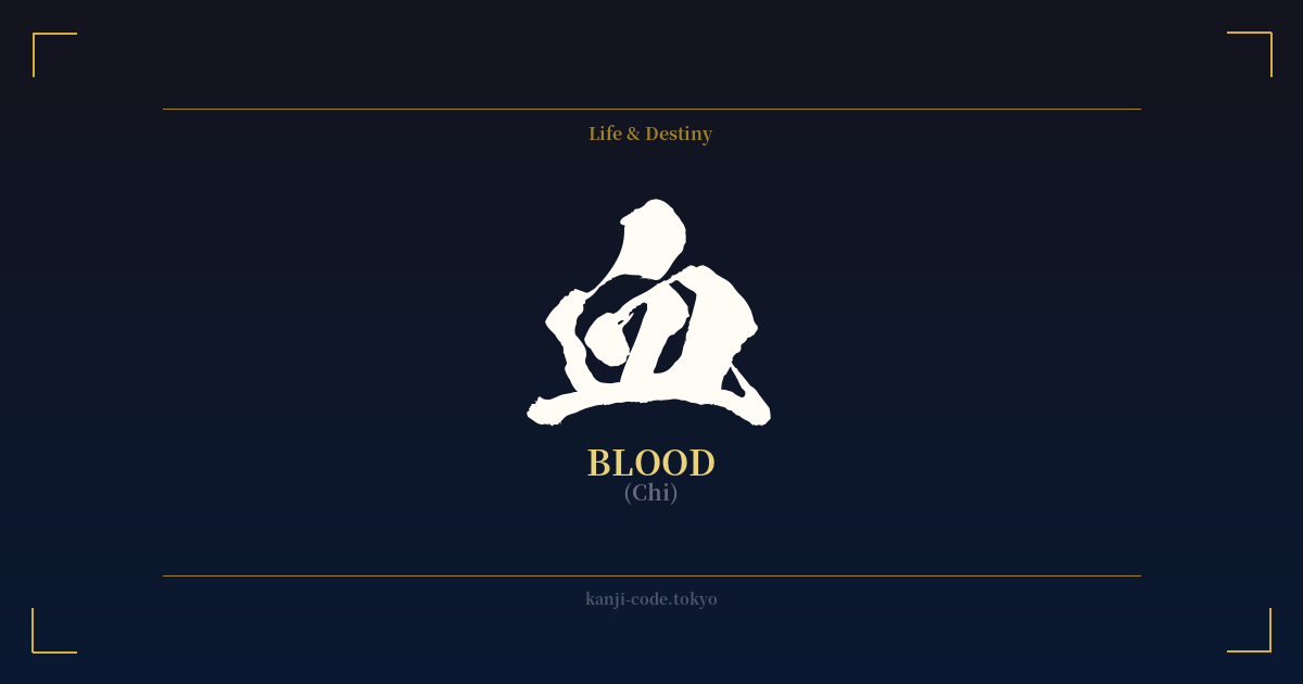
✍️ 血 (Chi) — Cultural Context
The kanji 血 (chi) is one of the most primal and potent characters in the Japanese language. Its origins are pictographic, depicting a drop of liquid inside a sacrificial vessel or plate (皿), symbolizing an offering. This ancient image immediately connects the character not just to the physical substance of blood, but to the profound concepts of life, sacrifice, and ritual.
In Japanese culture, 血 extends far beyond its biological function. It is the definitive symbol of lineage and ancestry. The word 血統 (kettō) means "bloodline," and family ties are often described as connections of blood. This concept is deeply ingrained, emphasizing heritage, duty, and the continuation of a family's legacy through generations. To share blood is to share a fundamental, unbreakable bond.
This connection to lineage also gives rise to a unique cultural phenomenon: the belief that blood type (血液型, ketsuekigata) influences personality. While scientifically unfounded, it's a popular topic in Japan, similar to how horoscopes are viewed in the West. Someone might be described as having a certain temperament because they are "Type A" or "Type B," linking the physical essence of blood directly to one's character.
The character is also a powerful descriptor of emotion and temperament. A passionate, enthusiastic person is called 熱血 (nekketsu), literally "hot-blooded." Conversely, a cruel or heartless individual is 冷血 (reiketsu), or "cold-blooded." These expressions show how blood is seen as the carrier of one's spirit and emotional intensity.
Historically, 血 is inseparable from the image of the samurai and the warrior ethos. It represents the ultimate sacrifice in battle, the price of loyalty, and the grim reality of conflict. In Japanese art, film, and manga, the stark, black character for blood is often used for dramatic, visceral impact, instantly conveying a moment of high stakes, injury, or death. It is a character that is both foundational to life and a stark reminder of mortality.
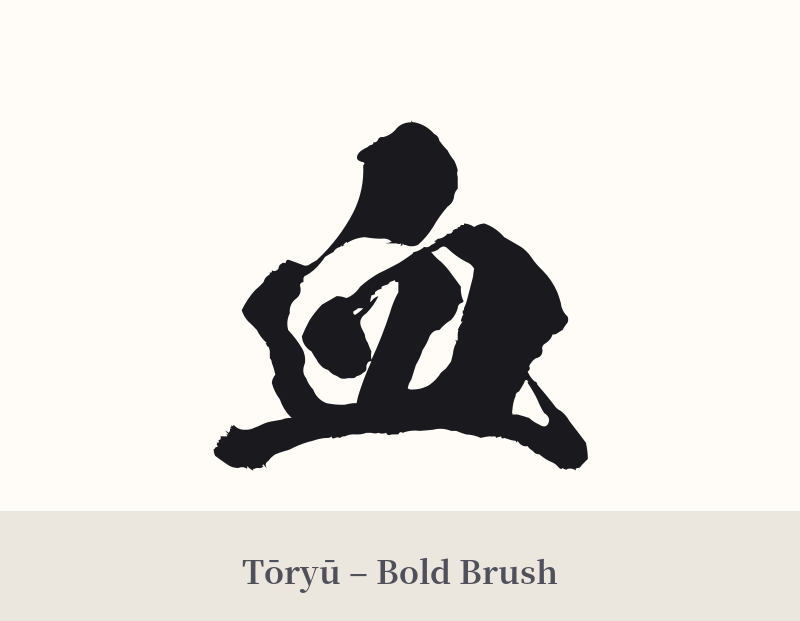
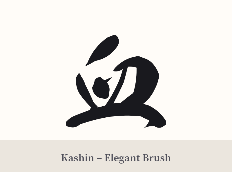
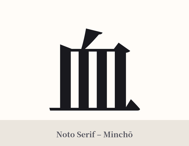
🖌️ Font Styles for 血
The same kanji can look dramatically different depending on the calligraphy style. Choose a font that matches the mood you want for your tattoo or design.
🎨 Tattoo Suitability
📐 Tattoo Design Guide
The kanji 血 is stark and powerful, making it suitable for a design that is either minimalist or highly expressive.
– Placement: Its compact shape works well in smaller, focused areas like the wrist, behind the ear, or on the ankle. For a more prominent statement, it can be placed on the forearm or calf, where its starkness can command attention.
– Font Style: The choice of font dramatically alters the meaning. A dynamic, splattered calligraphy style (shodō) can emphasize passion, conflict, or a wild nature. In contrast, a clean, geometric Mincho or Gothic font can highlight the concepts of lineage and the clinical essence of life.
– Visual Tips: While often tattooed in black for a classic, symbolic look, using red ink offers a very literal and visceral interpretation that is undeniably eye-catching. The character stands strong on its own, but could be integrated into a larger piece featuring themes of life and death, such as with a cherry blossom (sakura) to represent the transient nature of life, or with a demon (oni) to explore darker themes.
Comments