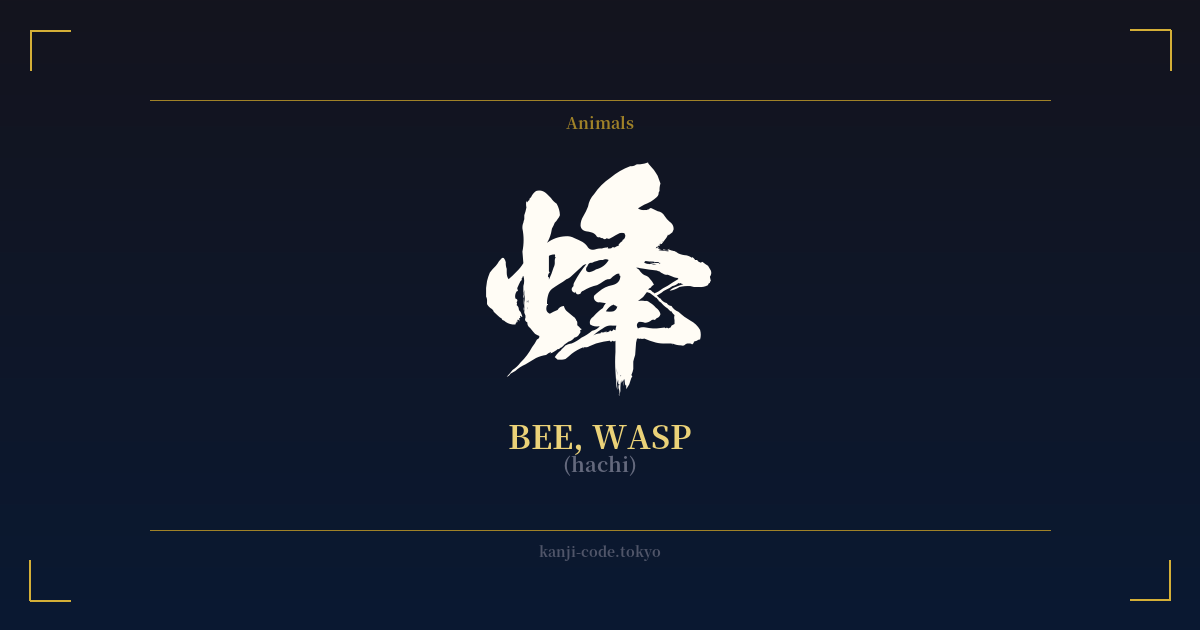
✍️ 蜂 (hachi) — Cultural Context
The kanji 蜂 (hachi) is a fascinating character that buzzes with dual meaning, encapsulating both the diligent bee and the formidable wasp. Its very structure tells a story. The left radical, 虫 (mushi), firmly categorizes it as an insect. The right side, 夆, is a phonetic component that contributes to the sound, but its original meaning of 'to clash' or 'to encounter' subtly hints at the sharp, potentially dangerous nature of the creatures it represents.
In Japan, the distinction between these two insects is culturally significant, even if they share a single base kanji. When speaking of bees, the term 蜜蜂 (mitsubachi), literally 'honey bee', is often used. These insects are symbols of tireless work, community, cooperation, and the sweet rewards of labor, represented by 蜂蜜 (hachimitsu), or honey. They embody a positive, productive force of nature, essential for pollination and respected for their organized social structure.
On the other hand, the wasp, particularly the infamous Japanese giant hornet or 大雀蜂 (ōsuzumebachi), is a symbol of raw power, aggression, and danger. The term 雀蜂 (suzumebachi), or 'sparrow bee', is used for hornets and wasps, evoking a creature far more menacing than its honey-producing cousin. These insects are respected out of fear; they are seen as fierce warriors of the natural world, territorial and equipped with a potent sting. An encounter with a nest of suzumebachi is a serious, often life-threatening event in rural Japan.
This duality is where the power of 蜂 lies. It is not simply 'bug'; it is a character that holds the entire spectrum of the hive mind, from productive harmony to lethal defense. It represents the idea that community can be for building or for battle, that nature's small creatures can be both creators and destroyers. This makes 蜂 a more complex and nuanced symbol than a simple picture of a bee or wasp might suggest. It forces a consideration of both sides of the coin: the gentle provider and the fierce protector, all contained within thirteen strokes.
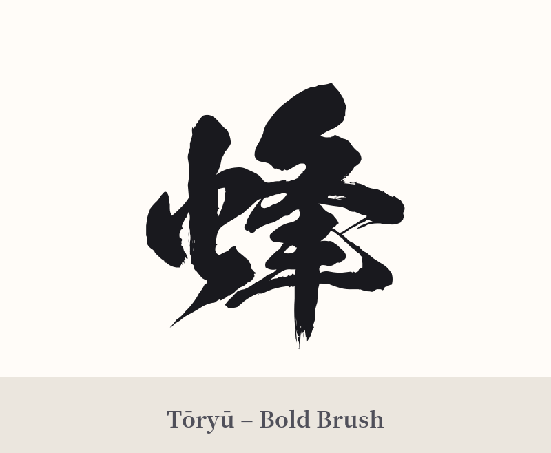
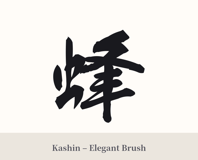
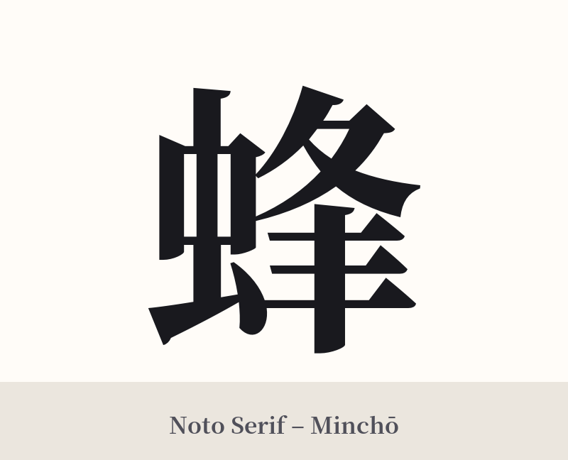
🖌️ Font Styles for 蜂
The same kanji can look dramatically different depending on the calligraphy style. Choose a font that matches the mood you want for your tattoo or design.
🎨 Tattoo Suitability
📐 Tattoo Design Guide
A tattoo of 蜂 (hachi) requires careful consideration to convey the intended meaning. Its moderate complexity works well in a variety of styles, but the ambiguity must be addressed.
– Placement: Forearm, calf, or shoulder blade are excellent choices. These areas provide enough space for the character's details to be clear. Avoid making it too small, as the internal strokes of the 虫 radical can blur together over time.
– Style: For a 'bee' theme, consider a clean, precise font like Mincho or Kaisho, emphasizing order and diligence. For a 'wasp' theme, a more aggressive and fluid calligraphy style like Gyosho or Sosho, with sharp, energetic strokes, can capture a sense of danger and movement.
– Visual Clarification: This is highly recommended. To specify 'bee', consider incorporating honeycomb patterns, cherry blossoms, or a drop of honey alongside the kanji. To specify 'wasp', you could pair it with sharper, more angular background elements, or even the kanji for 'poison' (毒) or 'fierce' (猛) if you want a particularly aggressive design.
Comments