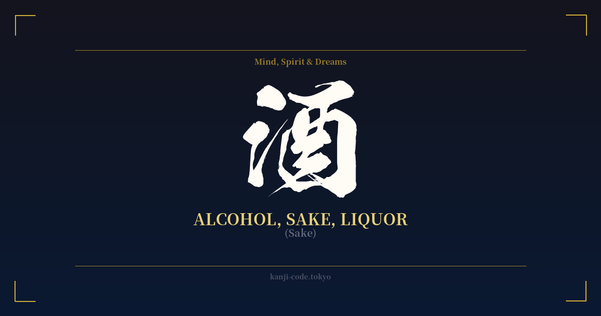
✍️ 酒 (Sake) — Cultural Context
The kanji 酒 (sake) is far more than a simple character for alcohol; it is a vessel of Japanese culture, history, and social dynamics. Its very structure tells a story. The left-side radical, 氵(sanzui), is derived from the character for water (水), signifying liquid. The right side, 酉, is a pictograph of a ceremonial jar used for fermentation. Together, they form a vivid image: a fermented liquid in a jar.
Historically and spiritually, sake holds a sacred place in Japan. In Shintoism, the indigenous faith, it is known as 'omiki' (お神酒), or 'the gods' sake.' It is brewed and offered at shrines to deities as a form of purification and communion. This sacred offering is then often shared with worshippers, symbolizing a shared blessing from the gods. This practice is central to festivals (matsuri) and important life events, including weddings, where couples share sake in a ritual called 'san-san-kudo' to seal their vows.
Beyond the spiritual realm, 酒 is the lifeblood of social interaction. The concept of 'nominication' (a portmanteau of 'nomu' – to drink, and 'communication') highlights how drinking together is a fundamental tool for building relationships, both personal and professional. In a society that often values reserve and indirectness, gathering at an 'izakaya' (Japanese pub) creates a space where colleagues and friends can speak more freely, break down hierarchical barriers, and foster a sense of unity.
The character also embodies a duality. It is synonymous with celebration, joy, and relaxation—the 'kanpai!' (cheers!) among friends or the quiet, contemplative cup after a long day. Yet, it also acknowledges the potential for sorrow and excess. The term 'yakezake' (焼け酒) refers to drowning one's sorrows in alcohol, a poignant recognition of its use as an escape from hardship. This balance between joyous communion and solitary melancholy gives the kanji a rich, human complexity that resonates deeply within Japanese art and literature.
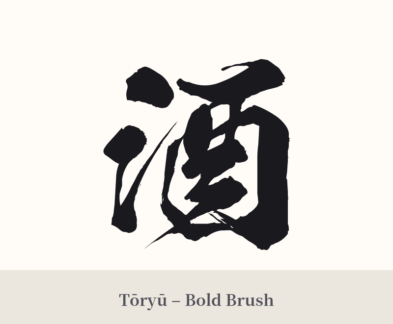
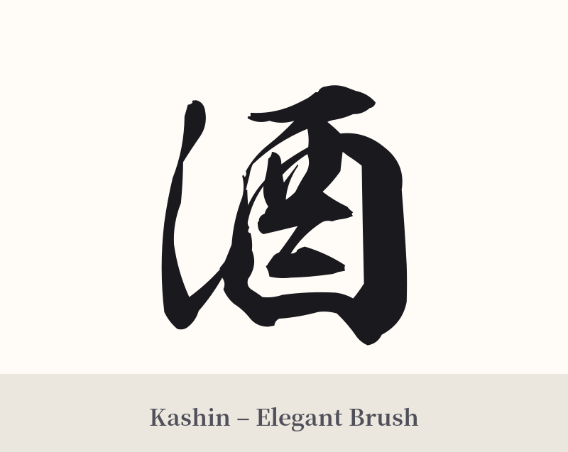
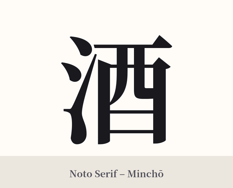
🖌️ Font Styles for 酒
The same kanji can look dramatically different depending on the calligraphy style. Choose a font that matches the mood you want for your tattoo or design.
🎨 Tattoo Suitability
📐 Tattoo Design Guide
The kanji 酒 offers great versatility for a tattoo design. Its balanced structure looks powerful whether rendered large or small.
– Placement Suggestions: Popular placements include the inner forearm, the calf, or the back of the neck. For a more subtle design, it can be placed on the wrist or behind the ear. It also works well as a central element in a larger Japanese-themed piece, such as a sleeve.
– Font Style: An expressive, semi-cursive calligraphy style (gyōsho) can capture the lively, flowing nature of liquid and celebration. For a more traditional and solid feel, a classic Mincho or Kaisho script provides clarity and weight. Avoid overly thin or generic fonts that fail to convey the character's cultural gravity.
– Visual Tips: Consider incorporating related imagery. Pairing 酒 with a sake cup (sakazuki), a traditional gourd flask (hyōtan), or even a stalk of rice can add narrative depth. Integrating it with cherry blossoms (sakura) can evoke the feeling of spring festivals and fleeting beauty.
Comments