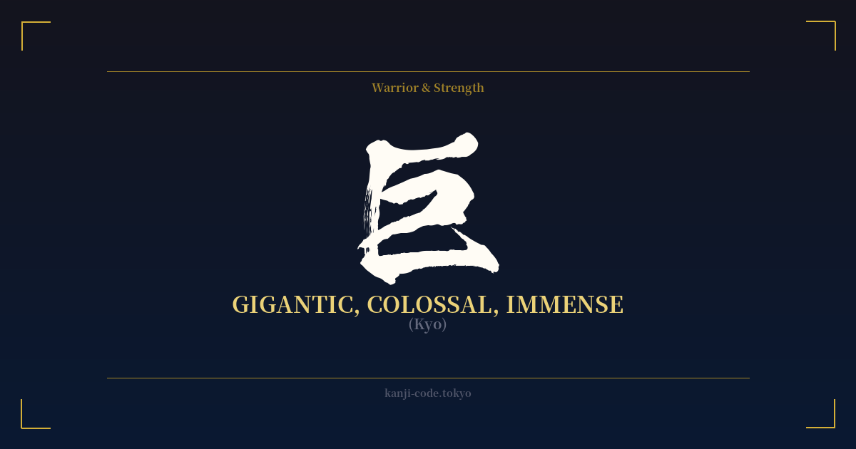
✍️ 巨 (Kyo) — Cultural Context
The kanji 巨 (kyo) is a powerful and evocative character that conveys a sense of scale far beyond the ordinary. While the common character for 'big' is 大 (dai), 巨 elevates this concept to 'gigantic,' 'colossal,' or 'immense.' It speaks not just of size, but of a scale that inspires awe, and sometimes, fear.
Its origin is believed to be a pictograph of a person holding a large carpenter's square (工). This origin ties the abstract idea of 'immense' to the tangible act of human construction and measurement, suggesting something so large it requires a special tool to even comprehend its dimensions. The character's form is simple, with just five strokes, yet it represents the monumental.
In Japanese culture, 巨 is most famously found in the word 巨人 (kyojin), meaning 'giant' or 'titan.' This term immediately brings to mind figures from folklore and mythology—powerful, often fearsome beings that tower over humanity. This connection has been massively amplified in modern global culture by the phenomenal success of the anime and manga series 'Attack on Titan,' whose Japanese title is 進撃の巨人 (Shingeki no Kyojin). Here, the kanji represents the overwhelming, terrifying power of the titans that threaten humanity's existence.
Beyond mythical creatures, 巨 is used to denote greatness in other fields. A 巨匠 (kyoshō) is a 'great master' or 'maestro' in an art form, someone whose skill and influence are monumental. A 巨万の富 (kyoman no tomi) refers to an 'immense fortune,' highlighting its use for abstract as well as physical size. The word 巨大 (kyodai) is a more common term for 'huge' or 'massive,' used to describe anything from giant robots in anime to massive architectural structures.
Using 巨 implies a dramatic sense of scale. It's a character that doesn't just mean 'big'; it means 'unprecedentedly big.' It captures the feeling of standing before something so vast it dwarfs your own existence, whether that's a towering skyscraper, a legendary beast, or the legacy of a master artist.
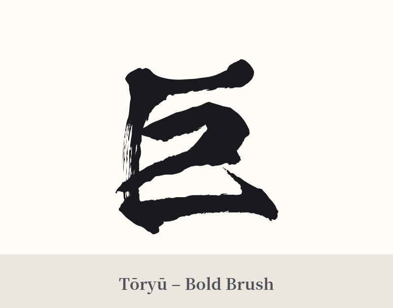
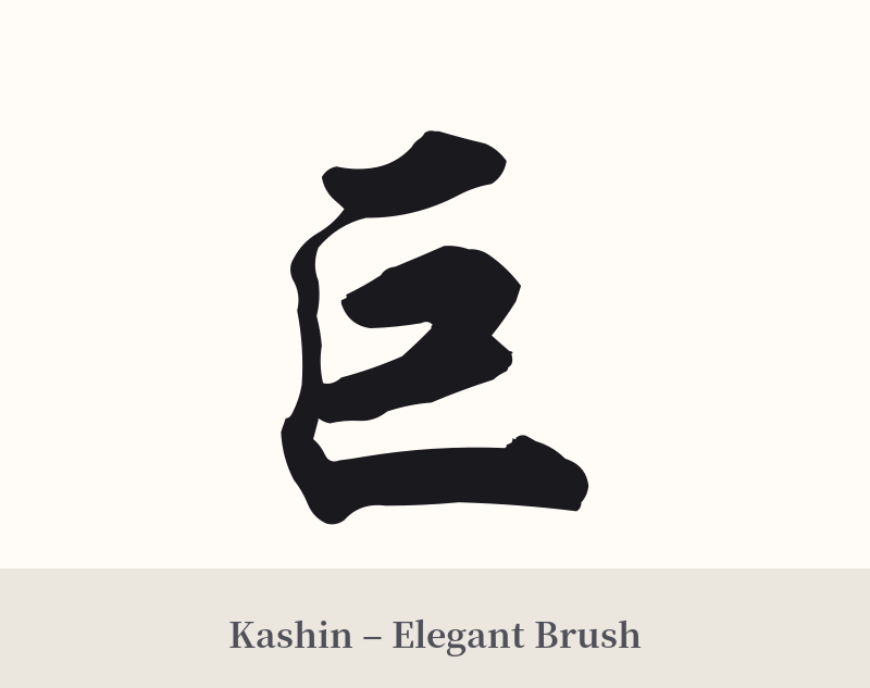
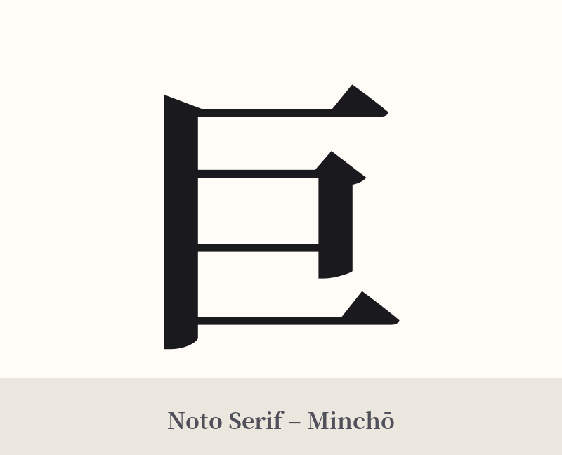
🖌️ Font Styles for 巨
The same kanji can look dramatically different depending on the calligraphy style. Choose a font that matches the mood you want for your tattoo or design.
🎨 Tattoo Suitability
📐 Tattoo Design Guide
The key to a successful tattoo of 巨 is to honor its meaning of immense scale in the design itself.
– Placement: This kanji benefits from being placed on larger, flatter areas of the body like the back, chest, or thigh. This gives the character 'room to breathe' and visually reinforces its meaning. A tiny tattoo of 'gigantic' can feel ironic and lose its impact.
– Font Style: Consider styles that convey weight and power. A thick, blocky Kaisho (print) or Gyosho (semi-cursive) script can give it a solid, architectural feel. For a more aggressive or ancient look, a bold, heavily-inked Sōsho (cursive) style can evoke the untamed power of a titan.
– Visual Tips: Avoid thin, delicate lines, as they contradict the core meaning. The strokes should have presence and weight. You could also consider integrating 巨 into a larger image—perhaps subtly within the form of a giant creature or as a stark symbol against a landscape, emphasizing the theme of scale.
Comments