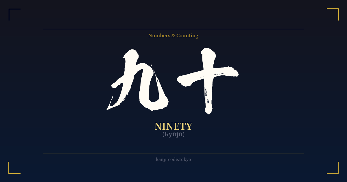
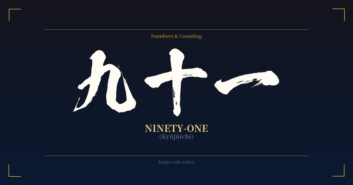
✍️ 九十 (Kyūjū) — Cultural Context
The Japanese word for ninety, 九十 (kyūjū), is a straightforward and logical compound. It is formed by combining the kanji for nine, 九 (kyū), with the kanji for ten, 十 (jū). This structure, 'nine-tens', is a hallmark of the East Asian numbering system, creating a clear and efficient way to express numbers.
While the number itself is simple, it holds significant cultural weight in the context of age and milestones. In Japan, reaching the age of ninety is a major celebration known as 卒寿 (sotsuju). This is a beautiful example of Japanese wordplay and calligraphic tradition. The character 卒 (sotsu), meaning 'to graduate', when written in its abbreviated, cursive form (卆), looks almost identical to the two characters for ninety (九十) stacked vertically. Therefore, the 90th birthday is seen as a 'graduation' of sorts, a monumental achievement in life's long journey.
This connection elevates the number ninety from a mere quantity to a symbol of longevity, resilience, and a life fully lived. While other numbers in Japanese culture can carry superstitious connotations—for example, the reading of nine (ku) can be a homophone for suffering (苦)—in the context of 九十 and especially the 90th birthday, the feeling is overwhelmingly positive and celebratory.
Beyond this specific milestone, 九十 functions just as 'ninety' does in English. It's used for counting, for dates, for prices, and in any context where the quantity is required. You might see it on a price tag (九十円, 90 yen), in a historical text referring to a 90-day period, or in literature describing a character's advanced age.
The simplicity of the characters themselves—九 being a graceful curve and 十 a perfect cross—gives the word a minimalist, almost architectural feel. It doesn't shout for attention but presents a fact with clean, undeniable clarity. It represents a point far along a journey, just shy of a hundred, embodying a sense of near-completion and seasoned wisdom.
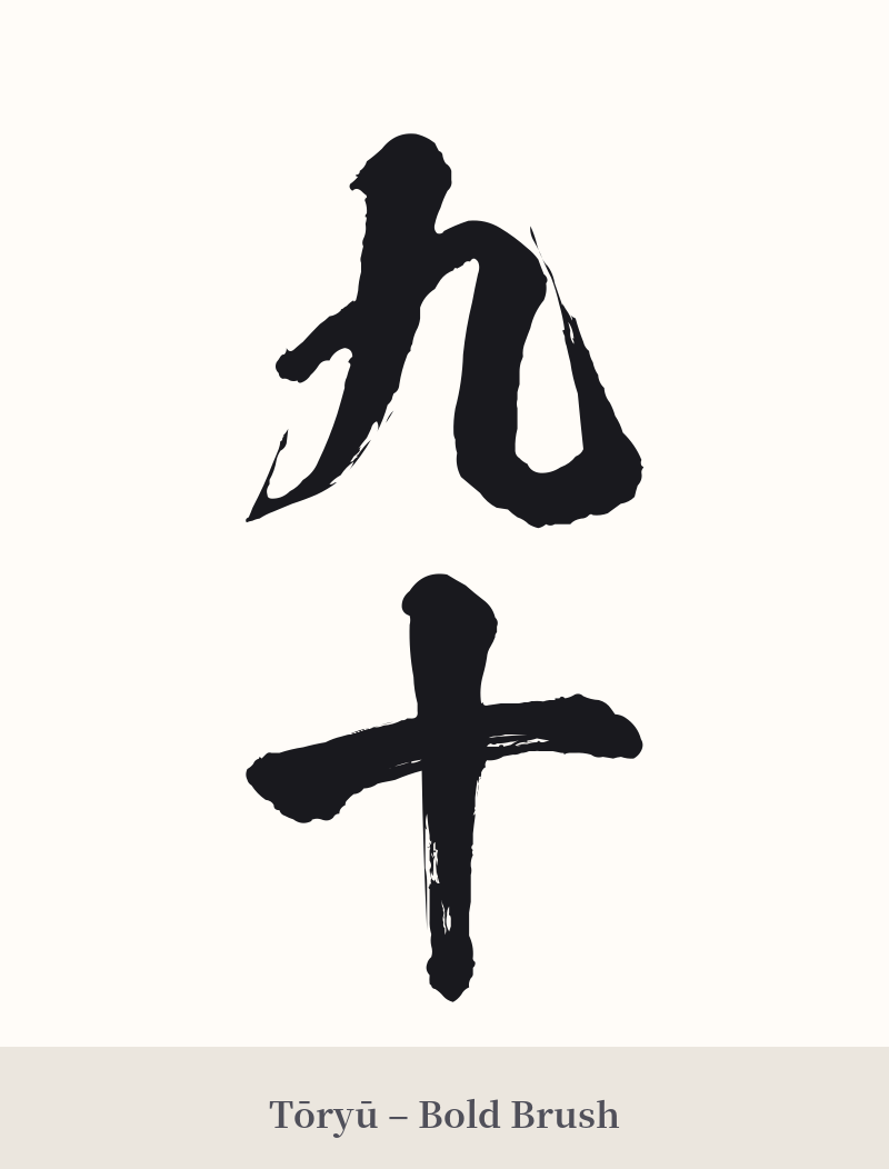
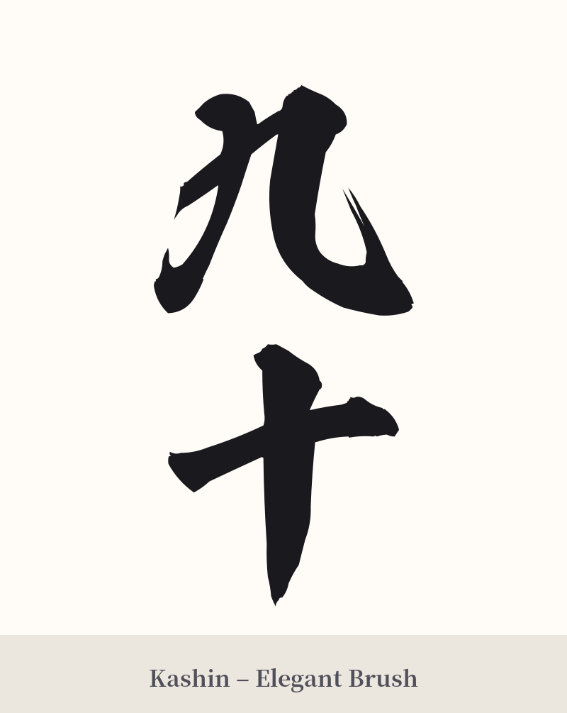
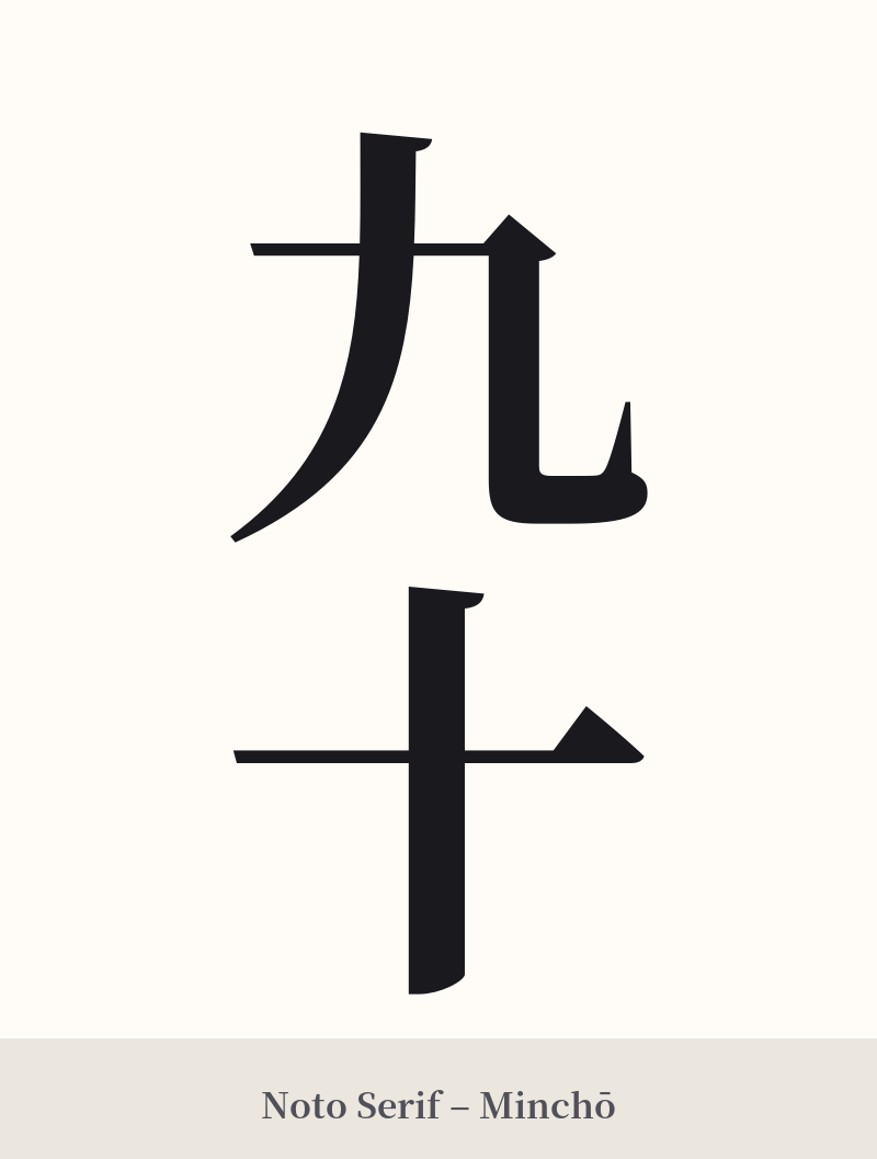
🖌️ Font Styles for 九十
The same kanji can look dramatically different depending on the calligraphy style. Choose a font that matches the mood you want for your tattoo or design.
🎨 Tattoo Suitability
📐 Tattoo Design Guide
For a tattoo of 九十, the design should honor its inherent simplicity and directness. Overly complex designs can detract from the minimalist nature of the characters.
– Placement: Given its simplicity, 九十 works well in smaller, more personal locations. Consider the inner wrist, the ankle, behind the ear, or along the collarbone. It can also be integrated into a larger piece, such as a date (e.g., '1990' written as '一九九十').
– Font Style: A clean, classic Mincho (serif) font emphasizes the characters' geometric shapes and clarity. For a more artistic and fluid look, a semi-cursive (Gyosho) or fully cursive (Sosho) calligraphy style can beautifully link the two simple characters, creating a sense of flow and connection.
– Visual Tips: Vertical orientation is the most traditional and aesthetically pleasing way to write two-character kanji compounds. To add more visual context, consider pairing it with a small, meaningful symbol. For instance, if it represents a birth year, you could add a subtle cherry blossom petal or another element related to that time.
Comments