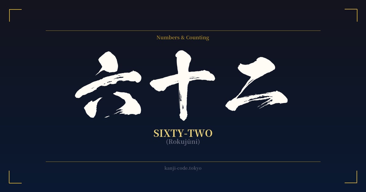
✍️ 六十二 (Rokujūni) — Cultural Context
The Japanese word for sixty-two, 六十二 (rokujūni), is a perfect illustration of the logical and elegant system used for writing numbers in kanji. The construction is straightforward: 六 (roku) means six, 十 (jū) means ten, and 二 (ni) means two. In Japanese, numbers above ten are formed by combining these base characters. So, 'sixty-two' is literally expressed as 'six-tens-two' (6 x 10 + 2), a clear and concise mathematical representation.
While the construction is elegant, the number sixty-two itself holds no special cultural or spiritual significance in Japan. Unlike numbers such as seven (七), which is associated with the Seven Lucky Gods (七福神), or eight (八), considered lucky for its widening shape, sixty-two is just a number. It doesn't appear in famous proverbs, historical events, or religious doctrines in any meaningful way. Its primary function is purely quantitative, used for counting, age, dates, and measurements.
This contrasts sharply with the number sixty (六十). A person's 60th birthday, known as 'kanreki' (還暦), is a major life milestone. It signifies the completion of one full cycle through the traditional zodiac calendar (a 60-year cycle) and a symbolic rebirth. Reaching kanreki is a time for celebration, often marked by wearing a red hat and vest. The number sixty-two, coming just two years later, carries none of this weight.
In modern Japan, you are far more likely to see the number 62 written with Arabic numerals (62) in everyday contexts like price tags, digital clocks, and train schedules. The kanji form 六十二 is reserved for more traditional or formal applications. You might find it on a formal certificate, in a vertically written novel, or on the menu of an old-fashioned restaurant. This formal usage gives it a slightly classic, traditional feel, but does not imbue it with any deeper meaning.
Therefore, while the kanji 六十二 is a functional and historically important part of the written language, its identity is tied to its role as a simple descriptor of quantity. It is a building block of the language, not a standalone symbol of a grand concept.
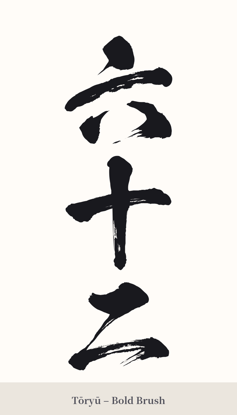
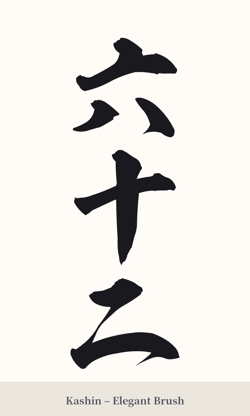
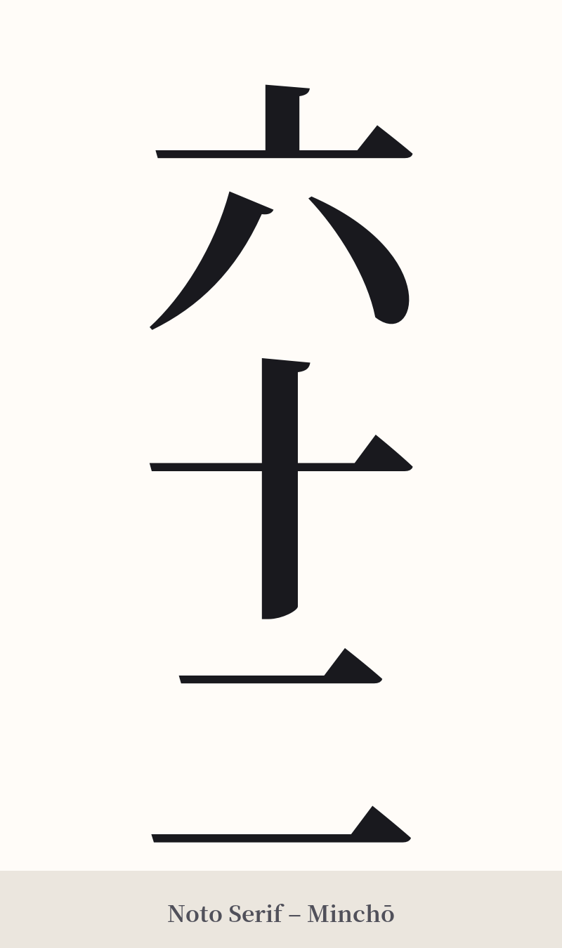
🖌️ Font Styles for 六十二
The same kanji can look dramatically different depending on the calligraphy style. Choose a font that matches the mood you want for your tattoo or design.
🎨 Tattoo Suitability
📐 Tattoo Design Guide
Given that 六十二 is not recommended as a standalone tattoo, any design should focus on integrating it into a larger, more meaningful context. If you are set on using these characters, consider the following advice:
– Context is Key: Instead of getting just '六十二', incorporate it into a phrase. For example, if it represents a year, you could use the full date, like 'Shōwa Sixty-Two' (昭和六十二年). This frames it as a specific moment in time rather than just a number.
– Supporting Element: Use the kanji as a small, subtle detail within a larger image. It could be a date on a document in a larger piece, a number on a jersey, or a small inscription on an object that has personal significance to you.
– Placement: Because it lacks the visual power for a centerpiece, placement should be discreet. Consider the inner wrist, ankle, or behind the ear. Avoid large, prominent areas like the back or chest unless it is a minor part of a much bigger design.
– Font Style: A simple, clean font like a standard Mincho (serif) or Gothic (sans-serif) style would be most appropriate. These styles match the literal, straightforward nature of the word. A highly ornate or cursive script would feel mismatched and could be difficult to read.
Comments