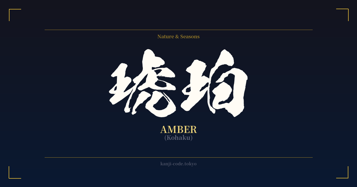
✍️ 琥珀 (Kohaku) — Cultural Context
琥珀 (Kohaku) is the Japanese word for amber, the fossilized tree resin known for its warm, golden hues and its ability to preserve ancient life within its translucent depths. This very act of preservation gives the word a profound undertone: it represents moments frozen in time, memories held safe, and a connection to a deep, geological past.
In Japan, the color of amber, known as 'kohaku-iro', is a cherished aesthetic. It's a color associated with the rich light of a setting sun, the warm glow of a lantern, and the nostalgic beauty of autumn leaves. This color evokes feelings of warmth, comfort, and a gentle melancholy, making it a powerful symbol in art and literature.
Beyond the gem itself, the name Kohaku holds immense cultural significance in another realm: the world of Nishikigoi, or ornamental carp. The Kohaku koi is one of the 'Big Three' varieties, celebrated for its pristine white body marked with vibrant red (hi) patterns. A perfect Kohaku koi is a living piece of art, symbolizing good fortune, success, and perseverance. For many, the word 'Kohaku' immediately brings to mind this iconic and revered fish.
This connection has made Kohaku a popular and evocative name in modern Japanese culture, for both people and fictional characters. Perhaps most famously to Western audiences, the mysterious boy Haku in the Studio Ghibli masterpiece 'Spirited Away' reveals his full name to be Nigihayami Kohakunushi, the 'God of the Swift Amber River'. This links the name to divinity, purity, and the flowing, timeless nature of water and memory.
As a result, 琥珀 is more than just a name for a pretty stone. It’s a word layered with meaning, from the ancient world trapped in resin to the celebrated patterns of a living jewel, to the spiritual essence of a river god. It speaks of preservation, natural beauty, and a quiet, enduring elegance.
🖌️ Font Styles for 琥珀
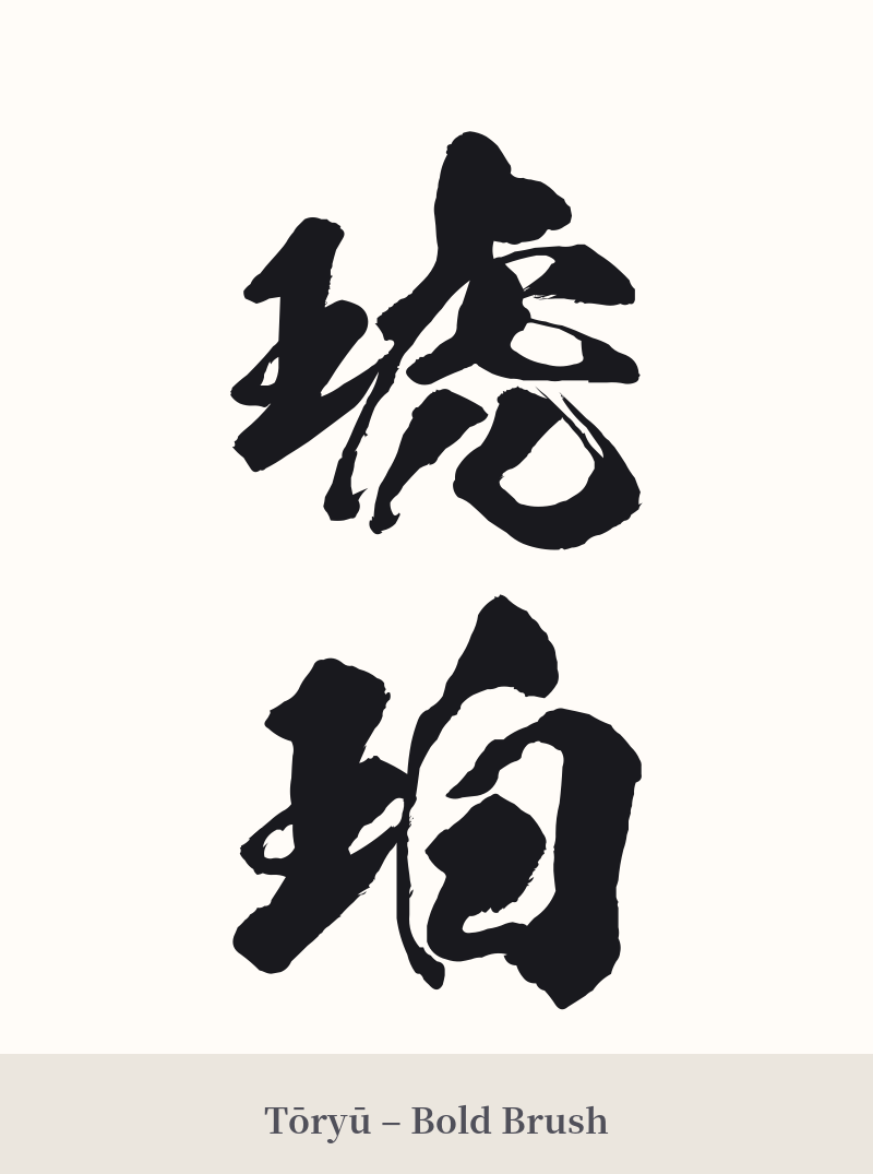
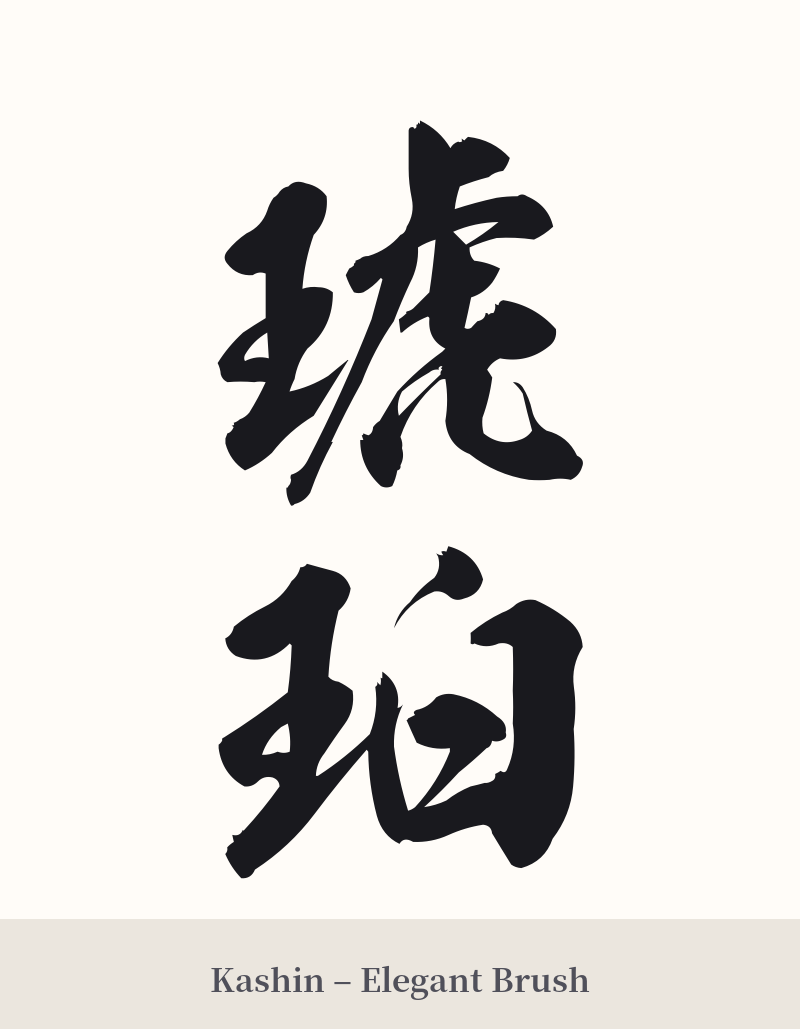
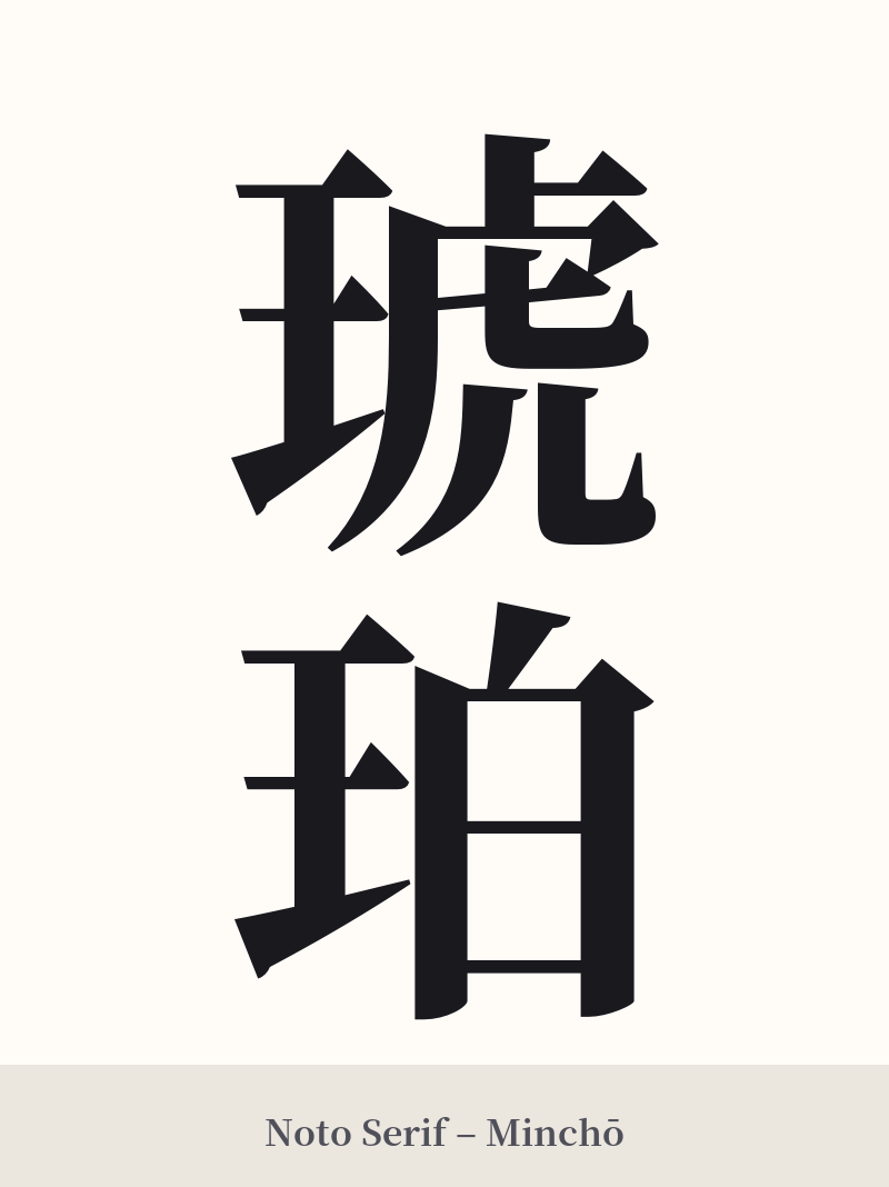
The same kanji can look dramatically different depending on the calligraphy style. Choose a font that matches the mood you want for your tattoo or design.
🎨 Tattoo Suitability
📐 Tattoo Design Guide
The word 琥珀 (Kohaku) offers beautiful visual potential for a tattoo, combining elegance with a touch of natural wonder.
– Placement: Its balanced, two-character structure works well both vertically and horizontally. Vertical placement is classic and looks stunning along the forearm, the spine, or the back of the calf. Horizontally, it fits well on the chest, upper back, or inner bicep.
– Font Style: A semi-cursive script (gyōsho) can capture the fluid, organic origin of amber. For a more formal and crisp look, a standard block script (kaisho) emphasizes the beautiful structure of each character, particularly the 'jewel' radical (王).
– Visual Tips: Consider incorporating color to enhance the meaning. Washes of golden yellow, orange, and warm brown behind or within the kanji can evoke the look of amber. Another powerful idea is to pair the kanji with imagery of a Kohaku koi fish, creating a design rich in symbolism and visual harmony.
Comments