✍️ 里 (Sato) — Cultural Context
The kanji 里 (sato) is a character steeped in nostalgia and a deep sense of belonging. While its most direct translation is 'village' or 'hamlet,' its true essence is captured in the word 'hometown'—not just a place on a map, but the place where one's heart resides.
Visually, the character tells a story of its own. It is a pictograph composed of two distinct elements: 田 (ta) on top, meaning 'rice field,' and 土 (tsuchi) on the bottom, meaning 'earth' or 'soil.' Together, they paint a vivid picture of an agrarian community, a settlement built upon the very earth that sustains it through farming. This origin anchors the kanji in the fundamental realities of life and community in ancient Japan.
In modern Japanese culture, 里 evokes a powerful concept known as 故郷 (furusato), which translates to 'old village' or 'native place.' Furusato isn't just about the physical location of one's birth; it represents a more profound, often idealized, connection to one's roots. It's the scent of the air after rain, the taste of a local specialty, the sound of a festival, and the warmth of family. For many Japanese people living in sprawling metropolises, the idea of their 'sato' is a comforting anchor to a simpler, more authentic past.
This is distinct from the more administrative term 村 (mura), which also means 'village.' While 'mura' refers to a political or geographical unit, 'sato' carries the emotional weight of home. You live in a 'mura,' but your heart longs for your 'sato.'
Furthermore, the concept of 里山 (satoyama) illustrates the Japanese ideal of harmony between humanity and nature. Satoyama refers to the managed woodlands and landscapes that border the 'sato,' where villagers would forage, gather firewood, and coexist with the natural world. This image reinforces 里 as a place of balance, sustainability, and deep connection not just to people, but to the land itself.
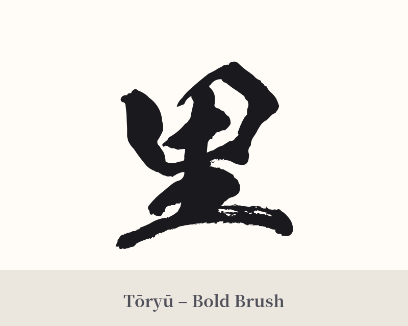
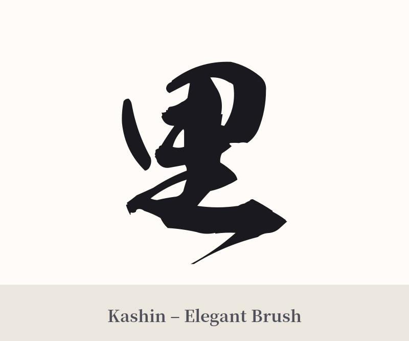
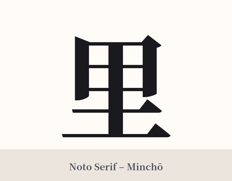
🖌️ Font Styles for 里
The same kanji can look dramatically different depending on the calligraphy style. Choose a font that matches the mood you want for your tattoo or design.
🎨 Tattoo Suitability
📐 Tattoo Design Guide
The kanji 里 (sato) is beautifully understated, making it suitable for a variety of designs that emphasize personal meaning over flashy visuals.
– Placement: Because of its personal and grounding nature, consider places that are more for you than for others. The inner wrist, ankle, behind the ear, or over the heart are all excellent choices. It can serve as a quiet, personal reminder of your roots.
– Font Style: A simple, clean Mincho (serif) font would highlight its balanced structure. For a more organic and emotional feel, a soft, flowing Gyosho (semi-cursive) or Sosho (cursive) calligraphy style would work beautifully, evoking a sense of nostalgia and warmth.
– Visual Tips: This kanji stands strong on its own. Avoid cluttering it with other elements. If you do want to add something, consider a subtle, minimalist element like a single cherry blossom petal or a simple enso circle to frame it, reinforcing themes of nature and cyclical return.
Comments