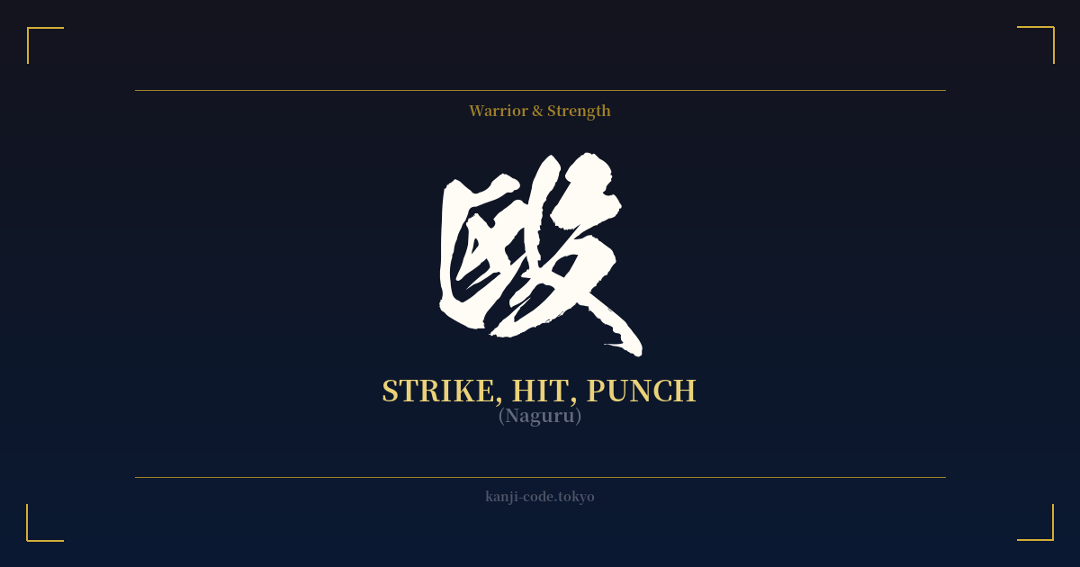
✍️ 殴 (Naguru) — Cultural Context
The kanji 殴, read as 'naguru,' is one of the most direct and unambiguous characters in the Japanese language. Its meaning is simple and visceral: to strike, to hit, or to punch. There is little room for poetic interpretation here; this character represents a raw, physical act of violence.
To understand its forceful nature, we can look at its components. The character is a combination of 区 (ku) on the left and 殳 (shu) on the right. While 区 is now commonly known as 'ward' or 'district,' its ancient form depicted a hidden or enclosed space. The right-side radical, 殳, is a pictograph of a long-handled weapon, similar to a halberd or a club. Together, they create a powerful image: taking a weapon (殳) to someone in a confined area (区), implying a direct and inescapable assault. This etymology strips away any pretense of elegance and gets straight to the point of blunt force.
In modern Japanese, 殴 is the go-to character for describing a fistfight or physical assault. You will see it in news reports about crime, such as 殴打事件 (ōda jiken – assault case), or in manga when characters engage in a brawl, often described as a 殴り合い (naguriai – a fistfight, a slugfest). It is not the character a martial artist would use to describe their disciplined technique. A trained punch in karate, for instance, would be described using terms like 拳 (ken – fist) or 突き (tsuki – thrust).
This distinction is crucial. While other kanji related to fighting, like 闘 (tō – battle) or 戦 (sen – war), can carry connotations of struggle, strategy, or a noble cause, 殴 almost never does. It signifies brute, often uncontrolled, force. It's the verb for brawling in a street fight, not the disciplined strike of a warrior. Using it is like choosing the word 'bludgeon' over 'strike'—it carries a heavy, negative weight.
Because of this, the character 殴 occupies a specific, somewhat dark space in the Japanese lexicon. It is a word of action, not philosophy. It lacks the aspirational qualities of kanji like 忍 (nin – perseverance) or 義 (gi – righteousness). It is pure, unadulterated aggression, a fact that should be heavily considered by anyone thinking of it as a personal emblem.
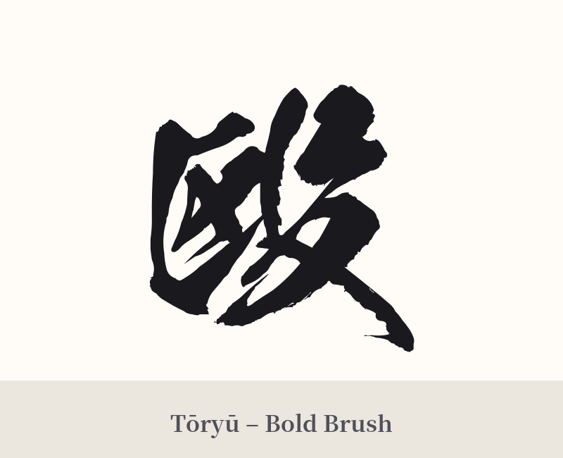
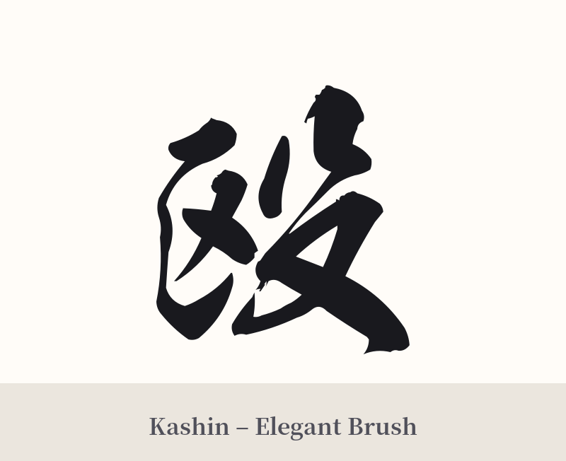
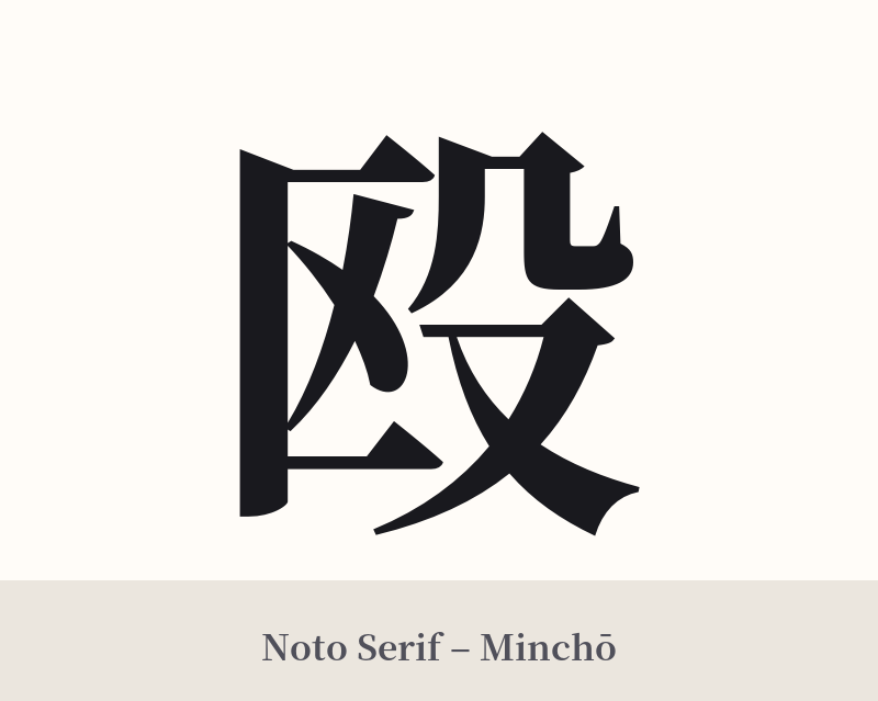
🖌️ Font Styles for 殴
The same kanji can look dramatically different depending on the calligraphy style. Choose a font that matches the mood you want for your tattoo or design.
🎨 Tattoo Suitability
📐 Tattoo Design Guide
Given its direct and aggressive meaning, designing a tattoo with 殴 requires careful consideration. The style should match its raw energy.
– Placement: This kanji makes a very bold statement. Placing it on highly visible areas like the forearm, knuckles, or neck will amplify its aggressive message. A more discreet location might be possible, but it doesn't change the confrontational nature of the character itself.
– Font Style: A thick, powerful brushstroke is most appropriate. A dynamic semi-cursive (gyosho) or a heavy, solid block script (kaisho) would effectively convey its force. Delicate or ornate styles would create a confusing visual contradiction with the kanji's blunt meaning.
– Visual Tips: As a standalone character, 殴 can feel incomplete and stark. It functions as a verb, 'to hit,' which can be awkward on its own. It might be better integrated into a larger, more complex design, such as a scene depicting a mythological battle or a dynamic action sequence. However, even in a larger piece, its presence signifies raw violence, not disciplined combat.
Comments