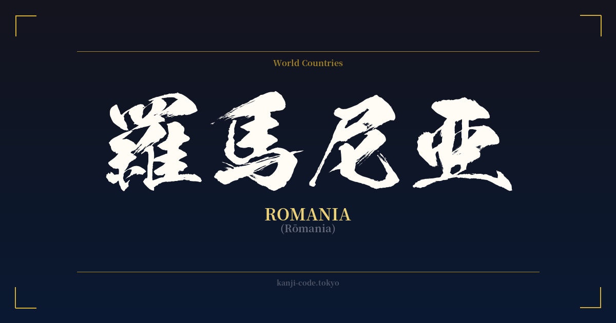
✍️ 羅馬尼亜 (Rumania) — Contexto cultural
La palabra 羅馬尼亜 es una fascinante ventana a una época pasada del idioma japonés. Representa una práctica conocida como 'ateji' (当て字), donde se utilizan caracteres kanji para transcribir fonéticamente palabras extranjeras. Antes de la adopción generalizada del alfabeto katakana para los préstamos lingüísticos, este era el método principal para escribir nombres de personas, lugares y conceptos de fuera de Japón.
En este caso, los caracteres fueron elegidos para aproximarse al sonido de 'Rumania': – 羅 (Ro) – 馬 (Ma) – 尼 (Ni) – 亜 (A)
Fundamentalmente, los significados individuales de estos kanji —'gasa/seda fina', 'caballo', 'monja' y 'Asia'— se ignoran por completo. Su selección se basa únicamente en sus valores fonéticos. Este es un concepto vital que hay que comprender, ya que muchos hablantes no japoneses creen erróneamente que los compuestos ateji encierran un significado poético secreto derivado de la suma de sus partes. En realidad, los significados son irrelevantes; solo importa el sonido.
Hoy en día, el uso de 羅馬尼亜 se considera arcaico y ha sido reemplazado casi por completo por la escritura katakana moderna, ルーマニア (Rūmania). Aún es posible encontrar estas grafías kanji para países en textos históricos, documentos formales o en nombres de empresas y productos que buscan un aire clásico y tradicional. Por ejemplo, otros países tienen ateji similares, como 亜米利加 (Amerika) para Estados Unidos, 仏蘭西 (Furansu) para Francia y 独逸 (Doitsu) para Alemania.
Comprender el alfabeto japonés (羅馬尼亜) no se trata tanto de comprender Rumania, sino más bien de comprender la flexibilidad y la evolución histórica del sistema de escritura japonés. Es un artefacto lingüístico, un testimonio de los esfuerzos de Japón por incorporar elementos del mundo exterior a su propia escritura, antes de que se estandarizaran las convenciones modernas.
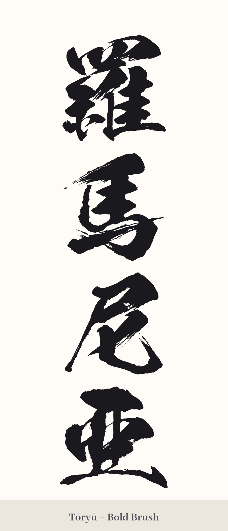
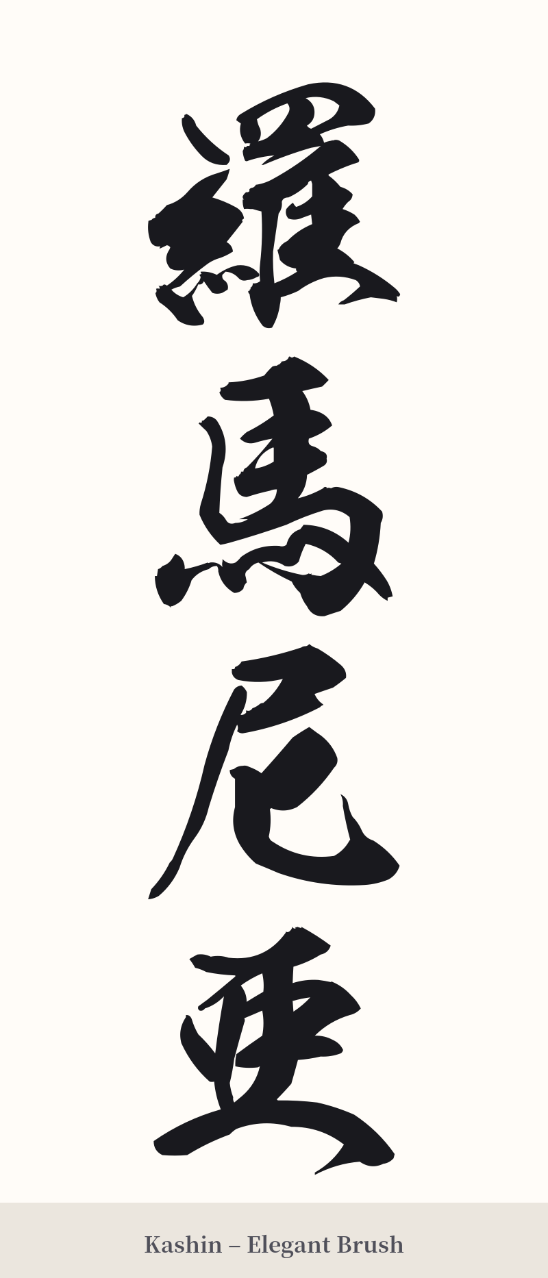
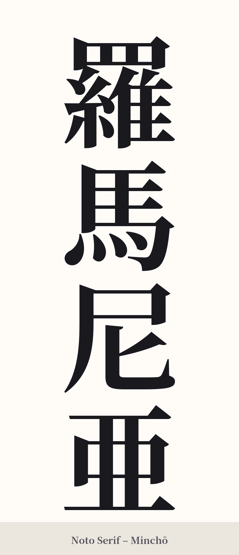
🖌️ Estilos de fuente para 羅馬尼亜
Los mismos caracteres kanji pueden verse muy diferentes según el estilo de caligrafía. Elige una fuente que se ajuste al ambiente que deseas para tu tatuaje o diseño.
🎨 Idoneidad para tatuajes
📐 Guía de diseño de tatuajes
Para un tatuaje de 羅馬尼亜, la longitud de los cuatro caracteres influye mucho en las opciones de diseño. Es especialmente adecuado para arreglos verticales.
– Ubicación: Una columna vertical de caracteres luciría impactante a lo largo de la columna vertebral, el antebrazo o la pantorrilla. Para una disposición horizontal, el pecho o la parte superior de la espalda ofrecen un espacio lo suficientemente amplio para que los caracteres sean claros y legibles.
– Estilo de fuente: Los estilos caligráficos tradicionales son los más adecuados. Una fuente Kaisho (de imprenta) nítida y formal resaltaría la complejidad de cada carácter, especialmente el 羅 de 19 trazos. Como alternativa, una fuente Gyosho (semicursiva) ligeramente más fluida podría unir los caracteres con una sensación de movimiento y elegancia.
Consejos visuales: El tamaño del tatuaje debe ser el adecuado. El primer carácter, 羅, es muy denso. Si se tatúa demasiado pequeño, sus intrincadas líneas podrían difuminarse con el tiempo, convirtiéndose en una mancha ilegible. Asegúrate de que tu tatuador tenga experiencia con kanji complejos para mantener el equilibrio y el espacio negativo dentro de cada carácter.
Comentarios