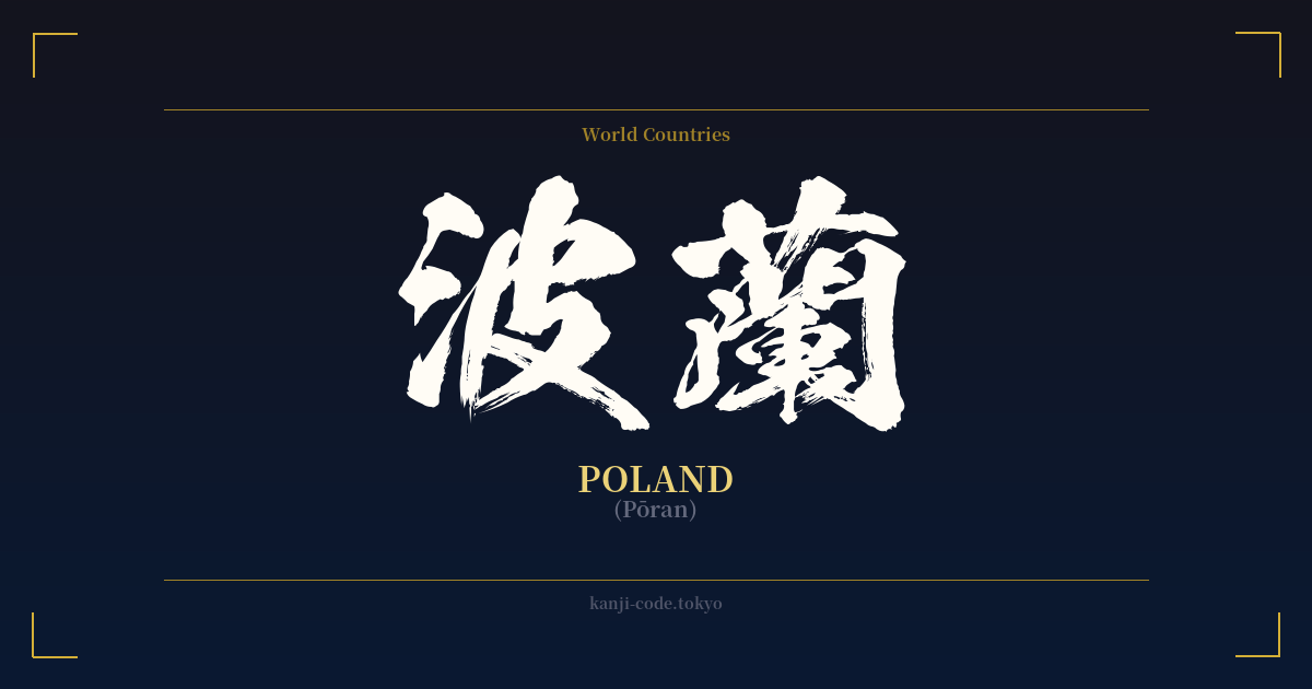
✍️ 波蘭 (Pōran) — Contexto cultural
El compuesto kanji 波蘭 (Pōran) ofrece una fascinante perspectiva de un período específico de la historia japonesa. Representa a Polonia, pero no por su significado, sino por su sonido. Esta práctica, conocida como 'ateji' (当て字), consiste en seleccionar caracteres kanji por sus valores fonéticos para aproximar el sonido de una palabra extranjera, a menudo sin tener en cuenta su significado original.
Este método fue particularmente común durante la Restauración Meiji (1868-1912), una época en la que Japón se abrió rápidamente a Occidente y necesitó incorporar una gran cantidad de nuevas palabras y conceptos. Países, términos científicos y objetos extranjeros recibieron estas ingeniosas grafías en kanji. Por ejemplo, Francia se convirtió en 仏蘭西 (Furansu) y América en 亜米利加 (Amerika). De esta tradición surgió 波蘭, donde 'Pō' se representa con 波 (ola) y 'ran' con 蘭 (orquídea).
Si bien los significados individuales de 'ola' y 'orquídea' no tienen una conexión directa con Polonia, su elección no es del todo aleatoria. Los caracteres escogidos para los ateji solían ser elegantes o tener una connotación positiva, lo que confería un aire de distinción al nombre extranjero. 蘭 (orquídea), en particular, es un carácter sofisticado y muy apreciado.
En el Japón contemporáneo, esta práctica ha sido casi completamente reemplazada por el uso del alfabeto fonético Katakana. Hoy en día, Polonia se escribe como ポーランド (Pōrando). El kanji 波蘭 se considera ahora histórico, literario o incluso arcaico. Puede encontrarse en textos antiguos, documentos históricos o como un adorno clásico deliberado, pero no se usa en la vida cotidiana.
A pesar de ello, la conexión entre Japón y Polonia tiene su propia historia singular, desde la ayuda japonesa a los huérfanos polacos de Siberia tras la Primera Guerra Mundial hasta la mutua apreciación por el arte y la cultura. Para alguien de ascendencia polaca, el 波蘭 puede ser una forma singular, aunque poco convencional, de representar su herencia a través de la perspectiva de la historia lingüística japonesa.
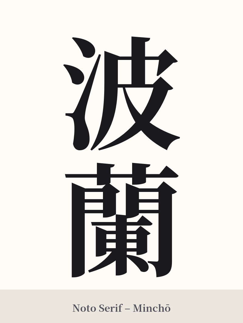
🖌️ Estilos de fuente para 波蘭
Los mismos caracteres kanji pueden verse muy diferentes según el estilo de caligrafía. Elige una fuente que se ajuste al ambiente que deseas para tu tatuaje o diseño.


🎨 Idoneidad para tatuajes
📐 Guía de diseño de tatuajes
Dada la naturaleza histórica y específica de 波蘭, el diseño debe abordarse con cuidado para respetar su contexto.
– Ubicación: Esta palabra se beneficia de una ubicación que permita una buena visibilidad, especialmente para el carácter 蘭, que es muy detallado. Considere el antebrazo, la pantorrilla o la parte superior de la espalda. Evite zonas pequeñas o estrechas como la muñeca, ya que los 19 trazos de 蘭 pueden difuminarse con el tiempo.
Estilo: Lo más apropiado es un estilo caligráfico tradicional. Una letra 'Kaisho' (de imprenta) formal luciría imponente, mientras que una 'Gyosho' semicursiva añadiría un toque elegante y fluido que complementa el carácter ondulado de la palabra. Evite las fuentes modernas, geométricas o minimalistas, ya que desentonarían con el carácter histórico de la palabra.
Consejos visuales: Se recomienda encarecidamente la orientación vertical, ya que refleja la escritura tradicional de Asia Oriental y luce especialmente equilibrada con estos dos caracteres. También se puede considerar combinar el kanji con un símbolo visual de Polonia, como un águila blanca estilizada o una amapola, para proporcionar contexto y conectar visualmente ambas culturas.
Comentarios