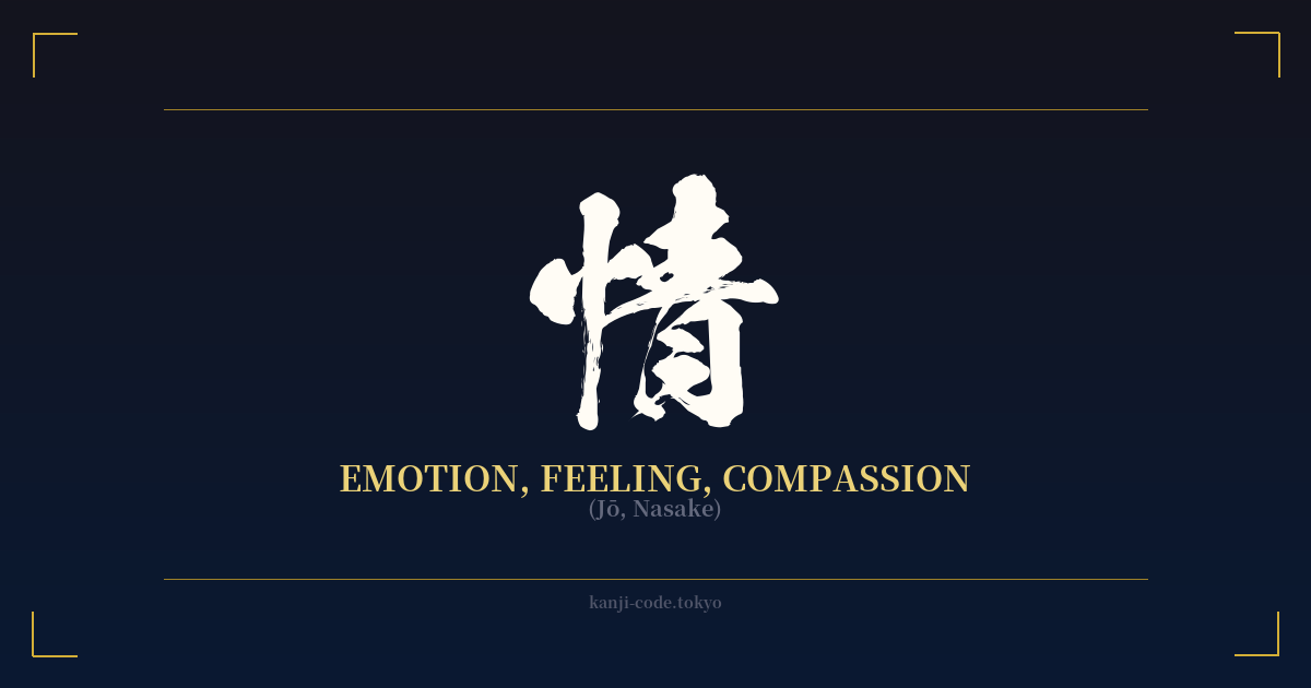
✍️ 情 (Jō, Nasake) — Cultural Context
情 (jō) is a kanji that sits at the very heart of the human experience. It encapsulates the entire spectrum of feelings, from the quiet stirrings of affection to the overwhelming waves of passion. Its meaning is not confined to a single emotion but rather represents the capacity to feel itself. This character is a fundamental component in words that define our relationships and inner lives.
The character's structure offers a beautiful visual metaphor. On the left is the radical 心 (kokoro), which means 'heart' or 'mind'. On the right is 青 (ao), meaning 'blue' or 'green', but also carrying connotations of youth, rawness, and purity. Together, they paint a picture of the 'pure state of the heart'—the origin point of all genuine emotion before it is filtered or defined.
In Japanese, 情 forms the basis for countless essential words. 愛情 (aijō) is romantic love, the feeling directed at a partner. 友情 (yūjō) is the bond of friendship. 感情 (kanjō) is the general term for 'emotion' itself. This versatility shows how 情 acts as a foundational element for expressing the nuances of human connection.
One of the most profound cultural concepts tied to this kanji is 人情 (ninjō), which translates to 'human feeling' or 'empathy'. Ninjō represents the natural, spontaneous compassion and kindness that people feel for one another. It is often famously contrasted with 義理 (giri), or 'social obligation'. This dichotomy—the conflict between personal feelings (ninjō) and societal duty (giri)—is a central theme in classic Japanese literature, theater, and film, from samurai dramas to modern stories. It explores the universal struggle between what the heart wants and what society demands.
Even in the stoic world of the samurai, the concept of 情 finds its place. The phrase 武士の情け (bushi no nasake) means 'the mercy of a warrior'. It speaks to the idea that true strength is not just about martial prowess but also includes the capacity for compassion, even towards an enemy. This highlights that 情 is not a weakness, but an integral part of a complete and honorable human being. Ultimately, 情 is the thread that connects us, the silent language of the heart understood across all boundaries.
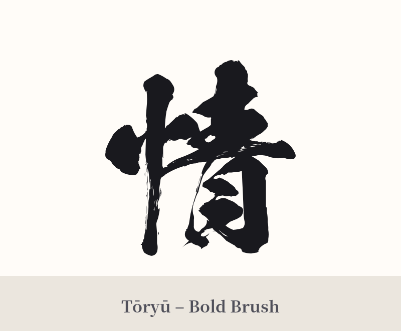
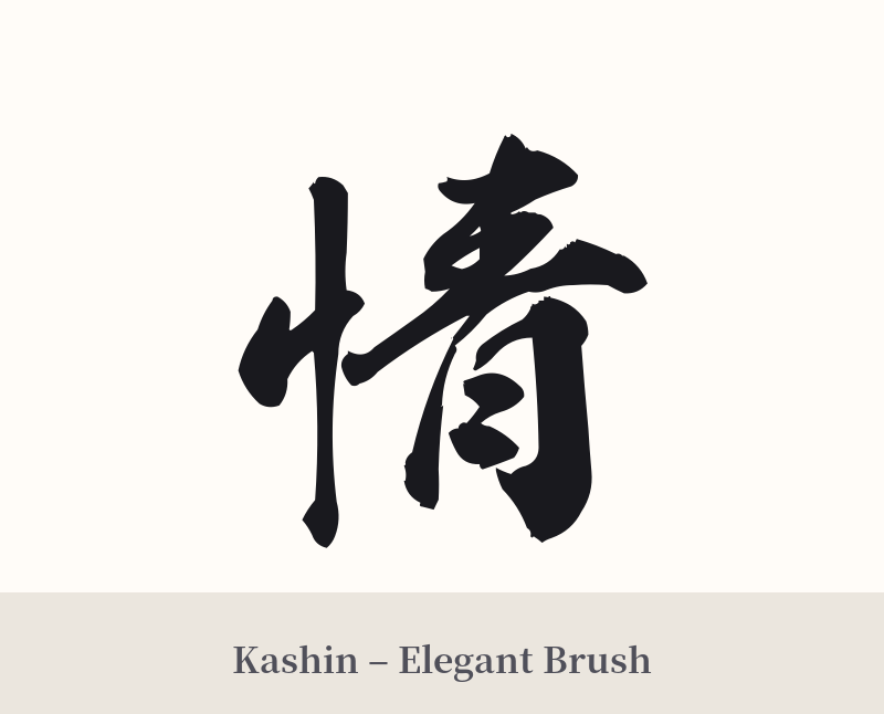
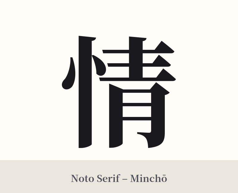
🖌️ Font Styles for 情
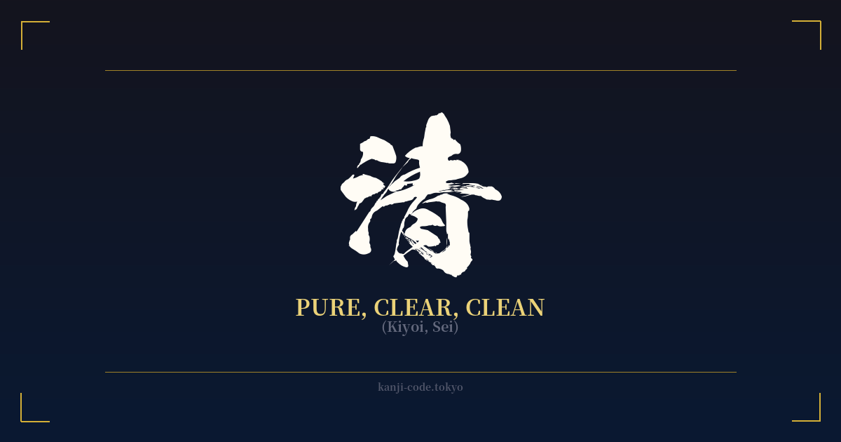
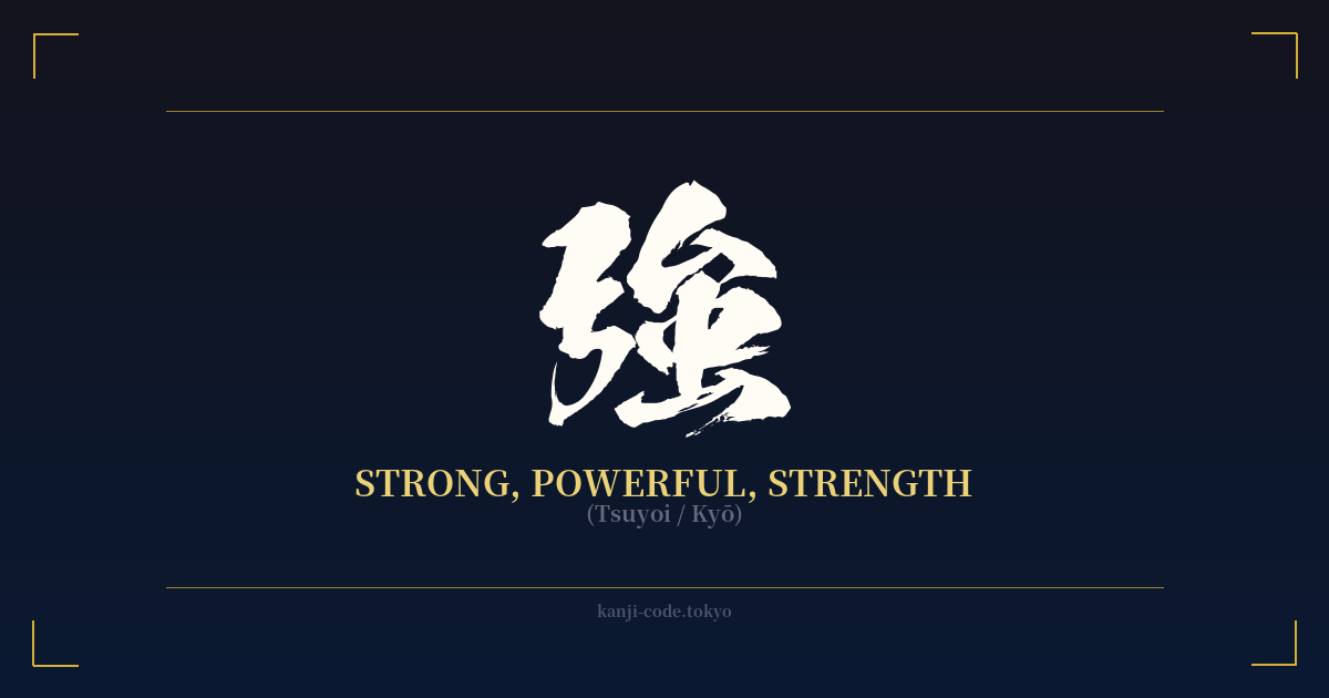
The same kanji can look dramatically different depending on the calligraphy style. Choose a font that matches the mood you want for your tattoo or design.
🎨 Tattoo Suitability
📐 Tattoo Design Guide
A tattoo of 情 works best when the design reflects its deep, personal meaning. Its ambiguity as a standalone character can be an advantage if you embrace its broadness, but it requires thoughtful design.
– Placement: Consider areas that feel personal or are close to the heart, such as the chest, over the ribs, or on the inner bicep. These locations reinforce the idea of an internal, core feeling.
– Font Style: The style can dramatically alter the nuance. A flowing, semi-cursive script (Gyōsho) can emphasize the fluid nature of emotion. A bold, blocky font (Kaisho) might suggest controlled passion or unwavering conviction. A highly abstract cursive (Sōsho) can represent emotion as a pure, almost untranslatable force.
– Visual Tips: To add context without another kanji, consider pairing it with a subtle visual element. A single falling leaf could represent melancholy (風情), while a small, simple heart could clarify the 'feeling' aspect. Keeping the character itself as the main focus is key; any additions should be minimal and supportive.
Comments