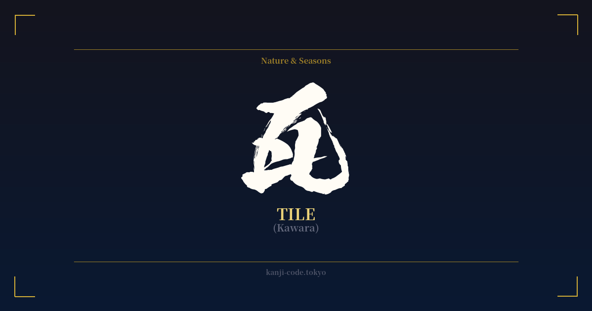
✍️ 瓦 (Kawara) — Cultural Context
The kanji 瓦 (kawara) refers to the iconic clay roof tiles that define much of Japan's traditional architectural landscape. Far from being a simple building material, kawara are deeply embedded in the nation's cultural and aesthetic identity. When you picture a Japanese castle, a serene temple, or an old-fashioned home, you are likely imagining its distinctive, gracefully curved roof made of these tiles.
Historically, kawara were introduced to Japan from China via Korea in the 6th century, initially used for Buddhist temples. Their use signified status, wealth, and importance, as they were more durable and fire-resistant than the thatch or wood shingles used previously. Over centuries, their production became an art form, with master craftsmen (shokunin) dedicating their lives to perfecting the shape, color, and texture of the tiles.
Beyond their practical function of providing shelter from Japan's harsh weather—from sweltering summers to heavy snow and typhoons—kawara hold significant symbolic weight. They represent protection, durability, and the continuity of tradition. A tiled roof is a shield for the family or community beneath it. This protective aspect is most powerfully embodied in the 'onigawara' (鬼瓦), or 'ogre tile,' an ornamental tile placed at the ends of the main roof ridge. These fearsome-looking tiles act as spiritual guardians, warding off evil spirits and misfortune.
The character itself reflects a sense of structure and groundedness. Its simple, balanced form evokes the feeling of something well-made and reliable. In martial arts, the practice of 'kawara-wari' (瓦割り), or tile breaking, is a dramatic demonstration of focus, power, and the ability to overcome physical barriers. This adds another layer of meaning related to strength and breaking through limitations.
Today, the sight of a moss-covered kawara roof can evoke a sense of 'wabi-sabi'—the Japanese aesthetic of finding beauty in imperfection and transience. The aged, weathered tile tells a story of endurance, standing as a quiet testament to the passage of time and the resilience of Japanese culture.
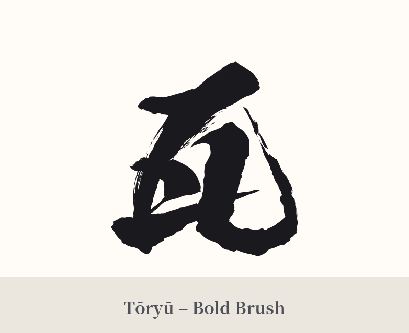
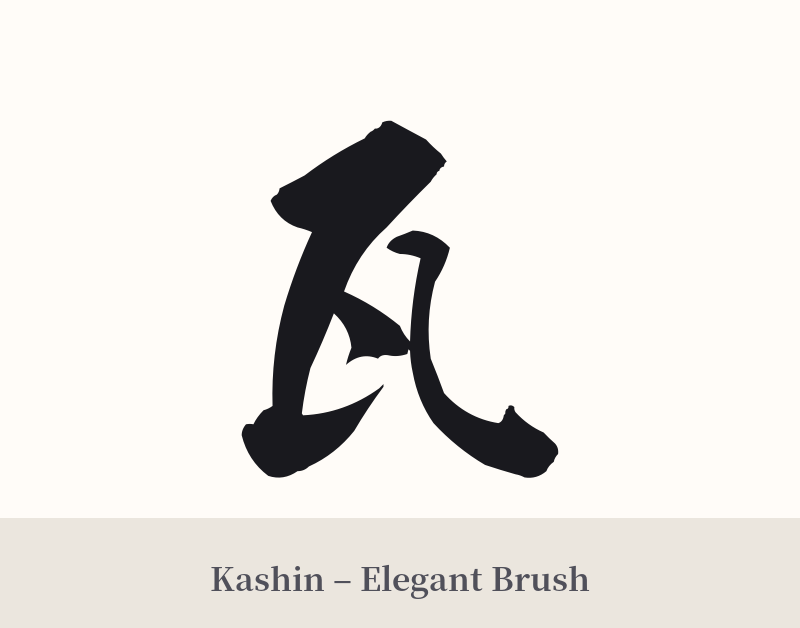
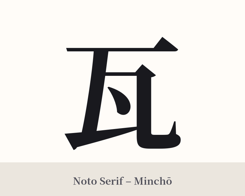
🖌️ Font Styles for 瓦
The same kanji can look dramatically different depending on the calligraphy style. Choose a font that matches the mood you want for your tattoo or design.
🎨 Tattoo Suitability
📐 Tattoo Design Guide
The kanji 瓦 has a clean, architectural quality that lends itself well to various tattoo designs.
– Placement: Its balanced, squarish shape works well as a standalone piece on the forearm, calf, back of the neck, or shoulder blade. It can also be integrated into a larger composition.
– Font Style: A bold, crisp Kaisho (block) script emphasizes its structural integrity and solid nature. For a softer look, a Gyosho (semi-cursive) style can mimic the flowing lines of a tiled roof or the movement of water over the tiles.
– Visual Tips: To add context and deepen the meaning, consider pairing 瓦 with other Japanese motifs. It could be placed above a koi fish swimming, behind a branch of cherry blossoms, or as part of a small, stylized temple roofline. For a more powerful and protective design, consider tattooing an 'Onigawara' (ogre tile) face with the 瓦 kanji incorporated nearby.
Comments