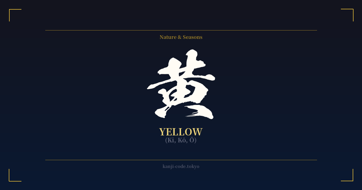
✍️ 黄 (Ki, Kō, Ō) — Cultural Context
The kanji 黄 (ki) is far more than just the name of a color; it is a character deeply embedded in the foundational philosophies and history of Japan. Its origins are debated, with some ancient forms suggesting a pictograph of an arrow fletched and ready, while others see the shape of a person adorned with jade. A prevalent theory connects it to agriculture, depicting a fire (a common component in other characters) beneath a field, symbolizing the golden light over ripening grain.
This connection to the earth is codified in the Chinese Five Elements system (五行, Gogyō), which heavily influenced Japanese thought. In this philosophy, yellow is the color of the Earth element (土) and represents the center, the point of balance and stability from which all other elements spring. As such, 黄 embodies concepts of nourishment, reliability, and the foundational core of existence. It is the color of the fertile soil that sustains life.
Historically, this central importance translated into imperial authority. Golden-yellow, or 黄金色 (koganeiro), was a color reserved for the Emperor of Japan, a figure considered a divine descendant of the sun goddess Amaterasu. The Chrysanthemum Throne, the very symbol of the monarchy, and the Imperial Seal of Japan are both represented by a golden-yellow chrysanthemum. To wear this color was to align oneself with divine power and the sun itself.
This noble association directly counters any Western notion of yellow implying cowardice. In Japanese history, yellow signifies bravery. During the historic Genpei War (1180-1185), the Minamoto clan, who would go on to establish the first shogunate, famously flew yellow flags in battle. This act cemented yellow as a color of martial courage and victory in the Japanese cultural psyche.
Today, the character appears in everyday life, from the yellow traffic light (黄色信号, kiiro shingō) to the brilliant yellow of autumn gingko leaves and spring canola flowers. It retains its sacred and powerful connotations while also being a simple, vibrant part of the natural world, representing a beautiful balance of the epic and the everyday.
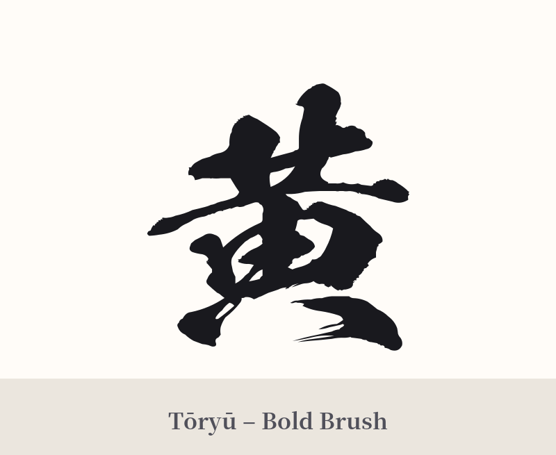
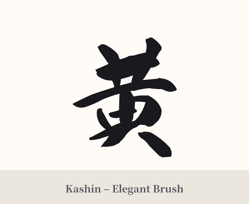
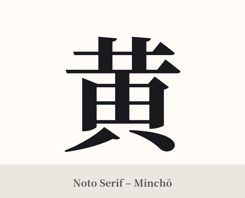
🖌️ Font Styles for 黄
The same kanji can look dramatically different depending on the calligraphy style. Choose a font that matches the mood you want for your tattoo or design.
🎨 Tattoo Suitability
📐 Tattoo Design Guide
The kanji 黄 has a strong, balanced structure that works well for a tattoo. Its visual weight is centered, making it suitable for various placements.
– Placement: Consider areas like the inner forearm, the calf, or the back of the neck where the character can stand alone as a point of focus. It also works well on the chest or as a central piece on the back, tying into its meaning as 'the center'.
– Font Style: A bold, traditional Kaisho (block) script will emphasize its foundational, earthy qualities. For a more dynamic feel, a semi-cursive Gyōsho style can evoke the feeling of light or flowing energy. Avoid overly thin or complex fonts that might obscure the character's distinct strokes.
– Visual Tips: To enhance its meaning, consider incorporating it into a larger design. Placing 黄 inside an Ensō (Zen circle) reinforces the concepts of the universe and the 'center'. Pairing it with a chrysanthemum or a sun motif can highlight its imperial and divine connections. Using gold or yellow ink is a literal interpretation but can be visually effective if done by a skilled artist.
Comments