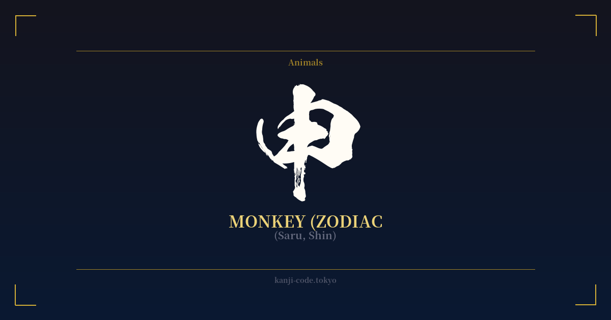
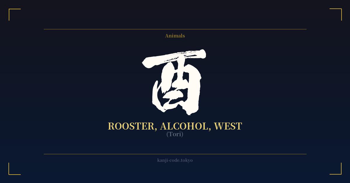
✍️ 申 (Saru, Shin) — Cultural Context
The kanji 申 is a character with a fascinating dual identity, rooted in nature and celestial observation. Its story begins not with an animal, but with a powerful natural phenomenon: lightning. The ancient pictograph for 申 depicts a zigzagging line, representing a bolt of lightning stretching from the heavens to the earth. This origin imbues the character with a primal energy, a sense of divine communication or a sudden, brilliant flash of insight.
From this concept of a divine message, 申 evolved to carry the meaning of "to state," "to express," or "to report." This is seen in the formal verb 申す (mōsu), a humble way of saying "to speak" or "to be called." You'll find this root in modern Japanese words like 申請 (shinsei), meaning "application," and 申告 (shinkoku), meaning "declaration." In these contexts, 申 signifies a formal act of communication, a clear statement made for the record.
However, in contemporary Japan, the most prominent meaning of 申 is its role as the ninth sign of the twelve Earthly Branches (十二支, Jūnishi), the Japanese zodiac. It represents the Year of the Monkey. Those born under this sign are often characterized as being intelligent, witty, curious, and inventive. Like their animal namesake, they are seen as playful, energetic, and sometimes mischievous problem-solvers. This zodiacal connection is by far its most recognized use today.
It is crucial to understand the distinction between 申 (saru) and the kanji 猿 (saru). While they can share the same pronunciation, 猿 is the character for the literal, physical monkey—the animal you would see in a zoo or in the wild. 申, on the other hand, is the abstract, calendrical, and symbolic representation of the monkey within the zodiac system. Choosing between them for a design depends entirely on intent: 申 is for the zodiac sign and its associated traits, while 猿 is for the animal itself. This nuance is key to using the character correctly and avoiding misunderstanding.
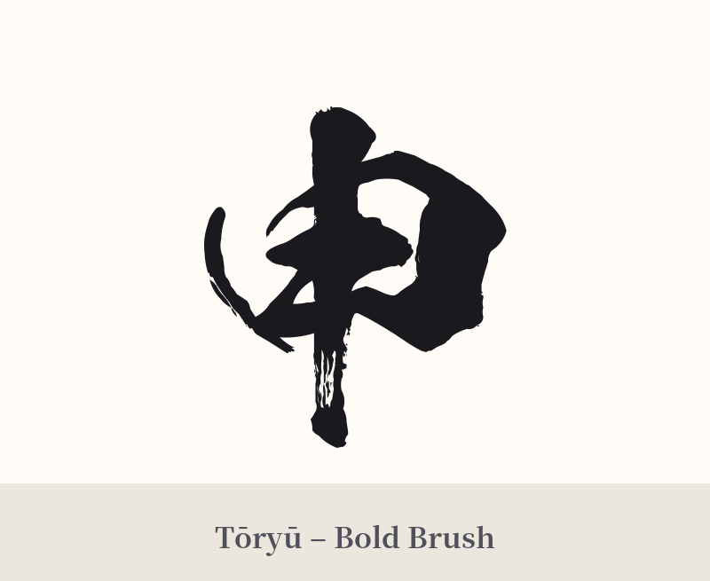
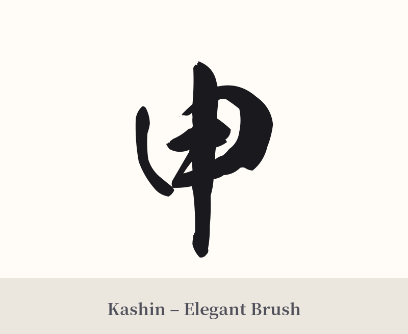
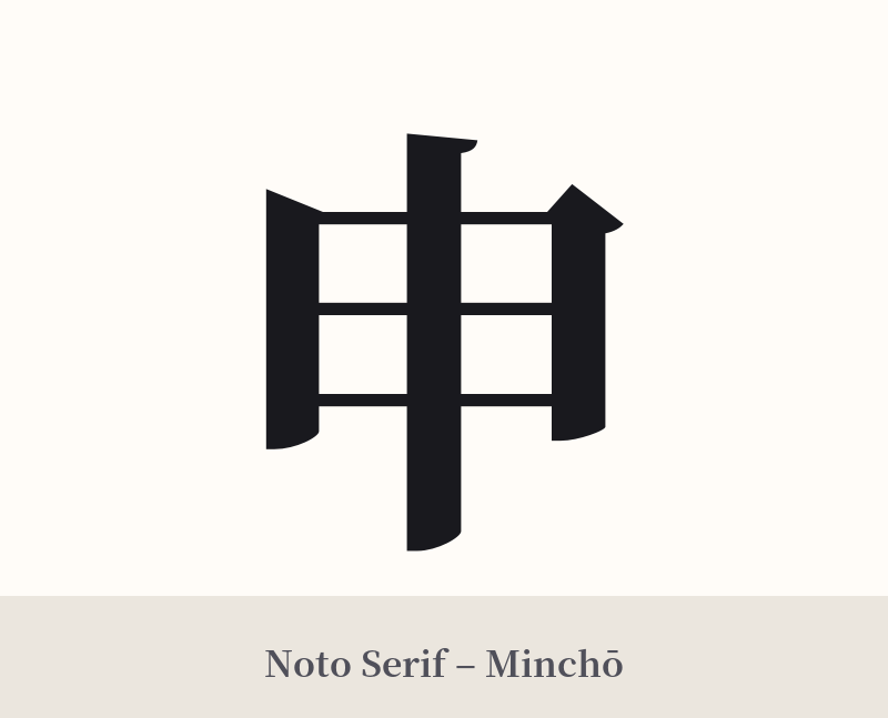
🖌️ Font Styles for 申
The same kanji can look dramatically different depending on the calligraphy style. Choose a font that matches the mood you want for your tattoo or design.
🎨 Tattoo Suitability
📐 Tattoo Design Guide
The kanji 申 has a clean, symmetrical, and powerful design that works well for tattoos. Its simplicity makes it versatile for various placements and styles.
– Placement: Due to its vertical and compact nature, 申 is excellent for smaller areas like the wrist, ankle, or behind the ear. It also looks striking on the forearm, bicep, or calf, where it can be scaled up without losing clarity.
– Font Style: A bold, angular Kaisho (block) script will emphasize its ancient, lightning-bolt origins, giving it a sense of power and stability. For a more dynamic feel, a semi-cursive Gyosho or fully-cursive Sosho script can evoke the playful and energetic nature of the monkey.
– Visual Tips: Consider pairing 申 with its corresponding zodiac symbol, a stylized monkey, to clarify its meaning. It could also be incorporated into a larger design with other zodiac animals or with abstract elements that hint at its lightning origin, like sharp, energetic lines.
Comments