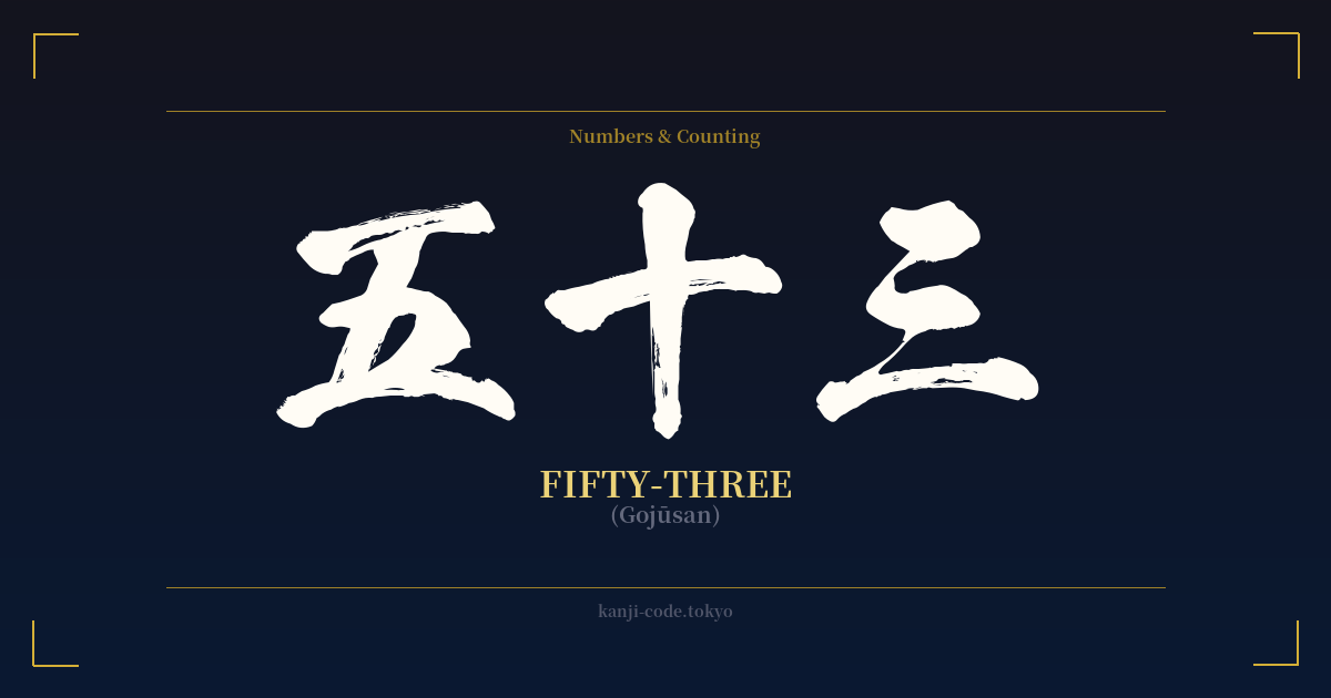
✍️ 五十三 (Gojūsan) — Cultural Context
At first glance, 五十三 (Gojūsan) is simply the Japanese word for the number fifty-three. It is constructed logically: 五 (go) for five, 十 (jū) for ten, and 三 (san) for three, combining to mean 'five tens plus three.' While numerically straightforward, its cultural weight in Japan is immense, primarily due to one of the most famous journeys in the nation's history: The Fifty-three Stations of the Tōkaidō.
The Tōkaidō, or 'Eastern Sea Road,' was the most important of the five major routes established during the Edo Period (1603-1868). This bustling highway connected the shogun's administrative capital, Edo (modern-day Tokyo), with the imperial capital, Kyoto. It was a lifeline for trade, communication, and travel, traversed by everyone from powerful daimyō lords with their retinues to humble merchants, monks, and pilgrims.
Along this approximately 500-kilometer route were 53 designated post stations, or 'shukuba.' These towns provided travelers with essential services like lodging, food, fresh horses, and a place to rest. Each station had its own unique character, local delicacies, and scenic views, making the long journey a series of distinct experiences rather than a monotonous trek.
The number 53 was forever immortalized in Japanese art and collective memory by the ukiyo-e artist Utagawa Hiroshige. His iconic woodblock print series, 'The Fifty-three Stations of the Tōkaidō' (東海道五十三次, Tōkaidō Gojūsan-tsugi), published in the 1830s, became an instant sensation. Hiroshige didn't just depict landmarks; he captured the atmosphere of the journey—the changing seasons, the weather, and the daily lives of the people he encountered. His prints made the beauty of the Tōkaidō accessible to everyone and cemented the number 53 as a symbol of this epic journey.
Therefore, 五十三 is far more than a mere number. It evokes a sense of travel, adventure, and a deep connection to Japan's rich history and artistic heritage. It represents a journey not just between two cities, but through the heart of Japanese culture itself, as seen through the eyes of one of its greatest artists.
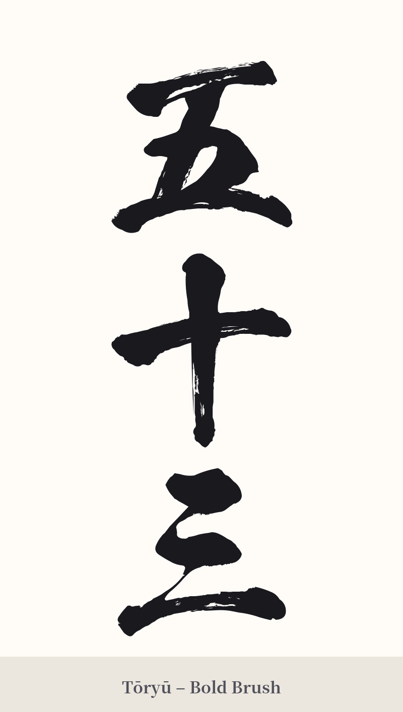
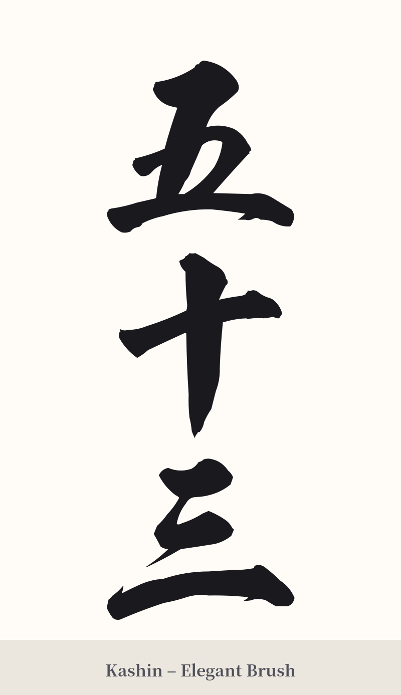
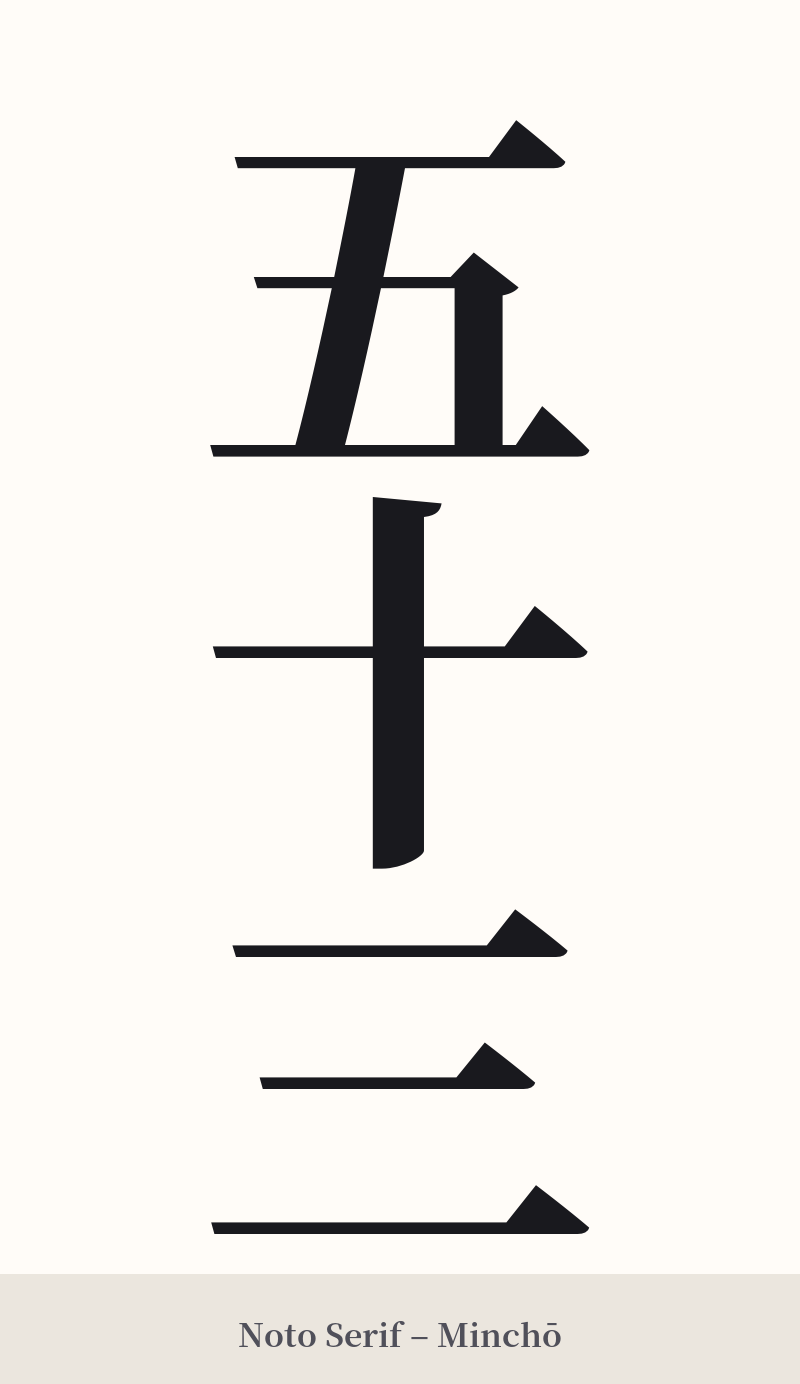
🖌️ Font Styles for 五十三
The same kanji can look dramatically different depending on the calligraphy style. Choose a font that matches the mood you want for your tattoo or design.
🎨 Tattoo Suitability
📐 Tattoo Design Guide
For a tattoo of 五十三, the design choices can greatly enhance its historical meaning. A vertical alignment is highly recommended, as it mirrors traditional Japanese script and fits elegantly along the arm, leg, or spine.
– Font Style: A classic calligraphy script like Gyōsho (semi-cursive) or Kaisho (block script) connects the design to its artistic roots in ukiyo-e and traditional ink work. For a more modern take, a clean Mincho (serif) font can provide a sharp, print-like quality.
– Placement: Vertical placement on the forearm, calf, or beside the spine works exceptionally well. A smaller, horizontal design could be placed on the inner wrist, chest, or behind the ear.
– Visual Tips: To add context and avoid the 'random number' look, consider incorporating a small, related element. This could be a stylized image of a pine tree, a snippet of a wave reminiscent of Hiroshige's art, or even a subtle red seal (hanko) to complete the composition.
Comments