✍️ 二 (Ni, Futa, Futatsu) — Cultural Context
The kanji 二 (ni) is a foundational character in the Japanese writing system, representing the number two. Its origin is a simple pictograph, depicting two horizontal lines used as tally marks for counting. This elegant simplicity, however, conceals a universe of symbolic depth centered on the concept of duality.
In Japanese and broader East Asian philosophy, the number two is not merely a quantity but the very principle of division, opposition, and ultimately, balance. It is the first number to break from the singularity and unity of 一 (ichi, one), introducing the concepts of pairs, partnership, and polarity. This is most famously embodied in the idea of In'yō (陰陽), the Japanese term for Yin and Yang. 二 represents this fundamental pairing of complementary opposites: light and dark, male and female, active and passive, heaven and earth.
This theme of duality permeates Japanese culture. In Shinto, pairs of guardian statues, such as the Komainu (lion-dogs), are often placed at the entrance of shrines, with one having its mouth open and the other closed. This represents the beginning and end, the cycle of life and death, a physical manifestation of the concept embodied by 二.
Furthermore, 二 appears in numerous proverbs and expressions that reveal cultural values. The saying, "二兎を追う者は一兎をも得ず" (nito o ou mono wa itto o mo ezu), which translates to "He who chases two rabbits catches none," warns against dividing one's focus. This highlights a practical wisdom tied to the number, suggesting that while duality is a fundamental principle of the universe, human endeavor often requires singular focus.
Beyond philosophy, 二 is a practical and ubiquitous character used in daily life for counting, dates, and forming countless compound words. From 二人 (futari, two people/a couple) to 二月 (nigatsu, February), its presence is constant. Its simplicity makes it one of the first kanji learned by children and students of Japanese, yet its symbolic resonance ensures it remains a powerful concept throughout one's understanding of the culture. It is the gateway from unity to complexity, the foundation of all pairs and partnerships.
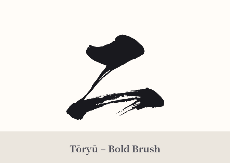
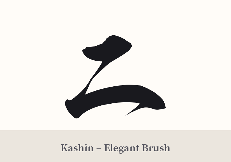
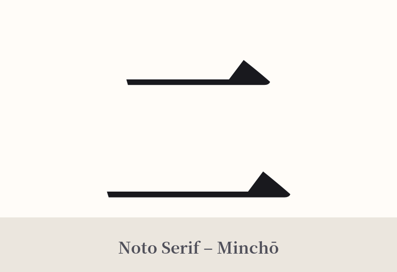
🖌️ Font Styles for 二
The same kanji can look dramatically different depending on the calligraphy style. Choose a font that matches the mood you want for your tattoo or design.
🎨 Tattoo Suitability
📐 Tattoo Design Guide
The stark simplicity of 二 presents a unique design challenge. A standard, blocky font can easily be mistaken for an equals sign. To make it work as a tattoo, the focus must be on style and context.
– Stylistic Choice: An expressive, calligraphic style (shodō) is highly recommended. A skilled artist can use variations in brush pressure, speed, and ink saturation to give the two simple strokes a sense of life, energy, and personality that a plain font lacks.
– Placement Strategy: Due to its minimalist nature, 二 works well in small, discreet locations like the inner wrist, behind the ear, on a finger, or the ankle. This turns its simplicity into a feature of elegance and subtlety.
– Integration: Consider incorporating 二 into a larger piece. The two lines could be formed by other elements, such as two swimming koi fish, the branches of a tree, or the bodies of two dragons. Alternatively, it can be paired with another kanji to form a meaningful word, providing context and visual balance.
Comments