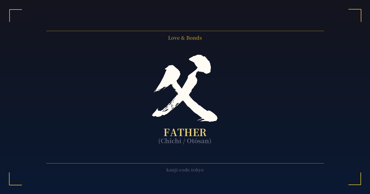
✍️ 父 (Chichi / Otōsan) — Cultural Context
The kanji 父 (chichi) is one of the most fundamental characters in the Japanese language, representing the concept of 'father'. Its origin is a powerful glimpse into ancient societal roles. The character is a pictogram, a simplified drawing of a hand holding an axe or a stone tool. This image powerfully evokes the traditional role of the father as the builder, the protector, and the one who worked to provide for his family.
This single character carries a weight of cultural expectation and history. In Japanese society, influenced by Confucian ideals, the father has historically been seen as the 'daikokubashira' (大黒柱), the central pillar supporting the entire household. This role demanded strength, stoicism, and a deep sense of responsibility for the family's well-being and reputation.
Understanding how to use this kanji is key to appreciating Japanese social dynamics. While 父 is the root character, it's rarely used to address one's father directly. Instead, you would use 'otōsan' (お父さん). The 'o-' prefix and '-san' suffix add layers of respect. Using just 'chichi' (父) is reserved for when you are speaking about your own father to someone outside your family, in a slightly more formal or humble context. For example, 'Watashi no chichi wa…' (私の父は…) means 'My father is…'.
There are other terms as well. 'Oyaji' (親父) is a more colloquial, sometimes gruff term, akin to 'old man' in English. While it can sound disrespectful depending on the tone, it's often used with affection between fathers and sons, conveying a sense of masculine camaraderie and familiarity. This variety of terms illustrates the complex and nuanced nature of family relationships in Japan.
In modern times, the image of the Japanese father is evolving. The post-war 'salaryman' archetype, who was often absent from the home due to long work hours, is slowly giving way to a more involved, hands-on style of fatherhood. Yet, the kanji 父 remains a potent symbol of paternal love, guidance, and the enduring strength that forms the foundation of a family.
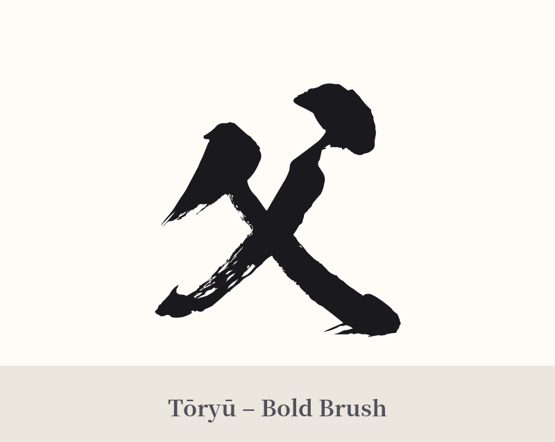
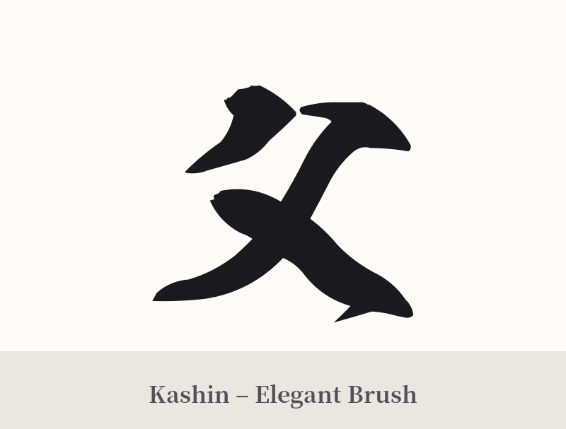
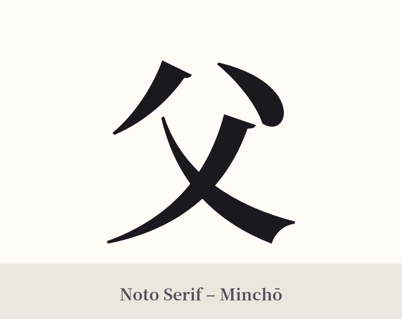
🖌️ Font Styles for 父
The same kanji can look dramatically different depending on the calligraphy style. Choose a font that matches the mood you want for your tattoo or design.
🎨 Tattoo Suitability
📐 Tattoo Design Guide
A tattoo of the kanji 父 is a powerful and personal statement. Its simple, strong structure lends itself to a variety of styles and placements.
– Placement: Consider placing it on the forearm or inner bicep, where it serves as a constant reminder. The chest, over the heart, is another deeply meaningful location. For a more subtle tribute, the back of the shoulder or along the ribs works well.
– Font Style: The character's simplicity shines in a traditional 'Kaisho' (block) script, which emphasizes its stability and strength. For a more dynamic and personal feel, a 'Gyōsho' (semi-cursive) script adds a touch of fluidity and grace. A bold, clean 'Gothic' or sans-serif style can give it a modern, minimalist look.
– Visual Tips: Because 父 is so simple, it stands powerfully on its own. Overly ornate or complex additions can detract from its core meaning. However, it can be beautifully integrated as part of a larger piece, perhaps alongside a child's or father's birthdate, or with a complementary symbol like a dragon for strength or a cherry blossom for the transient beauty of life.
Comments