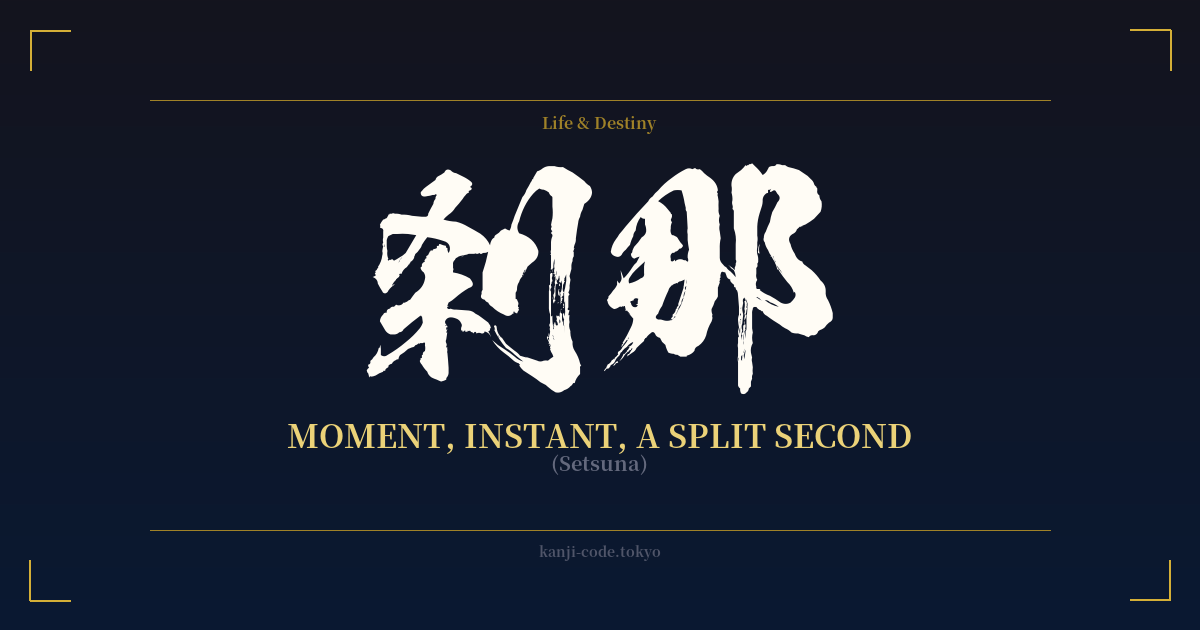
✍️ 刹那 (Setsuna) — Cultural Context
刹那 (Setsuna) is a word that captures a concept far deeper than its simple translation of 'a moment' or 'an instant'. It speaks to a sliver of time so brief it’s almost immeasurable, yet within that split second lies a universe of philosophical weight and poetic beauty.
The term has its origins in Buddhism, imported from the Sanskrit word 'kṣaṇa'. In ancient Indian and Buddhist cosmology, a kṣaṇa was a unit of time, defined as the shortest possible interval. While interpretations vary, one common definition states it is one-seventy-fifth of a second. It represents the fundamental, indivisible particle of time, the very heartbeat of existence.
This concept is intrinsically linked to the core Buddhist teaching of impermanence, or 無常 (mujō). The doctrine posits that all things are in a constant state of flux, arising and ceasing in an endless flow. Each 'setsuna' is a birth and a death. Nothing is permanent. To understand Setsuna is to understand that the universe is being recreated and destroyed in every passing instant.
Because of this, Setsuna carries a powerful call to mindfulness. It reminds us that the present moment is all that truly exists. The past is gone and the future is not yet here, but this single, fleeting instant is real and precious. This idea has profoundly influenced Japanese aesthetics and philosophy, from the tea ceremony to the appreciation of cherry blossoms, which bloom and fall in a brief, beautiful display.
In modern Japanese culture, Setsuna is often used with a poignant, sometimes bittersweet, and romantic nuance. It describes that perfect, transient moment—a shared glance, a sudden realization, the feeling of a summer festival firework exploding in the night sky. It's a word used in literature, song lyrics, and anime to evoke a sense of beautiful, tragic brevity. It is not merely a measurement of time like its synonym 瞬間 (shunkan), but an emotional and philosophical experience of it.
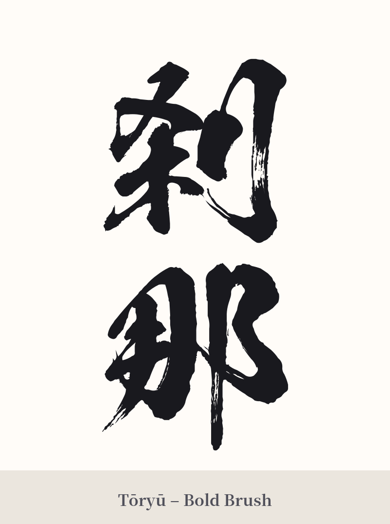
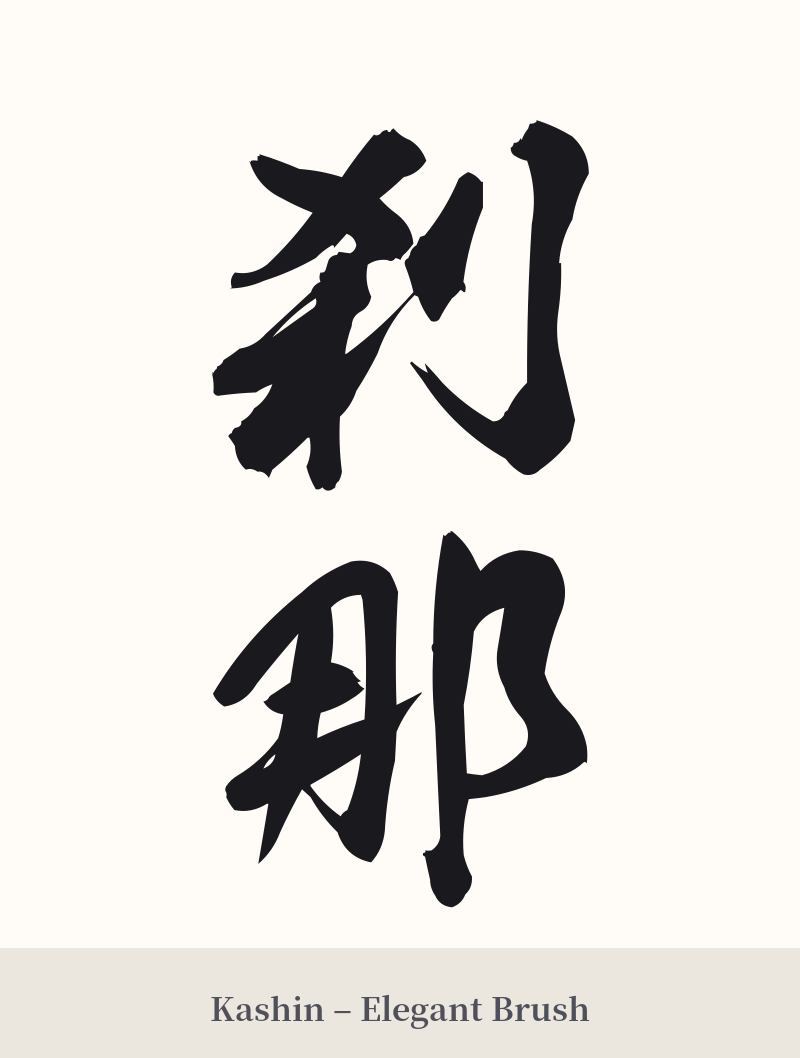
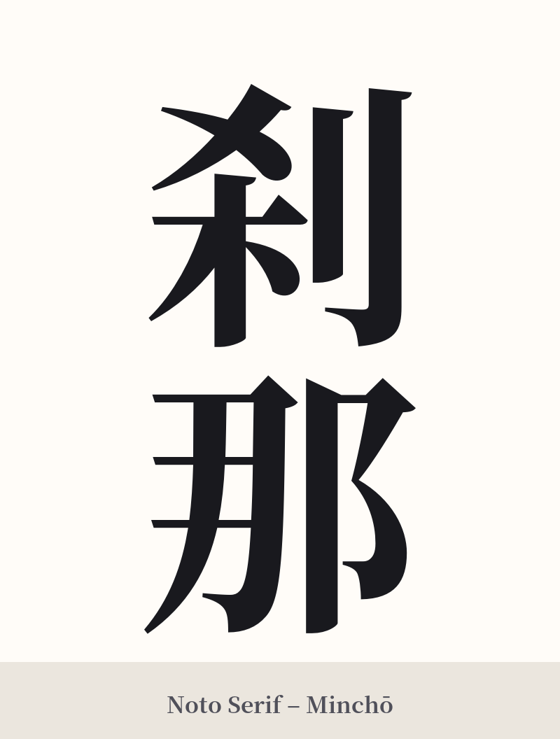
🖌️ Font Styles for 刹那
The same kanji can look dramatically different depending on the calligraphy style. Choose a font that matches the mood you want for your tattoo or design.
🎨 Tattoo Suitability
📐 Tattoo Design Guide
The poetic and vertical nature of 刹那 lends itself well to specific placements and styles that enhance its meaning.
– Placement: A vertical orientation is classic and elegant. Consider placements like the spine, the forearm (running from elbow to wrist), or along the calf. For a more subtle design, a smaller horizontal placement on the wrist or behind the ear can be very effective.
– Font Style: The style can drastically change the feeling. A flowing, semi-cursive script (gyōsho) can capture the 'fleeting' and transient quality of the word. For a more grounded and deliberate statement, a clean and crisp Kaisho (block) or Mincho (serif) font emphasizes the profoundness of the concept.
– Visual Tips: Consider pairing 刹那 with imagery that reinforces its meaning of transience. A few falling cherry blossom petals (sakura), a single maple leaf, or the delicate form of a dragonfly can create a beautiful and cohesive design. The idea is to complement the kanji, not overpower it.
Comments