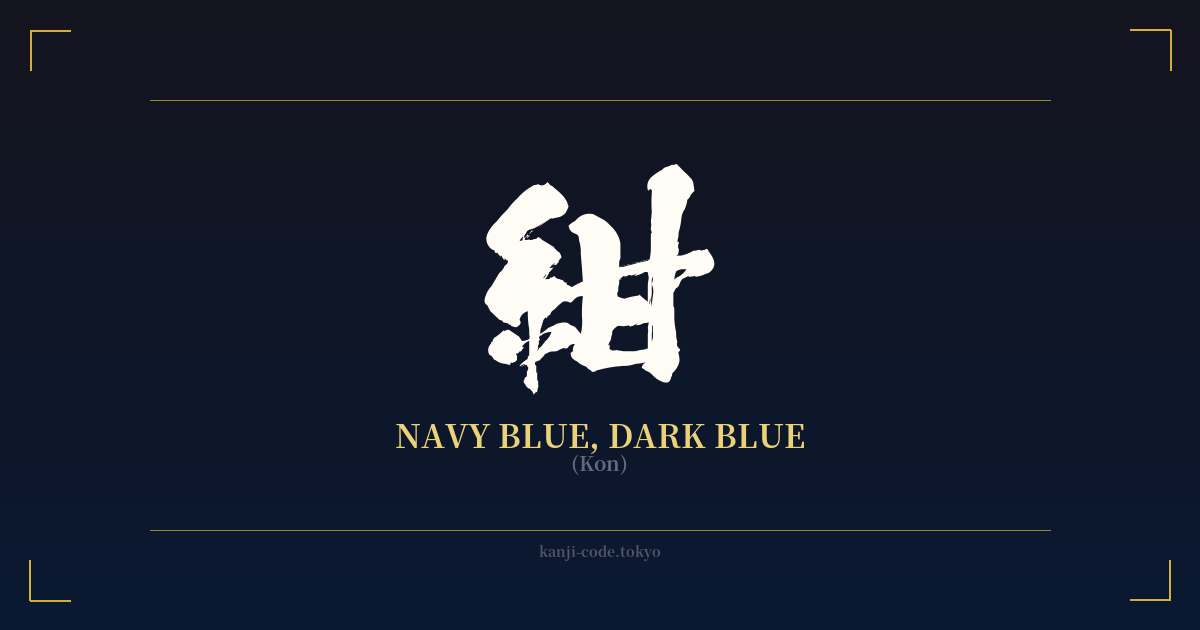
✍️ 紺 (Kon) — Cultural Context
The kanji 紺 (Kon) translates to navy blue or dark blue, but its significance in Japanese culture runs much deeper than a simple color swatch. It represents a specific, cherished shade steeped in history and traditional craftsmanship, particularly tied to the art of indigo dyeing, or 藍染め (aizome).
Historically, Japan developed a profound relationship with indigo. The shades produced from the Japanese indigo plant were so ubiquitous and distinctive that the term "Japan Blue" emerged. Within the spectrum of indigo dyes, 紺 is one of the deepest and richest hues, achieved through repeated dyeing processes that saturate the fabric with color. It was a color of both practicality and status.
During the age of the samurai, 紺 was a favored color for the garments worn under their armor. This choice was not merely aesthetic. The indigo used to create this deep blue was believed to have antiseptic and hemostatic (blood-clotting) properties, making it a practical choice for the battlefield. This association imbues the color with a subtle sense of protection, resilience, and warrior spirit.
Beyond the samurai, 紺 was the color of the common people. It was used for work clothes (野良着, noragi), shop curtains (暖簾, noren), and everyday kimono. Indigo-dyed fabric was durable, stain-resistant, and the color held fast. This widespread use made 紺 a symbol of Japanese daily life, representing diligence, functionality, and an unadorned, rustic beauty.
In modern Japan, 紺 retains its connection to tradition and quality. It is seen as a sophisticated, calming, and elegant color. It evokes a sense of deep tranquility, like the ocean at dusk or a clear night sky. Unlike a stark black, 紺 offers a softer, more nuanced depth. It is often used in formal wear, high-quality textiles, and corporate branding to convey trustworthiness, stability, and quiet confidence. Choosing 紺 is to choose a color that is at once humble and profound, practical and deeply beautiful.
🖌️ Font Styles for 紺
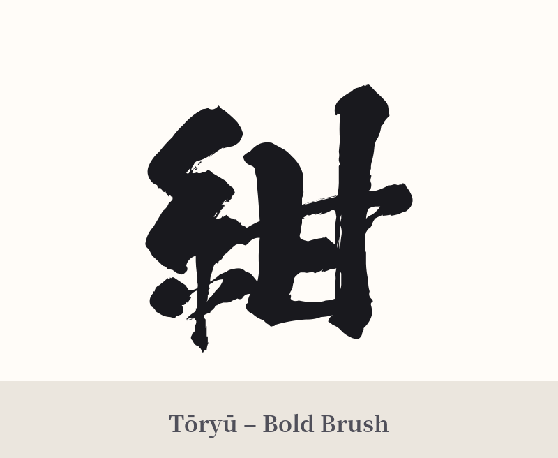
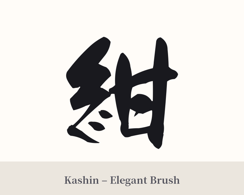
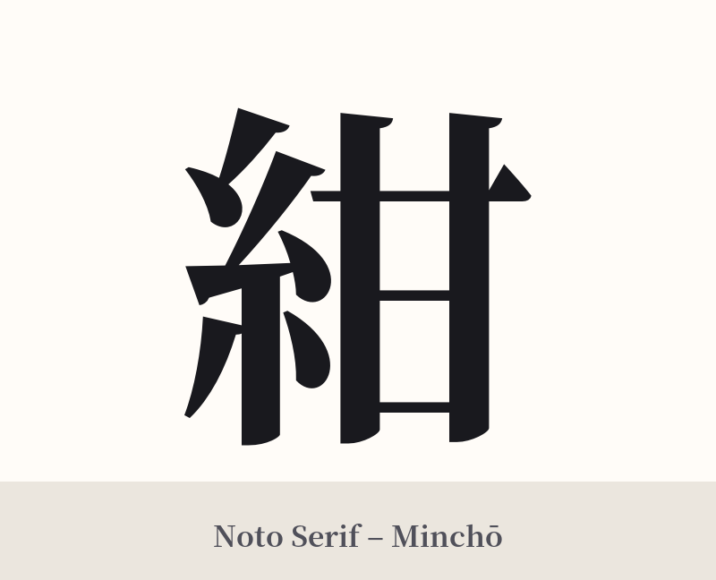
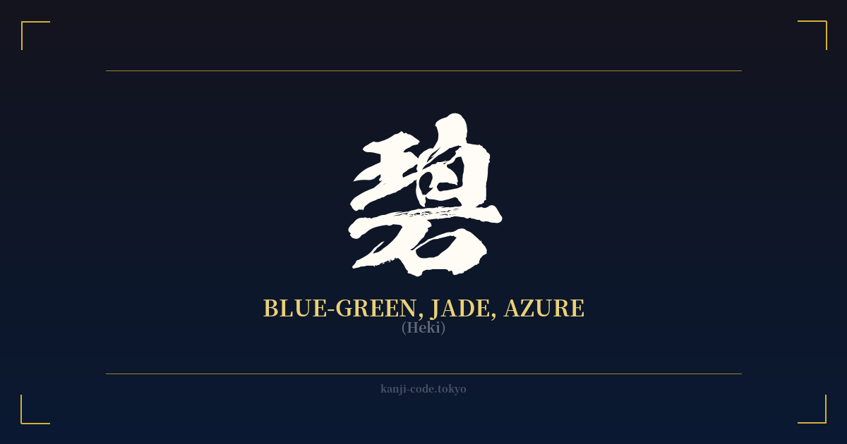
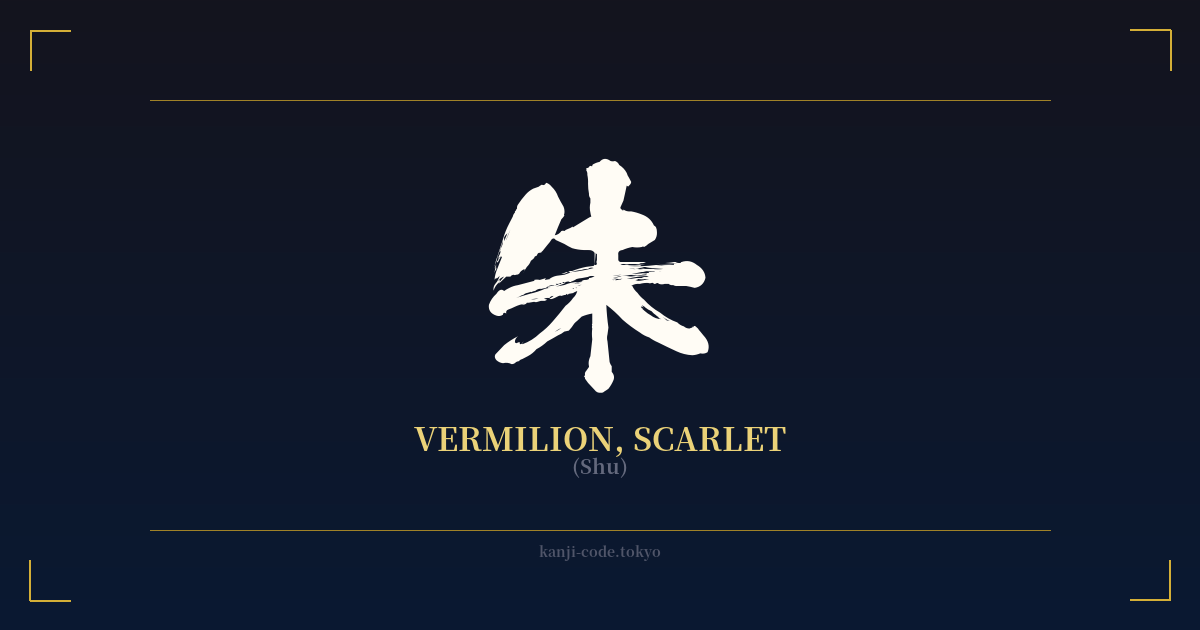
The same kanji can look dramatically different depending on the calligraphy style. Choose a font that matches the mood you want for your tattoo or design.
🎨 Tattoo Suitability
📐 Tattoo Design Guide
The kanji 紺 (Kon) is a subtle and stylish choice for a tattoo, reflecting a deep appreciation for Japanese aesthetics. Its balanced form works well in a variety of styles and placements.
– Placement: Consider smaller, more personal placements like the inner wrist, behind the ear, on the ankle, or along the collarbone. These spots complement the kanji's quiet elegance. For a slightly larger piece, the forearm or calf provides a clean canvas.
– Font Style: A traditional Kaisho (block) script will emphasize its clean lines and structure. For a more fluid and artistic feel, a Gyosho (semi-cursive) style is an excellent choice. A minimalist, sans-serif-inspired brushstroke can also work, highlighting its modern, chic appeal.
– Visual Tips: This is a perfect opportunity to use color. Consider having the kanji tattooed in a deep navy blue ink instead of standard black to directly represent its meaning. You could also incorporate a watercolor splash of indigo or navy blue behind a black kanji. Pairing it with a classic Japanese motif like a dragonfly (a symbol of victory) or a simple wave pattern can add another layer of meaning.
Comments