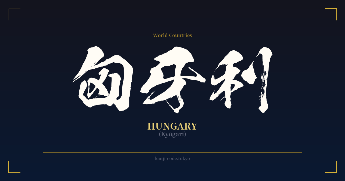
✍️ 匈牙利 (Kyōgari) — Cultural Context
The kanji compound 匈牙利 represents the nation of Hungary. However, its story is not one of deep symbolic meaning but rather of linguistic utility. This is a classic example of what is known in Japanese as 'ateji' (当て字), a practice where kanji characters are used to phonetically approximate the sounds of a foreign word, completely disregarding their original meanings.
During the Meiji Restoration (1868-1912) and earlier, as Japan rapidly modernized and increased contact with the West, there was a need to transcribe foreign names and concepts. The katakana syllabary, while existing, was not yet the standardized method for all foreign loanwords. Instead, scholars and officials often selected kanji that matched the syllables of the foreign word. For 'Hungary', the sounds were approximated as 'Kyō-ga-ri', leading to the selection of 匈, 牙, and 利.
This practice has resulted in some fascinating, and often confusing, combinations. The character 匈 is associated with the Xiongnu, an ancient tribal confederation, and by extension, the Huns, linking phonetically to 'Hungary'. 牙 means 'fang' or 'tusk', and 利 means 'profit' or 'benefit'. When assembled, the literal meaning becomes a nonsensical 'Turmoil/Hun Fang Profit'. This illustrates the core principle of ateji: sound over substance.
In contemporary Japan, this kanji spelling is considered archaic. Any mention of Hungary in news, books, or conversation will use the katakana script: ハンガリー (Hangarī). The kanji form 匈牙利 might only be encountered in historical documents, academic texts on etymology, or as a curiosity. Its usage is similar to seeing an archaic English spelling like 'Ye Olde Shoppe'; it signals a specific, historical context and is not part of the living, breathing language used today. Understanding this context is crucial for anyone considering it for a design, as it carries an air of history but lacks modern relevance and clarity.
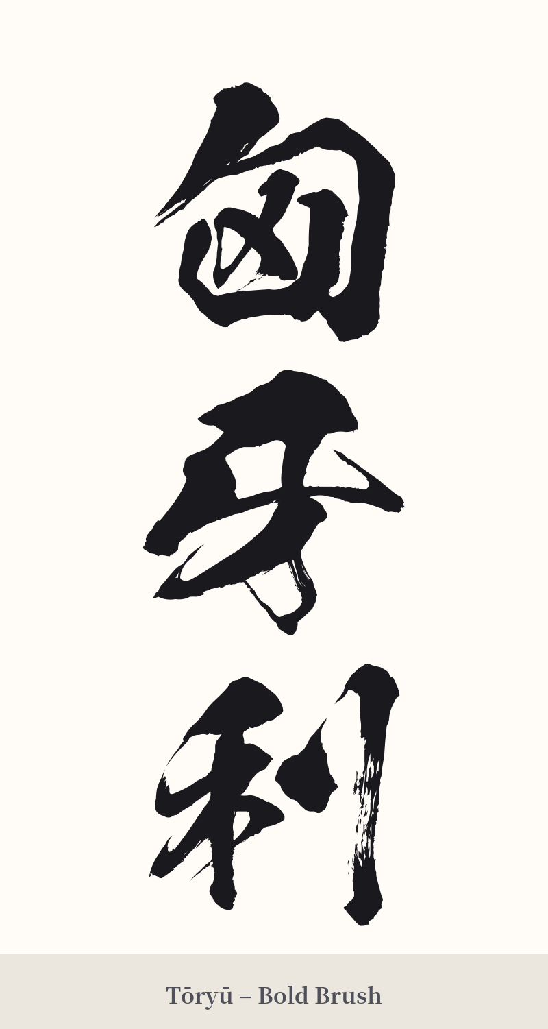
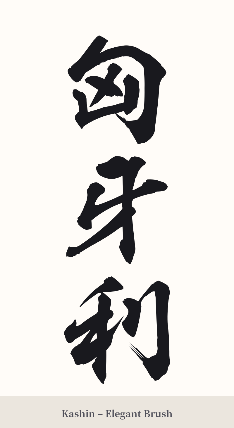
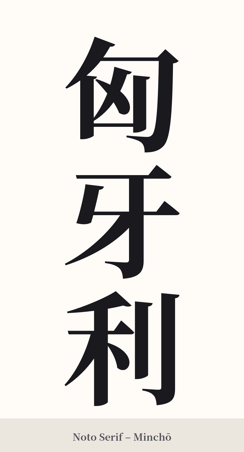
🖌️ Font Styles for 匈牙利
The same kanji can look dramatically different depending on the calligraphy style. Choose a font that matches the mood you want for your tattoo or design.
🎨 Tattoo Suitability
📐 Tattoo Design Guide
Given its status as an archaic and purely phonetic spelling, 匈牙利 is generally not recommended for a tattoo. The risk of it being misunderstood or seen as a strange choice is very high. However, if you have a specific historical or personal reason for choosing it, here are some design considerations:
– Placement: A vertical column on the arm or along the spine is a classic arrangement for multi-character kanji compounds. This emphasizes its traditional, albeit archaic, nature.
– Font Style: To honor its historical context, consider a traditional calligraphy script. A formal 'Kaisho' (block script) or a slightly more fluid 'Gyosho' (semi-cursive script) would be more appropriate than a modern, stylized font.
– Pairing with Imagery: To provide context and avoid confusion, consider incorporating a design element that clearly points to Hungary. This could be the colors of the Hungarian flag, the national coat of arms, or a recognizable landmark like the Parliament Building in Budapest.
– Alternative Ideas: A better choice might be a Japanese word that captures the spirit of what you admire about Hungary, such as '音楽' (Ongaku – Music) for its rich musical heritage, or '歴史' (Rekishi – History) for its deep past. This creates a meaningful tattoo that is also culturally and linguistically sound.
Comments