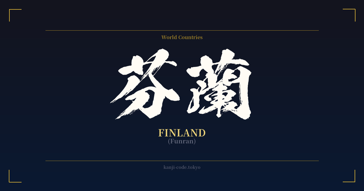
✍️ 芬蘭 (Funran) — Cultural Context
The word 芬蘭 (Funran) is a fascinating window into a time when Japan was rapidly absorbing and cataloging the outside world. This two-kanji compound is an example of ateji (当て字), the practice of using kanji characters to phonetically approximate foreign words, regardless of the characters' original meanings. This method was common during the Meiji Restoration (1868-1912) before the widespread adoption of the Katakana script for foreign loanwords.
In this case, 芬 (fun) was chosen to represent the 'Fin' sound, and 蘭 (ran) to represent 'land.' The result is a word that sounds vaguely like 'Finland' when read with its Sino-Japanese on'yomi readings. However, the true beauty—and confusion—of ateji lies in the literal meanings of the chosen characters. 芬 means 'perfume' or 'fragrance,' and 蘭 means 'orchid.' Thus, the kanji for Finland literally translates to 'Perfume Orchid.'
This poetic but entirely coincidental meaning gives the word a lovely, elegant air. It paints a picture of a place that is fragrant and beautiful, like a rare flower. Yet, this has absolutely no historical or cultural connection to Finland itself; it's purely a byproduct of a phonetic matching system from over a century ago.
Today, the use of 芬蘭 is almost entirely obsolete. It might be found in historical texts or used for a deliberately retro or literary effect, but in everyday life—from news broadcasts to travel brochures—the country is exclusively referred to by its Katakana name: フィンランド (Finrando). This is a crucial point for anyone considering this word for a design: you are choosing a historical artifact, not a living, breathing term.
Interestingly, the character 蘭 is also used in the ateji for Holland (阿蘭陀, O-ran-da), which can add another layer of potential ambiguity. While beautiful, 芬蘭 stands as a testament to the linguistic creativity and pragmatism of Meiji-era Japan, a phonetic relic with an accidentally beautiful meaning.
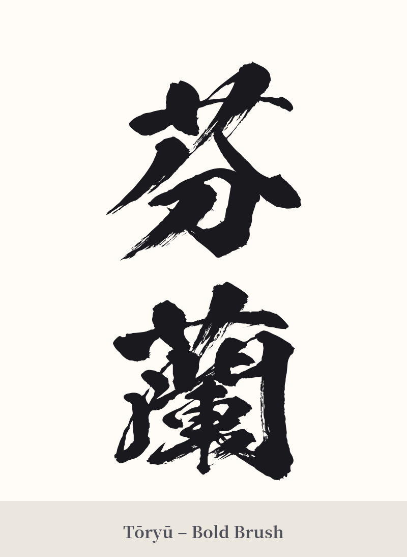
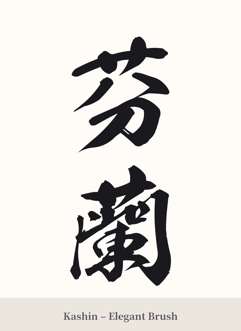
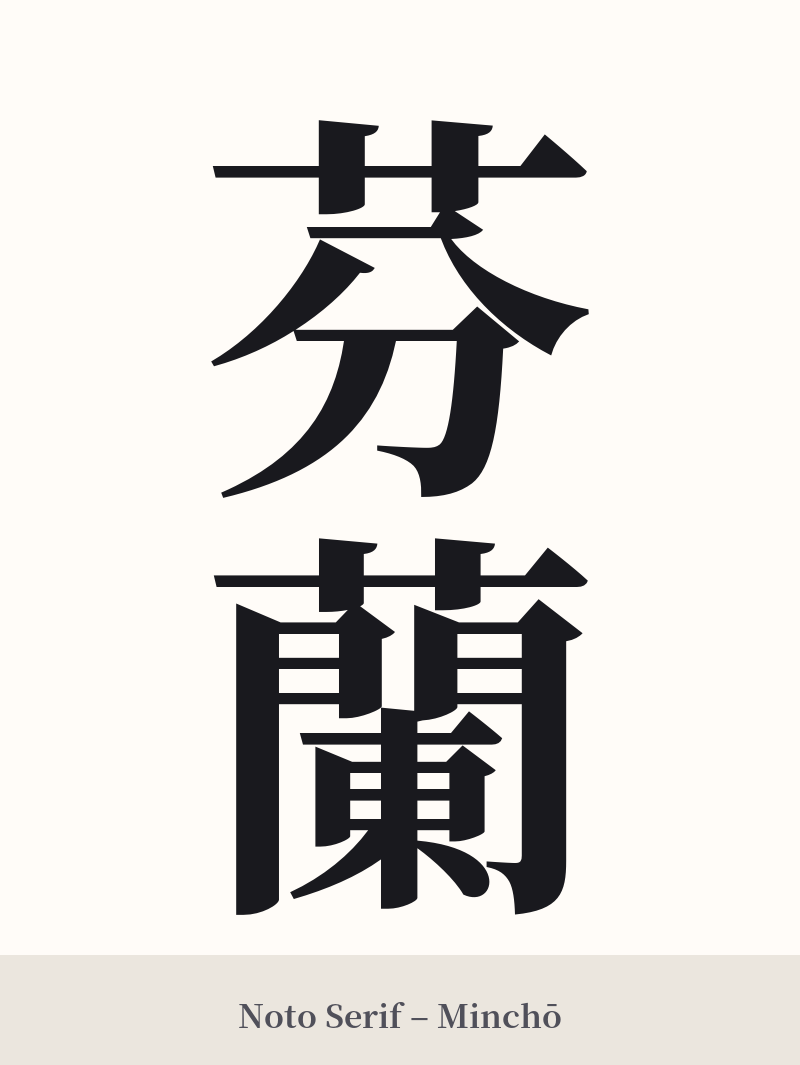
🖌️ Font Styles for 芬蘭
The same kanji can look dramatically different depending on the calligraphy style. Choose a font that matches the mood you want for your tattoo or design.
🎨 Tattoo Suitability
📐 Tattoo Design Guide
Given the historical and obscure nature of 芬蘭, a tattoo of this word is a specific and nuanced choice. To do it justice, consider the following design recommendations:
– Placement: The complexity of the second character, 蘭 (19 strokes), demands space. Avoid small or cramped areas. A vertical orientation on the forearm, calf, or along the spine would allow the characters to breathe and maintain clarity.
– Font Style: Embrace the word's archaic origins. A traditional, brush-like script such as Gyosho (semi-cursive) or Kaisho (formal block script) would be most appropriate. These styles honor the calligraphic roots of kanji and suit the literary feel of the word. Avoid modern, geometric, or minimalist fonts, which would clash with its historical context.
– Visual Tips: Ensure your tattoo artist is experienced with kanji. The intricate strokes of 蘭 can easily become a blurry mess if not executed with precision. A design that emphasizes the contrast between the simpler 芬 and the more complex 蘭 can be visually compelling.
Comments